Blog
Analysis and Evolution of the John Deere Logo
Some of the most successful logos we've come across are in the automotive and fashion domains. Yet there's one that has particularly stood out in the agricultural sector, one of the largest farm equipment manufacturers: John Deere. Whether it is through its color palette or representative symbol, let's take a closer look at the meaning and evolution of the John Deere logo.
A few words about John Deere
Our company of the day is named after its founder, John Deere, and was founded in 1837 in the United States. In those days John Deere manufactured and marketed cast steel ploughs. Today's John Deere products are mainly tractors and agricultural vehicles. In 1868, the company expanded, creating Deere & Company.
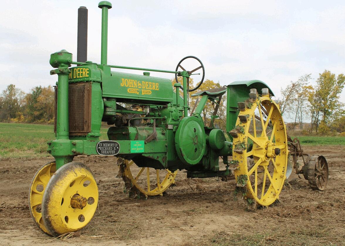
Over time, John Deere acquired many companies, including tractor manufacturers. The American company then began to open other factories, selling their agricultural vehicles around world. It's worth noting that in 1958 John Deere started using the color palette that would become one of their hallmarks. Even today, John Deere remains one of the most important companies in the agricultural sector.
The first John Deere symbol
What is the original John Deere logo? What does it stand for?
In 1873, several years after the company was founded, John Deere decided to create their first official logo, but they didn't register it until 1876. John Deere's original logo was composed of several components that are still used today in this agricultural company's brand image. The deer was chosen as the company's symbol, a reference not only to the founder's family name, but also to agriculture and nature. The company name was added above, followed by a reference to the location of the head office.

At the time, printing costs were high, so the color palette was black and white. As for the typography, a serif font was used. This version would be used for several decades.
The evolution of the John Deere brand over time
As John Deere is a company that would soon be two hundred years old, it was only natural for their logo to evolve with time. However, it's important to mention that the company's values have remained unchanged and have always been the basis of its brand image: quality, integrity, innovation, and commitment. It is part of John Deere's history.
The first John Deere logo was first modified in 1912. In fact, the overall design remained very similar. The only changes were the position of the bounding deer's legs, the ground, and a different serif font. A registration notice was added below the Moline, ILL, no doubt to enhance the credibility of the products, but above all of the brand.
John Deere celebrated their 100th anniversary with two new logos, one in 1936 and the other in 1937. First, the 1936 version was a different type of logo, a badge logo. A shield shape, intended to represent a barrier, was used around the logo. Otherwise, the important components remained the same, or nearly so. The deer silhouette is more defined, the font was changed again and the components below the animal were simplified. For the second version, the 1937 shield shape was removed around the logo.
In the 1950s, John Deere expanded. The company decided to go back to the drawing board with a new badge logo. In this version, the reference to Moline, Illinois was replaced by their slogan: Quality farm equipment. Only the name and deer symbol remained. We're getting closer and closer to today's version of the John Deere logo.
As you know, simplification is one of the most important trends in the world of logos. In 1956, the John Deere logo was reworked. A green curvilinear rectangle shape was used around the deer and the company name, but the slogan was removed, and a sans-serif font was added. In 1968, the shape became squarer, and the deer was simplified for better representation.
Finally, in 2000, the logo we know today was created by designers for the new millennium. This time, it was a combined logo, consisting of both the company name and a symbol. The John Deere name was placed below the deer. Another major change was the introduction of precise colors. In fact, this redesign was the first to use the brand's colors, yellow and green. The deer's position was also changed, showing the animal as gaining momentum instead of landing.
What font is John Deere's logo?
John Deere used different fonts over the years. First, they opted for a serif typography, which was trendy at the time. It was only in 1956 that this American business decided to focus on sans-serif fonts, Nowadays, the font used by John Deere is called Trade Gothic. The initials are also a little bigger.
How to be inspired by the John Deere emblem to create your logo
The evolution of John Deere's corporate image can certainly be a source of inspiration for your logo. To start, whatever the redesign, John Deere managed to keep their logos in line. Everything has just been modernized or simplified over time. Whether it's their first logo or the current one, it's easy to recognize the company. Also they also use their brand components directly on their products, which makes them stand out from the competition.
Next, let's talk about the various symbols. John Deere couldn’t have chosen a better ambassador than a deer, given the family name. The use of an animal also represents nature, the place where the company's products are used. We must also highlight the excellent choice of colors. Yellow and green are two colors strongly associated with nature, but also with agriculture. John Deere has also set themselves apart from the competition by using these two colors directly on their products, making them highly recognizable.
In conclusion, John Deere is an excellent example of the importance of taking the time to choose the right representative components when creating your logo. It could be an animal, a color palette, font, or nod to your home region. You'll notice that the most well-known company logos use such symbols. In other words, distinction remains one of the essential components of a good logo.
More tips and tricks on the blog


