Blog

Beige logos, the colour of understated elegance
You may have noticed that bright colors are back as a trend, especially among the younger generations. But what if that's not what you had in mind for your logo? What if you want to create something more subtle and refined? Have you considered using beige as your brand's main colour? Let's take a look at why you should consider this neutral hue for your logo, and what it can symbolize in your visual communication.
Why use beige for your company logo?
Have you ever noticed how few brands use beige in their logo? This scarcity represents a golden opportunity for your company to clearly position itself in a sector saturated with blue, red or green. While most areas are saturated with blues, reds and greens, beige offers you an almost unexplored visual territory to stand out.
Beyond this competitive advantage, beige has remarkable psychological influences. This color can evoke emotions such as serenity or elegance and naturally symbolizes understated sophistication while inspiring confidence: valuable assets for building a lasting relationship with your customers. Associated with the earth and natural materials, it also conveys values of authenticity, nature and sustainability. These are particularly appreciated in areas related to responsible design or interior design.
On a practical level, beige is exceptionally versatile. This neutral color with warm undertones blends well with many shades like yellow, green, or even purple, giving you considerable creative flexibility in choosing your visual design.
A few tips for a successful beige logo
Are you curious or interested? Let us give you some relevant tips to help you design the perfect beige logo for your brand. While beige offers many advantages, it also requires some attention to reveal its full potential.
Find the perfect tone
When creating your beige logo, the first thing is to choose the right shade or tone that matches the meaning you want to convey. What do you have in mind for your brand? What are your values? Are you looking to use a pink, yellow, or brown-beige?
A beige with pink undertones will evoke softness and soothing emotions, perfect for brands in the field of well-being or interior design. The yellow shades bring warmth and optimism, ideal for the food industry or hospitality. As for brown tones, they can symbolize stability and authenticity, excellent for sectors such as finance, crafts or nature-related businesses. Test several variations to find the one that resonates with your identity.
Think about the background
The second crucial piece is the background. Since white often dominates communication media (sheet of paper, website), you have to make sure that your beige logo remains perfectly visible and legible.
To avoid a logo that disappears or looks too subdued, opt for a darker or pigmented beige. Alternatively, create a striking contrast by adding a colorful, dark background. Why not use a geometric shape like a circle or square? This technique not only ensures visibility but can also enhance the visual impact of your brand.
Dare to use contrasts and with other colours
Just because you chose beige as the main color of your logo doesn't automatically mean that you're a serious or boring brand. On the contrary, why not break the mold by daring to contrast with bright colors to attract attention? This is an approached liked by Gen Z.
Imagine a sophisticated beige with electric orange or emerald-green. These unexpected combinations create a perfect balance between elegance and modernity, allowing your brand to speak to all generations while maintaining a distinct and memorable identity.
Three examples of brands using beige
As mentioned, not many brands have chosen this color for their company logo. However, we have managed to find you three relevant examples that will inspire you.
Louis Vuitton
Beige is universally recognized as a refined color, which is why luxury brands like Louis Vuitton have embraced it. Although the Louis Vuitton logo is made up of two intertwined black letters, it is the beige and brown monogram pattern that has made the brand iconic. This sophisticated palette instantly evokes French elegance and craftsmanship, proving that beige can become a true symbol of prestige.

UGG
UGG is a perfect example of the harmony between product and visual identity. The brand cleverly takes the warm beige hue of its iconic sheepskin boots, creating a natural and authentic consistency. This chromatic strategy reinforces the brand's DNA while evoking comfort and warmth. The contrasts with black and brown add the necessary depth, demonstrating that beige can be both cozy and professional.

Minnesota Vikings
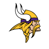
The Minnesota Vikings prove that beige can conquer even the sports world. Although this shade represents skin tone in their iconic Viking warrior logo, it is officially one of the colors in their color palette, alongside purple and bright yellow. This bold combination demonstrates the versatility of beige: able to combine with bright colors while bringing a touch of authenticity and strength to the visual identity.

Whether you want to evoke understated luxury, natural authenticity or accessible modernity, beige offers a palette of possibilities that is often underestimated. By mastering its nuances and associations, you create much more than a logo. You build a memorable and timeless visual identity.
Looking for more interesting and unique shades? Take a look at the Pantone color of 2026!
More tips and tricks on the blog


