Blog
Brand Evolution: From G Suite to Google Workspace
This is not the first overhaul of the web search giant. That being said, Google is in its sixth. Since the announcement of the change from G Suite to Google Workspace in 2020, users have been claiming that the icons are too similar. While the brand redesign is important, the question arises: how can this brand redesign help you create your logo?
In this article, we will look into the matter and give you some advice to help you get there.
Brand Analysis: Why change the name?
G Suite has been known as the professional domain of productivity and collaboration since 2006. They were Google tools, but they each had their own identity. Different colors, different typographies, and icons that were impossible to confuse due to their many differences.
In 2020, Google announced a reform of these tools. Both in terms of performance and overall look, the giant aimed for consistency and a more integrated experience in the product’s vision. This is an evolution, not a radical change. So they agreed on one thing: an integrated workspace that brings together all the products under the same identity… that of Google. That’s how the idea of Google Workspace was born.
COVID-19 paved the way
First, all the tools can be used together to form one great productivity tool: the Workspace. This evolution has added several features so work teams can collaborate easily from the cloud.
According to a study, 92% of employees want the opportunity to work remotely, in the comfort of their own homes. This explains why Google wanted to make Workspace a tool accessible from home and where it is easy to collaborate with colleagues, in part thanks to the ability to take a quick look at the links of the Docs, Sheets, and Slides files. That’s probably where the name “Workspace” comes from because, for most people, work was at home.
Google took the opportunity to launch the redesign of its products by adding some features to help work from home.
Uniformization of the icons
Was it necessary? To standardize all products as Google property, the answer is positive. The new icons were designed with Google’s colors, typography, and brand identity. There could be no more confusion regarding the different products as they were before. It’s then easier for users to quickly find the apps available in the Google Suite.
Several users mentioned the lack of differences and confusion between all the applications. However, despite the fact that the same colors are used, Google doesn’t seem to mind the confusion. According to them, most employees waste a lot of time changing from one application to another; with Workspace, this time will be saved.
Design changes
We know that colors have greater meanings than just because we like blue, we will use it. To refresh your memory, here are some examples of the meaning of Google colors:
Blue: reliability and strength.
Red: emotion and youth.
Yellow: optimism and warmth.
Green: health and growth.
In addition to adapting all previous colors of the apps to Google colors, several changes have been made to the products visually speaking. Here they are:
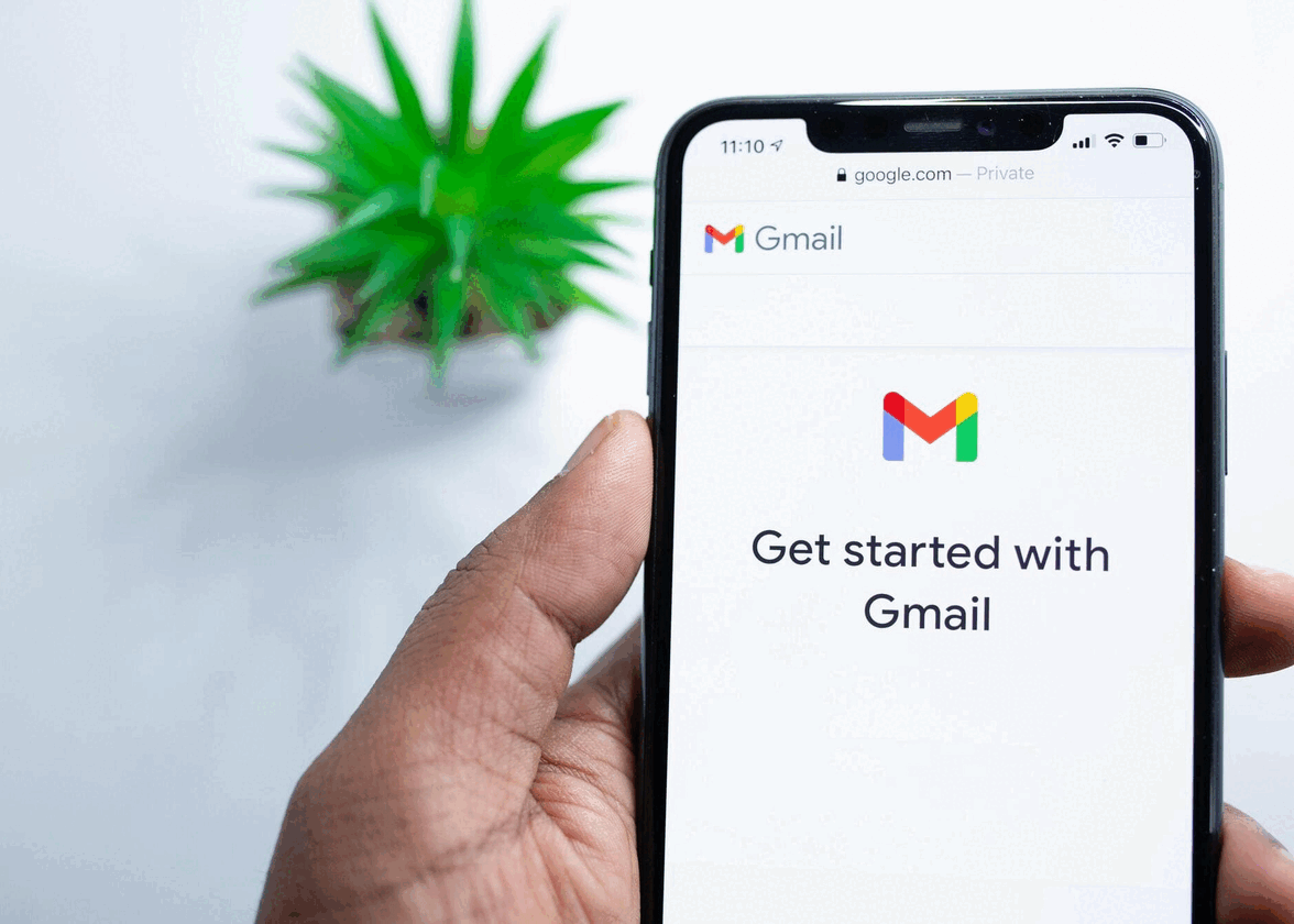
Gmail: The application changes from a red mailbox to “M” for “Mail”.
GoogleDrive: This one has received the most minor changes. The shape is kept, but the corners are rounded. It acts as a base for all other applications.
GoogleCalendar: The icon has been greatly simplified to leave only the number in the center of a square.
Google Sheets/Docs/Slides: The 3 icons have been replaced by a single one; a sheet.
GoogleMeet: The app that saw the biggest overhaul. Previously a green dialog box with a white camera in the center, Google kept only the camera to put an emphasis on it since in times of pandemic, the camera was (and still is) heavily used.
How to successfully redesign your product(s)?
Whether you’ve been on the market for decades or just a few years, your logo may need a redesign. To stay relevant, your visual identity must be willing to remove any superfluous elements. We can see that Google has removed all elements deemed not necessary to understand the product.
On the other hand, the elements cannot be confused; it is quite clear that all products are the property of Google since the colors, the typography, and even the rounded corners represent Google.
So, to succeed in your redesign, you have to analyze your business and see if the redesign is indeed necessary. That is, it could prove more costly if the analysis is not done well (see 3 examples of redesigns that went wrong). You must know three things, a redesign must clean up if only to remove superfluous elements. Then, make sure there is no confusion; your products belong to you and all live under the same entity. Thirdly, there’s no harm in making bigger changes if you want to update your logo and your product(s), you just have to choose the right time.
In summary
Workspace remains the same workspace for productivity applications, with a few additions to make it easier for colleagues to work together. It's the natural turning point that Google has taken regarding its suite of tools, so there is no harm in wanting to refresh your brand image when you want to stay relevant.
That being said, if you are launching your very first logo, keep in mind the trends to follow to ensure the success of the product without needing a redesign in a year or two.
More tips and tricks on the blog


