Blog

The Evolution of Delta's Logo
The American company Delta has seen its logo change multiple times since the company was founded in 1928! More than twenty different variations have been used, some of which were used at the same time. Each new version reflected the graphic design trends of the time, while maintaining key elements that ensured the consistency of its brand image. The evolution of Delta's logo is a testament to the importance of adapting its visual identity without losing its essence. Whether through subtle changes or major transformations, the airline has been able to modernize its image while remaining true to its values. Here is a look back at nearly a century of graphic evolution.
Delta's history
Delta began transporting passengers in 1929, but its history began in 1925 when it operated as an aerial crop spreading company under the name Huff Daland Dusters. It was the first in the world to offer this service! After contributing to the war effort by training pilots and supplying aircraft, it officially adopted the name Delta Air Lines in 1945. In 1953, it inaugurated its first international flight. Today, with more than 4000 daily flights and 700 destinations served, Delta is a major player in global aviation.
Delta's first logo

Delta's first logo was introduced in 1929 when the company launched its air passenger service as Delta Air Service. From the beginning, the visual identity was based on a triangle, a component still present in the logo almost a century later. This triangle refers to the letter "D" in the Greek alphabet, reinforcing the connection between the company's name and its branding.
Mercury, the god of travel and commerce, was at the center of the logo. This first emblem also illustrated Delta's three core values: speed, comfort and safety. The use of the triangle is not insignificant in graphic design: this shape evokes stability and steering, elements perfectly suited to an airline seeking to inspire confidence in its passengers.
The evolution of Delta's brand image over the years
1930 to 1951: the triangle in the center of the logo
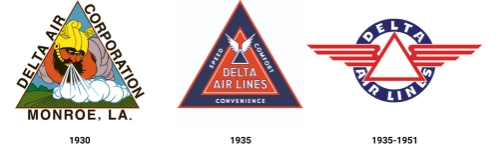
While the triangular shape has remained the central component of Delta's logo for more than twenty years, its appearance has evolved several times.
In 1930, a new version of the logo, originally designed for Huff Daland Dusters, still featured Greek mythology. This time, it was the god Thor who took up most of the emblem. However, this comprehensive overhaul was only used for five years before being replaced.
The brand image was given a new look, keeping only the shape of the previous logo. The company name now occupied a place in the center of the triangle, accompanied by Delta's distinctive strengths, inscribed in smaller letters. It was also at this time that the colours blue and red appeared, and they are still part of the company's visual identity today.
However, this logo did not last long. It was quickly replaced by a version where the wings of the white triangle extended further, more reminiscent of the silhouette of an airplane in flight.
1945 to 1959: the Flying D logo
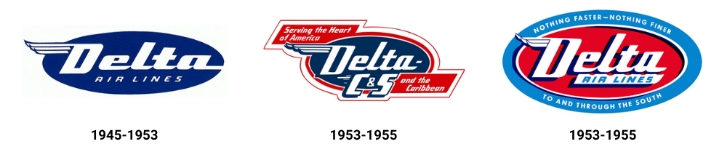
Yes, that's what Delta called the logos of that era, because of the wing next to the letter "D". This design was reminiscent of the winged helmet of Mercury, a reference to the company's first logo.
In all three variations, the name of the company was in the center of an oval. A special version was used from 1953 to 1955, after Chicago & Southern Air Lines was acquired by Delta. The "C&S" designation was added to ensure the transition and brand recognition on the airlines previously served by Chicago & Southern.
In 1955, Delta put more emphasis on its positioning with the addition of the slogan "Nothing faster - Nothing finer / To and through the South", integrated into the blue frame around the logo. This sentence was a reminder of the company's guideline and consumer experience. The sharp contrast between bright blue and bright red immediately captured the attention and enhanced the visibility of the emblem.
The similarities between these three logos allowed Delta to build a brand image that was recognized by consumers.
1959 to 2000: The Delta Air Lines era
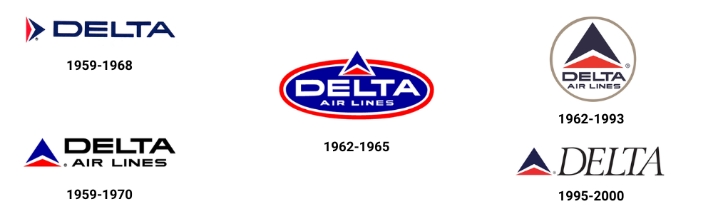
While the logo launched in 1959 resembled the company's current logo, it underwent several changes over the following decades. The distinctive component of this design was the symbol formed by two interlocking triangles, a graphic representation of the speed of Delta's aircraft. This shape, called the "widget" by the company, also evoked that of an airplane wing, reinforcing brand recognition. The colors red and blue remained present in each of the variations, but with different hues almost every time.
However, some variations of this period stood out by integrating an oval or circle around the triangles and the company name, bringing a different touch to Delta's brand image.
2000 to today: a simple, yet effective combination logo
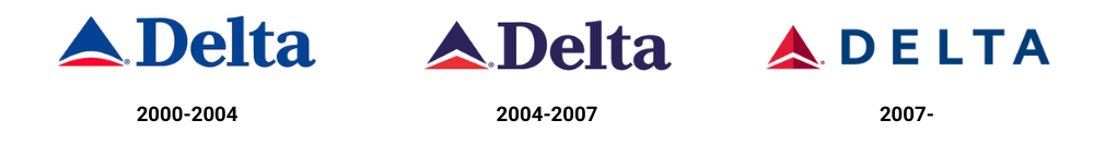
In 2000, the company dropped the name Delta Air Lines in favor of the one-word name "Delta," which it used in its logo along with its widget. In the early 2000s, several adjustments were made to this combined logo, including changes in colors and typography, before culminating in the version we know today.
The company played with shades of red to create a third-dimensional illusion in the symbol. This graphic component, accompanied by a new sans-serif font, gave Delta a contemporary and timeless image. Made in 2007, these changes illustrated Delta's ability to transform into a customer-first airline.
The history of Delta's logo shows that a good logo should be both timeless and evolving. By maintaining distinctive components while adapting to new trends, the company has been able to strengthen its recognition and credibility.
Need inspiration to design a logo that will evolve with your business? Try FreeLogoDesign and create a professional logo in just a few clicks!
---
Roxane has always written and dreamed of making a living from her pen. Now a web editor, proofreader and author, we can say that it's mission accomplished!
More tips and tricks on the blog


