Blog

3 Rebrand Stories that Did Not End Well
Even well-known companies with huge marketing departments are not immune to big branding mistakes. In fact, when they decide to change their image, these companies often spend an extraordinary amount of money and time doing multiple tests with different groups. So what could go wrong then? It happens that the final result does not meet the clients' expectations at all. Consider that people, in general, are hesitant to change and may find a certain comfort in the brands they know. Here are three logo rebranding stories that went wrong.
BP integrity issue
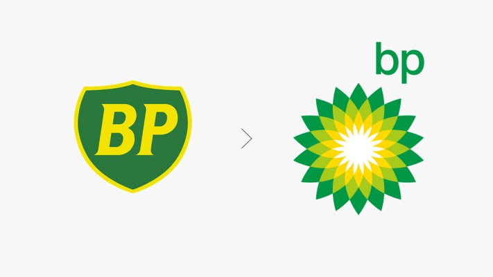
British Petroleum, better known as BP, is the third largest oil company in the world. This name might sound familiar because it made headlines a few years ago. In 2000, they went from a shield logo that had been used for decades, to a more contemporary one which was, let’s say, questionable. It was not the new vibrant tints that were problematic but its sun-like shape. It suggested that this oil company was greener which was not true. Luckily for BP, it worked relatively well until 2010. Moreover, it is said that BP paid an astronomic amount of money for this rebrand.
If you do not know BP as your nearby gas station, you might have heard that it was responsible for one of the worst oil spills in history. In April of 2010, a huge quantity of oil spilled from their Deepwater Horizon drilling station in the Gulf of Mexico. It had major negative impacts on wildlife and plants. As you can guess, BP’s logo that seemed so eco-friendly was marred by this tragic event, and because of this Greenpeace asked its followers to redesign a more realistic logo for the oil company. Since then, British Petroleum has spent millions of dollars to improve its image; however, their new image will likely always be linked to this horrible spill.
GAP’s failure
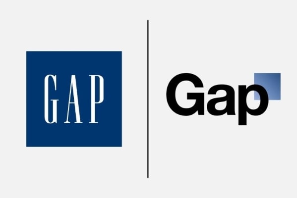
Do you remember when GAP’s new logo launched in 2010? Probably not since it lasted less than one week. This company which specializes in affordable clothing decided to change their timeless logo made up of their name in a dark blue square. The result was disappointing and boring. The square was shrunk and the font was changed for one that wasn't anything special. When the new image was shown discreetly on social media, people reacted badly.
The company’s response to the bad reaction did not help improve the situation. To start with, Gap first said that it was a more modern version of their logo. It did not make things any better. Then the clothing business said that it was a crowdsourcing process and that they wanted to get new ideas from their customers. That did not help either since graphic designers typically did not want to share their work free of charge when a company like GAP makes a lot of money. Finally, the executive manager decided, after only six days, to keep their old logo to everyone’s relief. According to the last estimates, this disastrous rebranding adventure cost GAP more than 100 million dollars. In this case, we can say that the customer was right.
Cardiff City strange new look
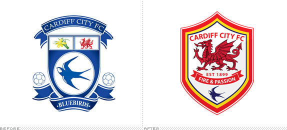
We have seen how passion can be inflamed by sports. Cardiff City FC is a soccer team founded more than 100 years ago in Wales. It is, in fact, the team where Emiliano Sala was supposed to play before his disappearance. The Bluebirds logo is mostly made up of a bluebird which also gave them their nickname over the years. You can also find a small red dragon on the top right, which is a symbol of that area of the UK. Before they changed it, their logo was very traditional, easily recognizable and loved by their fans. Why change something that worked well?
In 2012, the new team director, Mr. Vincent Tan, wanted to refresh the Bluebirds image. So, instead of working the tint or the bird icon on the Cardiff City FC emblem, the director decided to change the heart and soul of the logo. The new image depicted the Welsh dragon instead of the usual Cardiff bird. Moreover, the new uniform which had always been blue was changed radically for a red one. This was a real shock for the fans who thought it did not make any sense at all. There were many critics, protests, and threats from Cardiff City FC admirers following this scandal. Luckily for them, the Bluebirds management team decided to offer compromises in 2015. They started by putting the bird back on the logo and then the uniform progressively became blue again. It may have certainly been wiser to consider keeping the bird on the logo in the first place.
As mentioned above, it is not because a business can afford to have a huge marketing team that it is mistake proof. There are others who have had rebrand fiascos than just these three and we will surely see some more in 2019. On your end, you might feel like your logo needs to be redesigned. Do not let your brand become outdated. If you know your customers and your product well, it will be just fine!
Images: UnderConsideration
More tips and tricks on the blog


