Blog
The History of the Reebok Logo
After studying the history of the logos of Nike, Pumas or Adidas, today we go to England where the Reebok company was created. In this new article, let's discover the evolution of the Reebok logo and why it is an example of a good logo.
Reebok's story and origin
In 1895, Bolton, England, Joseph William Foster created the sports equipment brand Reebok. In its early days, the company was called J.W. Foster and Sons, and it was one of the first companies to manufacture studded sports shoes. In addition, they made them by hand. Very quickly, the company attracted an international sports clientele and provided their shoes for the Summer Olympics in Paris in 1924. Then, in 1958, J.W. Foster and Sons was renamed Reebok by the founder's grandchildren. Why Reebok? This is thanks to a variety of basic South African antelope called rhebok in Afrikaans. Animals also have a meaning, and Reebok chose this animal because it represented grace, strength or intelligence. Their logo could have represented an antelope, but that's not really the case. We will come back to that.
Subsequently, an American, Paul Fireman, bought rights, founding a new company Reebok USA for North America. Thanks to many sales and great growth, Paul Fireman would eventually buy the authentic brands group located in England.
Reebok's first logo design
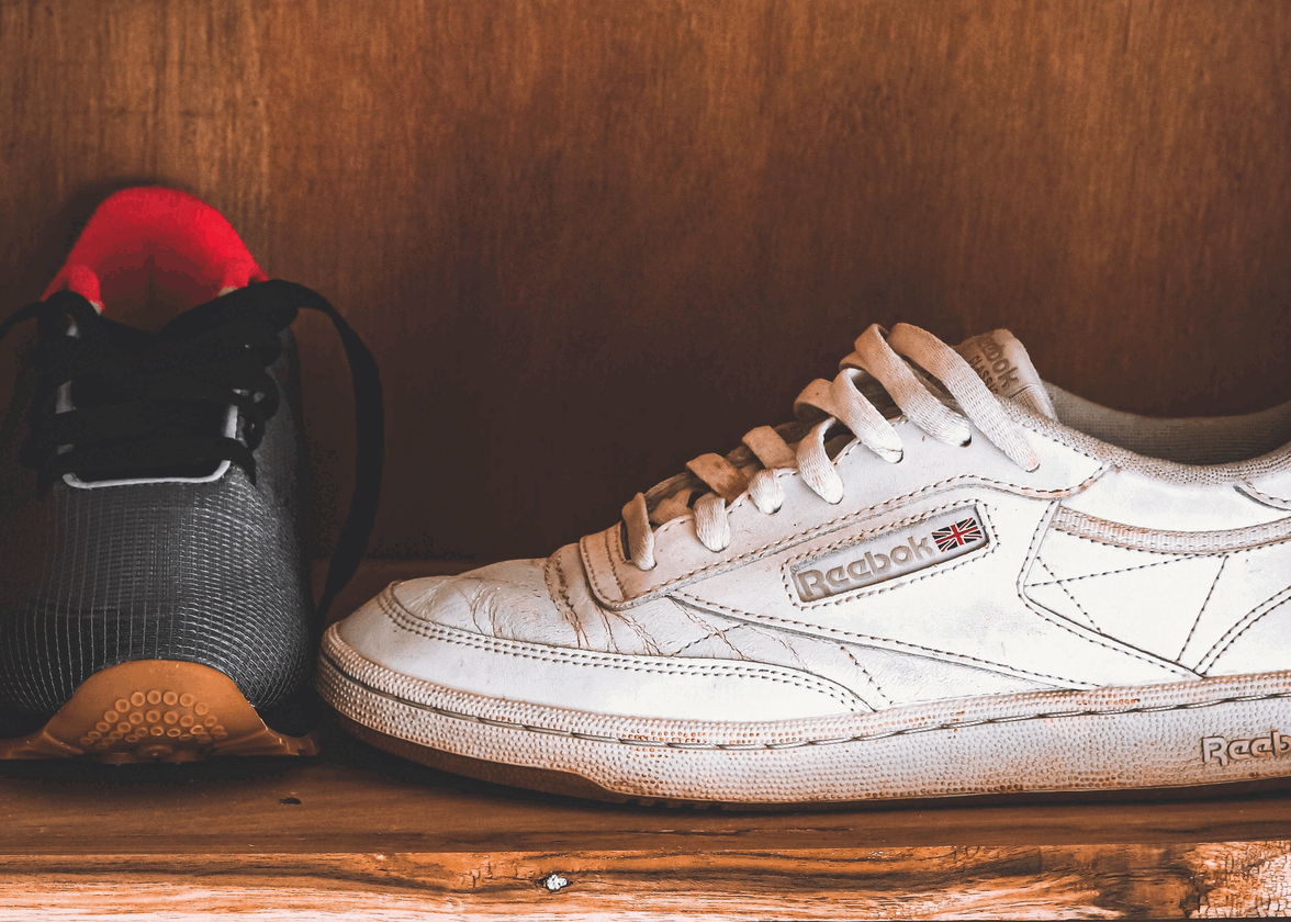
In 1958, the first Reebok logo appeared. This logo design was very simple and only sought to represent the origins of the company. The name of the brand was written in bold in a sans-serif font with rounded letters. The brand also included the British flag, the Union Jack. It was there to represent the company and where it comes from. This logo can be found on Reebok shoes today.

The evolution of the Reebok brand logo
Why did Reebok change its logo so often?
Subsequently, Reebok underwent no less than nine logo design evolutions. It was simplified, then updated and finally it returned to its roots.
In the late 80s and 90s, Reebok decided to simplify its logo, while making it complex. The British flag turned into a type of vector (that's even how the brand named the logo), with two lines crossing another, always with the colors of the flag. Lines can have certain meanings. Since they were not perfectly horizontal or vertical, we could still feel a sense of movement or speed and power when we saw these lines intersect. It was also interesting to note that although they still represented the Union Jack, the blue line was also compared to two racetracks that later join to form a kind of unity. The word Reebok was always blue, you noticed that it was just a lighter color.

The logo then changed at the end of the 90s, more precisely in 1997 and until 2000. They opted for a black and white version, instead of gray and white. Be aware that you should always have different versions of your logo, including a black and white version. Of course, in this case Reebok's goal was not to show that they had a monochrome logo. They just became very popular in the years that followed. Monochrome logos are often considered very simplistic and timeless and elegant. For this, you only have to think of the logo of the American company Apple.
Surprisingly, the logo would only stay 3 years before changing to a logo that mixed many elements of the past. With this logo, there were 4 colors, which may seem a lot for a logo. We generally advise not to exceed 3 colors. The icon was always present in blue on a gray background. Reebok was now written in red in a sans-serif font and in italics representing speed and energy. The whole was inscribed in a parallelogram accentuating this idea of movement.
Again, the logo would only last a few years, about 5 years. In 2005, the company decided to shorten the word Reebok in the same way that it shortened it when it went public in 1985 to RBK. The typography would be changed again, but still slightly in italics.
This logo would only last 3 years before the brand decided to do a redesign of their logo. A very minimalist logo was created. Only the brand name in blue even lighter than usual with a sans-serif font making the logo quite traditional. We could also see that the icon disappeared. This logo would represent the company for 6 years.

What is the delta symbol of Reebok?
Even though the logo represented the brand well, it was often criticized for being simplistic. In 2014, when repositioning itself to be considered a 100% fitness brand, the English company decided to create a new logo. The brand name turned black again with a new symbol: the Delta. The company said the delta was chosen as a symbol of transformation and change. In addition, each part of the triangle represented a state of transformation of a person, physicality, mentality and socially. The delta which is in fact a triangle also represents the energy or movement thanks to the two sides of the latter which converge towards the same point. Red was always present to represent passion.

What is the new logo for Reebok?
In 2019, the latest Reebok logo was created, abandoning the delta, but not totally. We could still see it on social networks or the official website. The company decided to remerge their logo of the 90s with a monochrome palette, that is to say in black and white. The vector symbol would return below the brand name in its old typography.
Who owns Reebok now? Is Reebox still British?
For a while, Reebox was owned by Adidas, one of the major sports brands around the world; however, in 2021, this German company decided to sell its English counterpart to a company based in the United States: Authentic Brand Group. Therefore, Reebox is no more affiliated with the Adidas empire.
How to get inspiration from the Reebok logo to create your own
Reebok had a good combination mark logo – the brand name and an icon. Reebok chose their icon well, the company wanted to represent their origins across Europe and even the world. They were inspired by the name of an animal that is graceful and fast to represent what the brand sells, stylish shoes and allowing you to be fast. To simplify their flag, they used geometric shapes; many people forget that using these shapes can be very useful in making your logo unique. Something, you just line a line to make an idea something unique, just like the Amazon symbol.
The logo has also remained simple since its creation and therefore recognizable quite easily. These are important components of a good logo. They also used inspiration from the place of foundation by adding the Union Jack or elements of the British flag along the designs.
Now you know everything you need to know about the Reebok logo and why it's a good model to help you create your own. Do not hesitate to read our other articles on logos evolution, such as the difference between Pumas and Adidas.
More tips and tricks on the blog

