Blog
Everything You Need to Know About the Logos for the 2022 Olympics
2021 is coming to an end and maybe you have forgotten that we will have the chance to watch another Olympic Games in just a few months? Less than a year after the Tokyo Olympics, it will be Beijing's turn to host this major event this winter. For this occasion, let's take a closer look at the evolution of the official logos for the 2022 Olympic Games.
The 2022 Olympic Games
And yes! Unless there is a last-minute change, we will indeed have the Winter Olympics in 2022. They will again take place in Beijing, alternatively know as Peking, in China. It is the first city to host the Summer and the Winter Games. For the winter games, Beijing was in competition with the capital of Kazakhstan. A total of 109 events will be held at various Chinese facilities. It should be noted that the event will be held immediately after the Chinese New Year. Now, what about the official logo of the 2022 Olympics? Fortunately for China, there have been no controversies surrounding the official logo, unlike the Tokyo Olympics.
The bid logo
When a city wants to submit their candidacy for the Olympic Games, they must submit a bid logo. Subsequently, an official logo is unveiled when the city is chosen by the Olympic Committee to host the games. Beijing's bid logo for the 2022 Olympics was made up of several elements. First, there was an emblem located at the very top. It included various colorful lines that created a silhouette of a person and a zigzag that looked like snowy slopes and was also the number two for the year 2022. Added to this bid logo were the words Beijing, Candidate City and the Olympic logo underneath.

One point we would like to emphasize for the Beijing bid logo is the use of the colors of the Olympic symbol and shading. First, all the Olympic colors were present on the bid logo. Then, all colors were linked using shading. As we saw in our article on the logo trends of 2021, shading is all the rage. For this you just have to think of the logos of Instagram or Tinder.
The official logo of the 2022 Olympic Games
In 2017, the official logo for the 2022 Olympic Games was unveiled. The artist behind this creation is Lin Cunzhen and he wanted to include various traditional and modern elements of Chinese culture when creating the logo. First, the primary inspiration was the Chinese character for the word winter. The official name of the logo is also Winter Dream. The logo for the 2022 Olympic Games is a combined logo.

Cunzhen transformed the Chinese character into an athlete's silhouette, while parts of it depict the Chinese peaks where the competitions will be held. There is a festive side to this logo as the games will be held during the Chinese New Year. As well, the colors were not chosen at random. Blue was used as a symbol of dreams and purity, in addition to representing snow in a way. As for red and yellow, they are representative of the Chinese flag.
Finally, as it is a combined logo, there is text in the composition of the logo. Under the emblem we have the name of the host city, Beijing, and the year 2022. The font and color represent the specificities of traditional Chinese calligraphy. Of course, once again, the Olympic logo is underneath.
The official logo of the 2022 Paralympic Games
All Olympic Games now have their own Paralympic Games. The official logo of the Beijing 2022 Paralympic Games was unveiled at the same time as the logo for the Olympic Games. There is a lot of resemblance between the two logos. The Paralympic logo is, in a way, a simplified version, and its name is Flying High. It has fewer lines, but the same colors as the Olympic logo. For this logo, Cunzhen was inspired by the Chinese character for the word fly to give the impression of a person in a wheelchair in action. This logo also has Beijing 2022 and the logo of the Paralympic Games at the bottom.

Reminder: The meaning of the Logo of the Olympic Games
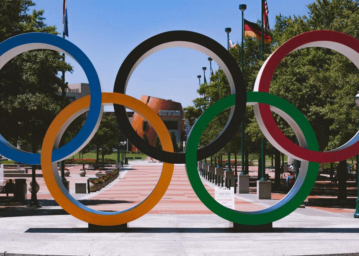
For those who do not know, the official Olympic logo has a very specific meaning. The intertwined rings represent the five continents: green for Oceania, black for Africa, yellow for Asia, blue for Europe and red for the Americas. In the background, there is a white flag that signifies peace and the Olympic spirit. This symbol was designed by Pierre de Coubertin, the founder of the modern Olympic Games.
In conclusion, are you looking forward to the next Olympic Winter Games? They will certainly be colorful and hyped with excitement. When creating your logo, you can very well use elements specific to your culture. It can even help you create a unique logo. Although, it can be said that the logo of the Audi car brand looks a bit like the Olympic logo. Enjoy watching the games and happy new year 2022!
More tips and tricks on the blog

