Blog
The History and Evolution of the Netflix Logo
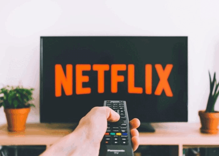
Over the past 10 years, many web companies have become some of the most influential on the planet. Some have changed our consumption habits. Others have made our lives easier. Among these companies, the one that cannot be ignored is Netflix: the film and television distribution and streaming service that has been very useful during the pandemic. But what about its brand image? Let's take a look at the history and evolution of the Netflix logo.
A few words about Netflix company and streaming services
To start, Netflix was founded in 1997 by Reed Hastings and Marc Randolph. In the early days, we were a long way from the service we know today. At that time, Netflix offered DVD rentals by monthly subscription. At that time, everything was delivered by mail. Then, in 2007, the American company allowed the rental of movies on computers on their platform. In the following years, this basic service would become available throughout the world.
During the following decade Netflix started offering their own television creations, several of which were a commercial success. These series and films, called Netflix originals, included Stranger Things, The Crown, 13 Reasons Why, The Umbrella Academy, Orange is the new black and Peaky Blinders. However, it is important to mention that these original series with characters we love are only a small part of all the content found on this platform, most of which are movies or series from other studios. To date, it is estimated that there are more than 200 million subscribers on Netflix. In addition, according to some sources, nearly 15% of Internet use is dedicated to this distribution giant in some countries such as France or the United States.
Netflix's first logo
When was the original Netflix logo created?
Did you know that Netflix didn't always have a wordmark logo? The first logo of the American company was a combined logo, a logo with the company name and an icon. Founded in 1997, Netflix's first logo had the company name in a serif font with a distinctive film reel as a symbol, which was quite relevant. The logo was purple and black, giving it a rather simple and professional appearance. This Netflix logo was only used for three years.

The evolution of the Netflix branding over the years
When did the Netflix logo change? Why is the icon red?
You may remember Netflix' second logo which looked similar to the brand image we know today. During this redesign, they dropped purple for red and white. The background was a flamboyant red hue. Added to this was the name of the company in white with black shading. The result certainly played with contrasts which was the desired effect – attracting attention. It is also important to mention that a sans serif font was used. Netflix would have this logo for 14 years.

What font is the Netflix logo?
As we've mentioned in many blog posts, current logo trends revolve around simplicity. Getting rid of all the unnecessary details, logos today have a minimalistic design. In 2014, Netflix updated their logo in this way. Only two colors were used for each version, although red, black and white remain the colors of the brand. The font was Bebas Neue, a sans-serif font. It is also worth noting that the latest Netflix logo had the distinctive feature of being easily adaptable, which means that it could be suitably used on all mediums. For example, the N could be used alone when the dimensions of the logo were restricted. Other times, the background color could be white or black depending on what was more effective.

How to be inspired by the Netflix app symbol to create your logo
So, how can you create a logo that is just as beautiful as Netflix? Here are some tips. To begin, color choices are important. Netflix is a company that has revolutionized the way people consume movies or series, so it needed a strong brand image. To achieve this, Netflix played with contrasts, which inevitably attracts attention. Therefore, when creating your logo, consider using contrasts and even complementary colors if you want your brand image not to go unnoticed.
Then, don't forget to create a relatively simple logo. The more elements or details you add, the harder your logo will be to reproduce. It can also give a chaotic look to your logo. Instead, play with colors or fonts to create the style you desire. The Netflix logo is simple and minimalist but stands out. In addition, keep in mind that you need to be able to modify your logo as needed. A simple logo is easier to adapt than a detailed logo. Having a logo that is adaptable will allow you to use your logo in many places, like on an app, your social media, or promotional items. You can also decide to add a little something like a shape, just like the Amazon business logo.
In addition, if your company changes or you plan to offer new products, ask yourself if it is time to redesign your logo. It may be appropriate to change your logo if the company is changing. That's what Netflix did when they stopped the DVD rental business to focus on the web. They needed a logo that worked with this new adventure and decision.
In conclusion, you may not see the Netflix logo in the same light the next time you watch a show on this platform. Sometimes, you just have to do something simple to have a strong brand image. Speaking of web giants, do you know the history of Spotify's logo? You'll see that it is another example of a logo that simplified over time!
More tips and tricks on the blog

