Blog

The History of the Microsoft Word Logo
The Word logo has changed a lot since the software was created in 1983. By looking at its evolution, we can see that it reflects not only graphic design trends, but also the many transformations of the program itself. Here is an overview of the main versions of the Word logo over the decades.
The History of Microsoft Word
Microsoft is a multinational company founded in 1975 by Bill Gates and Paul Allen, two specialists in software development and sales. Over the years, the company has created many essential programs, including Word, the well-known word processing software.
Word was launched in October 1983, but it was not until 1989 that it could be installed on computers running Windows. It quickly gained popularity thanks to its innovative visual interface. What users saw on screen closely matched the printed result, which was a major breakthrough for document creation and editing at the time.
Today, Word is just one of the many programs in the Microsoft Office suite. It is now available on a wide variety of devices: PC, Mac, iPhone, Android phones, and more. Anyone can use it, no matter the platform.
The First Word Logo

When Microsoft launched its new software in 1983, the company chose a very simple logo. Made up of just one color, black, it included the company’s signature logo. The program name was added under “Microsoft,” along with a horizontal line. The sans-serif font reinforced the serious, clean, and professional look of this new product.
A Logo With Frequent Changes
1987 to 1993
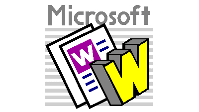

The first original Word logo was introduced in 1987. The icon still included the Microsoft name, but it was visually less prominent, since it was moved to the top of the logo. At the time, mentioning Microsoft in the logo was important to reassure users and associate Word with a brand that was already recognized in the computer industry.
The “W” in Word now took center stage. It was stylized with a graphic effect reminiscent of what could be created using WordArt. The visible pages illustrated the software’s main purpose: creating, editing, and printing documents.
A second, very similar variation of the 1987 logo was launched only four years later, in 1991. This time, the color palette was simplified. The logo used different shades of blue, a color often associated with reliability, productivity, and technology.
1993 to 1999


In 1993, the Microsoft name disappeared completely from the Word logo. The page representation was kept, but a sense of movement was added, as if to suggest speed or fluidity in word processing. This logo did not last long. Only two years later, in 1995, it was replaced by a fifth version.
This new logo still featured the iconic letter associated with the word processing software, with a shadow effect added to the serif typeface. The design conveyed a sense of strength and seriousness while remaining approachable. The dark blue reinforced the idea of professionalism and stability, while the three-dimensional effect suggested the software’s expanding features at the time.
1999 to 2007


In 1999, the Word logo took a simpler direction. Unnecessary elements were removed, and all the focus was placed on the “W.” It was positioned in the center of a white square with a dark blue outline, matching the shade of the software’s initial. This logo can still be seen today on documents saved in the Word 97-2003 format.
In 2003, this clean version was updated. The graphic elements remained the same, but a few aesthetic adjustments were made. The solid blue became a gradient, and shadows were added around and inside the “W,” giving the logo a glossy effect and a sense of depth.
2007 to 2013


In this new version of the text editor’s logo, the “W” was still present, but it was integrated into a page where rectangles represented lines of text. This sheet was placed above a rectangular shape with a rounded left corner, giving the logo a more dynamic and modern appearance. It was used until 2010, when it was replaced by a new version that looked very similar.
The logo used from 2010 to 2013 brought more attention back to the “W.” It also integrated the sheet inside the square. The use of several shades of blue added volume and visual hierarchy.
2013 to 2019
In 2013, Microsoft launched Microsoft 365, a subscription system that allowed users to access the latest versions of its applications and cloud storage. This change came with a complete redesign of the Microsoft suite logos, including Word’s.
The “W” was now placed on the cover of a slightly open notebook, illustrated in a single shade of blue. This design followed a growing trend in graphic design: the search for simplicity and visual efficiency, with clean shapes and a limited color palette.
The Current Logo

In 2019, Microsoft adopted Fluent Design across its products, and Word was no exception. The goal was to make interfaces clearer, deeper, and more fluid, which visually translated into a completely redesigned logo.
The “W” reappeared inside a square, accompanied by a drop shadow that creates a sense of depth. Four horizontal blue bands, each in a different shade, symbolize the richness of the software’s features. The result is a modern logo that fits seamlessly into Microsoft’s visual universe.
Each new version of the Word logo has accompanied changes to the software and reflected the features being highlighted at the time. It is a good reminder that your brand image should evolve along with your services. Whether you are an entrepreneur or a designer, make sure your visual identity accurately reflects what you offer today.
Ready for a fresh start? Use FreeLogoDesign to create your new logo!
About the Author
Roxane has been writing for as long as she can remember and always dreamed of making a living from her words. Today, as a web writer, editor, and author, she can proudly say: mission accomplished.
More tips and tricks on the blog