Blog

How to Use Complementary Colors When Creating Your Logo
It may seem like a lifetime ago that your art teacher taught you the complementary colors; perhaps at that moment, you were drawing in one of your notebooks. The eye can perceive 6 colors and an incalculable number of shades. That means there are a lot of possibilities for your logo! Did you know that you can use complementary colors to revitalize your image? But first, what are the complementary colors, and how can you use them when designing your logo?
What is the meaning and theory behind complementary colors?
How can you find opposing colors using a color wheel?
First, get your color wheel out and identify the three primary colors, red, yellow and blue. Remember primary colors are colors that are not produced using other colors. Thanks to the primary colors, we can create secondary colors like orange, green and purple, and tertiary colors. Complementary colors are made up of a set of two colors on the opposite side of the color wheel, a primary color and a secondary color.
What are the pairs of complementary colors?
No need to use color palette generators or bionic eyes to find some cool color combinations for your logo and brand. Like many businesses before you, you can decide to use complementary colors. But what are the six pairs of complementary colors?
The pairs are red and green, yellow and purple, as well as blue and orange. These combos give off the feeling of strength and energy, as the primary color in the combo is not used to create a secondary color. Designers and artists can also use complementary colors when they need high contrast.
Have you ever noticed that complementary colors are used to represent popular holidays? Red and green for Christmas, yellow and purple for Easter, and orange and blue (which became black) for Halloween.
How to use sets of complementary colors when creating your logo
Go ahead and choose complementary colors when creating your logo. When complementary colors are used, they give each other more intensity. There are however some color theory rules to respect so that your creation is harmonious and pleasant to look at.
For starters, it is important to use one complementary color more than the other. One of the two colors must be dominant, the other is a complement. You can use the 60-30-10 rule to balance your colors. Consider choosing a primary or main color and use it predominantly in your logo. Then, use the secondary color at 30% and add an accent color at 10%. Also, make sure that saturation is the same for the two complementary colors. Creations made with complementary colors have to stand out from the crowd and catch the eye easily.
Some examples of creations using complementary color combinations
If you feel that there are too many options regarding the color spectrum, here are a few examples of businesses and flags using complementary colors. Some of these examples have been using these original color combinations for a long time.
Red and Green
The combination of red and green gives a festive impression due to its close connection to the Christmas holiday. Red conveys several strong emotions such as love, passion and anger. Green is softer than its counterpart, red, evoking nature, peace, and health. Here are two examples of the use of a red and green combo:

Lacoste
The famous French sports brand has had a crocodile logo for almost 100 years now. René Lacoste, one of the founders of the company, was nicknamed "The Alligator" by the American press. The tennis player decided to take inspiration from his nickname to create a very recognizable logo of a green crocodile with a red mouth. Even today Lacoste is a brand known for its high-end clothing.
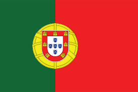
The Portuguese Flag
Is there a flag made of red and green? Yes, there are, including Portugal’s flag. Created in 1911, the colors chosen to represent the country have a meaning. First, the red means blood and battle, while the green means peace and hope for better days. The two colors together certainly evoke the duality of the Portuguese situation following their journey to a republic.
Yellow and Purple
The combination of yellow and purple sends a completely different impression. In history, these two colors represented wealth and power. Yellow is a color of both joy and the sun. Purple, which also has a rather unique history, is the shade often used to represent royalty or wisdom. You can find these complementary colors in certain sports logos.
Los Angeles Lakers
This American basketball team is well recognized on the court for their gold and purple jerseys. Since the 60s, the jersey has had a yellow ball with purple print. The Lakers are from Minnesota where you will find another sports team wearing the same colors, the American football team the Minnesota Vikings.

The Second Spanish Republican Flag
There were very few flags made of purple until the 19th century as this shade was very expensive to make. However, the second Spanish Republican flag, used from 1931 until 1939, had a tricolor combination: red, gold and violet. Purple represented the Kingdom of Leon and Castile, as well as the Catholic religion. The red and gold evoked the Kingdom of Aragon.
Blue and Orange
The complementary colors blue and orange seem to be used more often than the other two combinations. Once again, blue and orange are two very different complementary colors. Blue is the symbol of serenity and freshness while orange is perfect to represent energy and creativity. You will typically see orange with blue to accentuate its lively appearance. Since so many business logos use blue, it could be a way to stand out if you want to use this color.

Fanta
Fanta is one of the products of the American Multinational Company Coca-Cola. The recipe comes from Italy and is inspired by the citrus fruit growing in the region of Naples, hence the use of the orange color throughout the different logos. The contrast provided by these two complementary colors gives customers the idea that this sweet drink is young, and fun to drink.
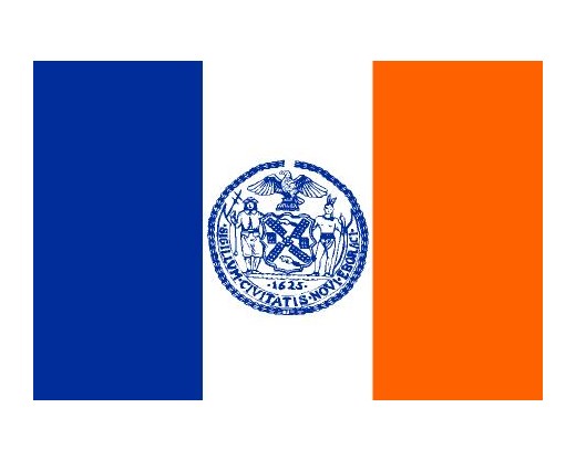
New York City flag
The flag that represents New York City is quite unique with its use of blue, white and orange. Why did they not use red instead of orange like the American flag? The New York flag was an inspiration from the Dutch flag. Did you know that the Dutch were the first to colonize this territory which was called New Amsterdam at the time? This rather unique flag, despite everything, has been the emblem of New York since 1977.
And now, are you ready to have the experience of using complementary colors for your logo? Dare to go out of the ordinary, but remember to find the perfect color for your brand if you want to stand out. If you want tips about this, feel free to take a look at our Color Meanings pages and do some tests using complementary pairs if needed!
More tips and tricks on the blog


