Blog
The Starbucks Logo Story and Meaning
The Starbucks logo is one of the most recognizable worldwide, thanks to its green color and the siren that is automatically associated with Starbucks coffee. Although the siren has been in the logo since the very beginning, the Starbucks logo has evolved since its first release in 1971. Here is the Starbucks logo timeline!
A few words about the origin of Starbucks
Where is Starbucks from, and how did it get its name?
Starbucks was founded in 1971 in Seattle by 3 partners Jerry Baldwin, Zev Siegl, and Gordon Bowker. They wanted to start a place where they could sell great coffee. It took time and a lot of effort to know the success they have today.
After a few years, Starbucks moved to Pike Place and decided to add teas and spices to their offer. They also use a technology that allows avoiding any carbon dioxide in coffee bags. Therefore, the coffee grains remain fresher. Howard Schultz joined the company in 1982 and wanted to promote a more European style for Starbucks. He finally bought the Starbucks business and brand in 1986. It was around this time that Starbucks started opening new coffees outside the Northeast, for example, in Chicago and Canada.
They will quickly stand out from other coffee shops by offering a great variety of coffee and beverage options. Since 2000, they quickly expanded across the world, becoming one of the largest coffeehouse chains.
But how did they come up with the name? Seattle is located near Mount Rainier. At this place, there is a mining town called Starbo. It reminded the founders of the tale of Moby Dick, more precisely, a character named Starbucks.
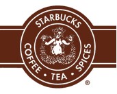
1971: The first Starbucks symbol
What does the Starbucks logo symbolize? What does the siren mean?
The original Starbucks logo, consisting of a mermaid with two tails, was imagined by designer Terry Heckler from an old Scandinavian picture. Also, in Greek mythology, this mermaid attracted sailors to the coast of an island named Starbuck. So they used the image of the siren to attract coffee lovers to come and drink theirs. In addition, the mermaid is a relevant symbol for the brand because it is related to the sea. As we mentioned before, Starbucks was founded in Seattle, and this American city is located close to the Pacific Ocean.
Let us now talk about the Starbucks logo itself. All the Starbucks logos over time have been badges, a type of logo that often uses shapes for the background. They also look like coats of arms. Here, two circles are used, one to present the mermaid symbol and another one for the company name. Remember that Starbucks was not that much known in the 1970s.
And why would Starbucks choose brown as the main color for its first logo? The reason is quite simple. Starbucks chose brown because it is the color of coffee and coffee beans. Regarding the font, it is a simple sans-serif typography.
The evolution of the Starbucks brand over the years
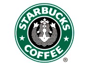
1987: Why did the Starbucks logo change from brown to green?
The logo drastically changed in 1987 when the company moved from Starbucks Coffee Tea and Spice to Starbucks Coffee. The logo was changed to an uncluttered design and the green color was introduced to represent freshness as well as prosperity while the company was acquired by Howard Schultz. Over the previous years, Schultz worked on a new project for Starbucks called Il Giornale. He really wanted an Italian vibe for the brand. He also wanted to reuse the brand colors of Il Giornale for the new Starbucks logo design.
They wanted to modernize and simplify the first Starbucks logo, and the result works. The designers removed some of the text to only keep the company name and what they are known for. Two stars are added and the font is changed to a bolder one,
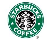
1992: A rebrand for the two tails mermaid
Reworked in 1992, the third version of the logo was even more refined and modernized. The navel of the siren disappears when it is closer to the frame. The emblem is simplified. The color palette, font, and other elements remain the same.
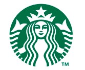
2011: Becoming one of the most important brands
It was in 2011 that the current logo version was adopted. Even more refined, the words Starbucks and Coffee were completely removed, as well as the black color. Once again, the reason is quite simple: you likely already know Starbucks; it needs no introduction. While retaining the legacy of the company, the new Starbucks logo design provides more flexibility to think beyond the coffee.
We must say that one of Starbucks' greatest strengths is the way they use their branding. Indeed, whether you go grab a coffee in Paris, Washington, or Sydney, the restaurants look the same. The logo and color palette can be found everywhere, from the employee's uniforms to the packaging and posters.
How to inspire yourself from Starbucks when creating your logo
If you want to create a logo for your business, how can you inspire yourself from the Starbucks brand? First, you could choose a symbol from legends or mythology. Indeed, the siren is a classic maritime tale, a major nautical figure. It represents well what the founders had in mind and the area where the first coffee shop was opened. In addition, the rebrands were nicely executed since there is a connection with the previous logos. In other words, if you want to do a rebrand, no need to start from scratch.
Here is another tip: dare use green even if your business is not related to nature or the environment. The green color can also be used to represent modernity and technology, just like the Spotify logo.
More tips and tricks on the blog


