Blog

The Evolution of the UPS Logo
Since its creation more than a century ago, UPS has established itself as a key player in parcel delivery. Its logo, like the company itself, has evolved with the times while maintaining a strong and recognizable identity.
The beginning of UPS
The famous delivery company was founded in 1907 in a Seattle basement by two friends, Claude Ryan and Jim Casey, who were 18 and 19 years old at the time. Together, they founded the American Messenger Company, a company launched with a loan of $100, about $3,400 in today's dollars. They got two bicycles and a telephone in order to meet the needs of all kinds of their customers. In an era where cars were still scarce, Seattle residents relied on Ryan and Casey to deliver meals and packages, deliver messages or run errands.
The company acquired its first truck in 1908, marking a first stage of growth. Then, in 1919, it began its expansion beyond Seattle by establishing itself in Oakland, California.
The first UPS logo

It was also in 1919 that UPS unveiled its very first logo, more than a decade after its start. That year, American Messenger Company bought out its main competitor and officially became United Parcel Service, which is known today by the abbreviation of its name, UPS. A lot of work has been done to create a brand image that has a classic, sophisticated and professional side. The delivery vans took on their emblematic brown color, and a first coat of arms logo was presented to the public.
The design at the heart of the badge depicted an eagle carrying a package. It was accompanied by an inscription: "Safe, Swift, Sure". This slogan highlighted the company's core values, aimed at reassuring customers about the reliability of its services. This logo lays the foundation for UPS' visual identity, which would continue to evolve over the decades to reflect the company's growth and growing ambitions.
The evolution of UPS brand image over the years
1937: The second logo

In 1937, as UPS established a strong foothold in the western part of the USA, the company began its conquest of the East Coast of the United States, and its offices migrated to New York City. The desire to establish itself on a national scale led the company to take a look at its image in order to establish a reputation as a reliable and safe transporter of parcels.
The logo has therefore been updated to spread this message more effectively while keeping the essence of the brand's image. The badge shape was kept on this new version, but the eagle disappeared to make way for the initials of the company's name, UPS. These golden-yellow letters contrasted well with the brown of the badge, while representing nobility. The slogan was changed, giving it more prominence by writing it at the top of the logo in sans-serif font capital letters.
1961: The third logo

After more than twenty years with the same logo, UPS hired Paul Rand to refresh its brand image. This graphic designer, who was very popular at the time, created several logos for major companies, such as IBM and ABC.
In this new version of the logo, the yellow disappeared to make way for brown. The badge shape remained, reminiscent of the company's previous logos. A playful touch was included by adding the gift. This logo, quite simple, emphasized the company's specialty, which was parcel delivery.
2003: The fourth logo

UPS was modernizing its brand identity after more than forty years of sporting the same image. The objective behind this change was to show that the company knew how to adapt to an increasingly technological world. The design was simplified to increase its impact: the gift disappeared, leaving the badge as the only central element.
Gold made a comeback in this new version, while a reflection effect created a sense of relief, following a popular graphic trend in the early 2000s. It was also at this time that UPS adopted its own font, the UPS Sans, designed by Paul Rand.
The current logo
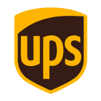
The current UPS logo is very similar to the previous version, but its design has been streamlined for versatility and better integration with the company's various communication tools. The reflection has been removed, and the colors are richer and deeper. It is a simple badge logo that embodies the reliability and strength of the century-old company. At the same time, the logo remains faithful to the origins of its visual identity thanks to its shape.
How to use UPS to refresh your logo
UPS is an excellent example of a company that has been able to adapt its brand image to trends and the arrival of technology while maintaining a strong visual identity through the decades. If you're thinking about updating your logo, you could, like UPS, simplify its design while maintaining a distinctive component from one version to the next. Similarly, maintaining a key color in your palette can strengthen your brand's continuity and recognition, even as your visual identity evolves.
In more than 100 years of existence, UPS has been able to evolve its logo without ever denying its identity. Despite some adjustments over the decades, the shape of the iconic badge has remained at the heart of its branding, a testament to the stability and reliability that the company is known for around the world.
Thinking of updating your own logo? Why not follow how UPS did it? Maintain a distinctive component to ensure a smooth transition. With FreeLogoDesign, you can create a professional logo that stands the test of time while adapting to new trends.
---
Roxane has always written and dreamed of making a living from her pen. Now a web editor, proofreader and author, we can say that it's mission accomplished!
More tips and tricks on the blog


