Blog
The Evolution of the Airbnb Logo
Since its creation in 2007, Airbnb has revolutionized the way we travel. Today, the platform has millions of hosts around the world and has become a major player in the accommodation industry. Behind this success is a brand identity that has evolved alongside the company. From the colourful and playful logo of its early days to today’s minimalist and iconic symbol, discover how Airbnb transformed its visual identity to better reflect its mission.
The Evolution of the Airbnb Logo
Since its creation in 2007, Airbnb has revolutionized the way we travel. Today, the platform has millions of hosts around the world and has become a major player in the accommodation industry. Behind this success is a brand identity that has evolved alongside the company. From the colourful and playful logo of its early days to today’s minimalist and iconic symbol, discover how Airbnb transformed its visual identity to better reflect its mission.
The Idea Behind Airbnb
It was while struggling to pay their rent that Airbnb founders Brian Chesky and Joe Gebbia came up with an idea that would change their lives. During a major conference in their city, San Francisco, hotels were fully booked, leaving many travellers without accommodation. Chesky and Gebbia decided to offer them a place to stay during the event. The two roommates inflated air mattresses and turned their apartment into a place to welcome guests. They launched a website to advertise this accommodation offer. It was a success, and from there came the idea that individuals could rent out a room in their house or apartment to travellers.
Their goal? To offer a more personal and affordable experience than hotels.
A few months later, in 2008, Nathan Blecharczyk joined the duo as Chief Technology Officer and the company’s third co-founder, under the name AirBed&Breakfast.
Since then, the company has come a long way. In November 2025, more than five million hosts had listed accommodations for travellers around the world, completely transforming the tourism industry.
How the Airbnb Logo Has Evolved
2007: The First Logo
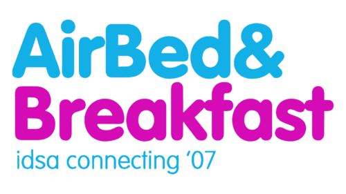
A simple and effective logo is what Airbnb used at the beginning of its journey. The rounded letters, set in an easy-to-read sans-serif font, helped create a warm brand identity. This effect was reinforced by the colour choices, sky blue and vibrant purple, which evoked optimism and openness. Together, these elements created a welcoming and dynamic visual identity.
It is also worth noting the left alignment of the text. It reflected the professionalism of the new company, despite its friendly feel.
A slogan accompanied the first version of the logo: “idsa connecting ’07,” a reference to the conference taking place when the founders hosted Airbnb’s first guests.
2008 to 2009
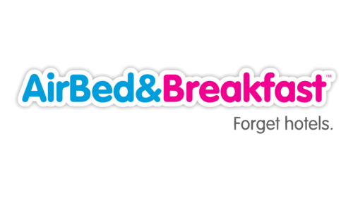
This second logo kept a style very similar to the original version, but certain changes were made to strengthen the readability and adaptability of the visual identity. The sans-serif font was preserved, but the company name was now written on a single line. A white outline and shadow effect were added to the letters, ensuring excellent visibility on all types of backgrounds. The contrast between the two colours used for the text became more pronounced, while “Breakfast” adopted a more pinkish shade than before.
The slogan was also changed to make it more timeless and general. “Forget hotels” now appeared under the company name in a thin grey typeface.
2009 to 2010
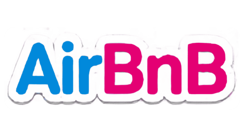
This is when the company adopted the name AirBnB, even though its capitalization would later change. The colours, outline, and shadow from the previous logo were maintained, making it easier for travellers to recognize the brand.
The slogan disappeared with this new version, as the company focused first and foremost on the strength of its name.
2010 to 2013
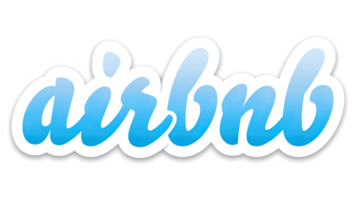
A major rebranding awaited the brand in 2010. This new visual identity, created by the British design agency DesignStudio in collaboration with the co-founders, kept the bubble effect of the previous logo but transformed several other aspects. The blue remained, but its solid shade gave way to a dynamic gradient. The typography, which had remained fairly similar since the company’s launch, became a script font written entirely in lowercase. To make it easier to distinguish between “air” and “bnb,” the “r” was placed slightly above the first “b,” while a white outline visually separated the two elements. The result was a more playful and accessible overall look.
Several research efforts supported this graphic approach. The agency’s goal was to create a brand image that accurately represented the company’s values and mission.
2013 to 2014
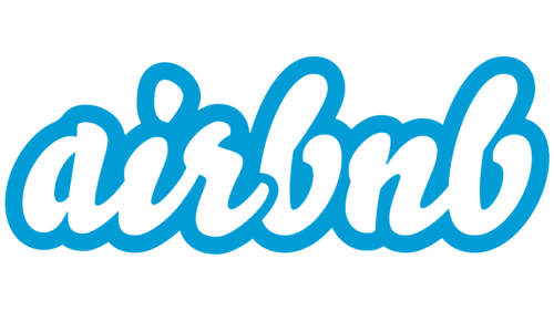
The logo introduced by Airbnb in 2013 was very similar to the previous version. The colours were simply reversed, and the bubble effect was removed. This new version became cleaner and more readable, regardless of the medium on which it appeared.
2014 to Today
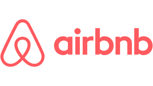
The company had come a long way since its early days. Airbnb now offered diversified services: users could rent entire homes, enjoy unique experiences, and connect with local communities directly through the platform. A major change in brand identity was therefore welcome in order to reflect these innovations.
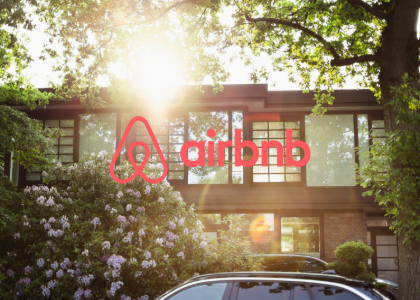
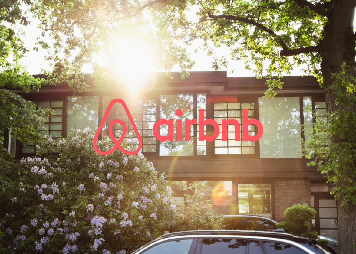
For the first time, Airbnb moved away from its signature-style logo and adopted a combination logo. The goal? To create a personal and recognizable symbol that, even when used on its own, clearly communicated the essence of the company. A collaborative creative process once again began between Airbnb and DesignStudio. This is how the Bélo was born, the stylized “A” that represents Airbnb’s four pillars: people, places, love, and the company name. To communicate these elements even more strongly, blue was replaced with a vibrant coral, a more inviting and warmer shade. A custom minimalist typeface was also developed specifically for the company, using only lowercase letters in the logo.
More than a decade later, this visual identity is still in place and has helped consolidate Airbnb’s dominant position in the world of short-term rentals and tourist accommodations.
The evolution of the Airbnb logo teaches us a valuable lesson: a strong visual identity is born from authentic values and a deep understanding of a company’s mission. Take the time to define what sets your brand apart, what you want to communicate to your target audience, and how you want to be perceived. These reflections will guide your graphic choices and help you create an authentic logo that evolves naturally with your business.
Ready to design a visual identity that reflects who you are? Explore FreeLogoDesign’s logo maker and bring your vision to life.
What You Should Remember From the History of the Airbnb Logo
- Do not be afraid to go for it and be bold.
- Create a logo with a story people can connect with.
- Think flexibility and adaptability.
- Keep in mind that a strong brand image is built over the long term.
About the Author
Roxane has been writing for as long as she can remember and always dreamed of making a living from her words. Today, as a web writer, editor, and author, she can proudly say: mission accomplished.
More tips and tricks on the blog