Blog
Hard Rock Cafe Logo Analysis
When I'm traveling and looking for a gift for my dad, my choice is pretty easy. I simply get him a Hard Rock Cafe sweater from the city I'm visiting. Speaking of which, where does the mythical Hard Rock Cafe logo come from? How did their promotional items become so popular? Let's take a closer look at the history and analysis of the Hard Rock Cafe logo and see how it can inspire you.
A few words about the founding of Hard Rock Cafe
How was the first Hard Rock Cafe created? The story can be summed up as follows: two Americans living in London were looking for a good hamburger. That's when they came up with the idea of setting up their own restaurant. Isaac Tigrett and Peter Morton founded the first Hard Rock Cafe in 1971, near Hyde Park, a popular spot in the English capital. In 1978, a second restaurant opened in Toronto, Canada.
This restaurant chain quickly made a name for itself with its decor featuring music and pop culture items. Hard Rock Cafe now has a museum feel. People come to eat, but also to see the costumes and objects that belonged to artists such as Elvis Prestley, Michael Jackson and the Beatles. As well, the Hard Rock Cafe restaurants added a store, which would help raise awareness of the brand overseas through their promotional items.
Today, Hard Rock Cafe is much more than just a restaurant. The company has also diversified, building casinos, hotels and even an amusement park in every corner of the globe. So, whether you're in Paris, Macau or Las Vegas, there's a Hard Rock Cafe to visit!
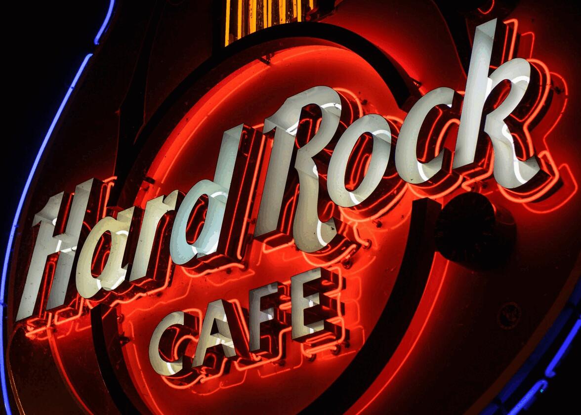
Hard Rock Cafe logo design
What about the famous logo? How was it created and what exactly does it represent? The artist behind this mythical emblem is Alan Aldridge, known for his work with The Beatles. So, by 1971, Tigrett and Morton not only had a restaurant, but also a logo that stood out from the rest.
Initially, the two founders wanted to use American elements for the logo of their new restaurant. That's why the initial inspiration was the emblem of the Chevrolet car manufacturer. At the time, the logo was composed of the brand name in letters set in a circle. We also know that the founders wanted their logo to use a blue, white and red color palette to represent the American flag, but this idea was eventually abandoned.

Aldridge's result was rather simple. It was a badge logo composed of the company name in brown and white within a yellow circle. Two different fonts were also used. However, as we've seen in other logo analyses, simplicity is often the key to success!
Different versions of the Hard Rock Cafe logo
Over the years, we've been lucky enough to see the Hard Rock Cafe logo adapt and take on different versions. First, the name of the city where the restaurant, hotel or casino is located can be found under the word Cafe in the same font. Also, the logo changes if it's a casino or a hotel.
It's also common to see other color combinations used for the Hard Rock Cafe logo. Although the original palette is yellow, brown and white, there are a large majority of versions. However, since the original logo and its main components are present, it's easy to recognize that this is a Hard Rock Cafe logo. Note that on their website, the brand only uses the word Hard Rock in a circle.
How did the Hard Rock Cafe logo become popular?
Leaving aside the fact that Hard Rock Cafe establishments became known for the celebrity memorabilia they displayed, the brand's main claim to fame was its many promotional items, particularly clothing. Interestingly, Hard Rock Cafe started selling sweaters because of a mistake. They had ordered too many T-shirts to sponsor an event and decided to sell their surplus in their restaurants. It was a huge success.
When people wear clothing with their logo, it creates publicity for the brand. And since there are restaurants all over the world, many Hard Rock Cafe fans collect Hard Rock Cafe clothing when they travel.
How to get inspired by Hard Rock Cafe when creating your logo
So, how do you get inspired by Hard Rock Cafe when creating your corporate logo? To start, keep it simple. Focus on the elements that are important. In Hard Rock Cafe's case, they wanted to promote the brand name. A simple logo is more likely to be flexible. So, it's easier to use everywhere. As well, the color palette can be seen as something original in the restaurant business.
On another note, the Hard Rock Cafe logo has a retro feel, whether it's a nod to the old Chevrolet logo or font. As we've seen from the latest trends in logo design, retro is in. So, if you want to stand out from the crowd, it might be worth opting for a font with a less modern look.
In conclusion, Hard Rock Cafe and their famous logo just celebrated their 50th anniversary, which is no small feat. Today, the company is much more than just a restaurant, it's a number of establishments in major cities and a brand recognized in every corner of the globe.
Would you like to put a rock and roll spin on your logo and are you looking for original ideas? Why not take a look at the evolution of the Harley-Davidson logo?
More tips and tricks on the blog


