Blog
The Origin and Evolution of the Harley-Davidson Logo
Of all the vehicle brands, none seem to have as passionate a clientele as Harley-Davidson. People who own one of their motorcycles do not hesitate to display their logo everywhere, whether on promotional items or clothing. So, what is the history of these motorcycles? Let's take a closer look at the origin and evolution of the Harley-Davidson logo and brand.
A few words about the origin of Harley-Davidson and their motorcycles
In 1903, in Milwaukee, United States, William Harley and Arthur Davidson created Harley-Davidson. The two young men designed the first motorized bicycle, then various other prototypes. A few years later, Harley-Davidson won various awards, which popularized the brand. Then, during the world wars, production increased to meet the needs of the army.
Over the years, the style of Harley-Davidson motorcycles has been defined and is easily recognized. The brand is also present in popular culture, linked to the stereotype of the bad boy. Even so, Harley-Davidson is still one of the largest motorcycle manufacturers and one of the oldest in the world.
The first Harley-Davidson symbol
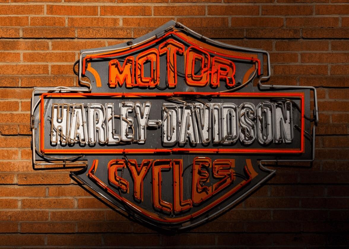
What does the Harley-Davidson bar and shield logo mean?
It was a few years after the founding of the company that Harley-Davidson created the first logo for their brand. Although this emblem is more than 100 years old, we cannot ignore the fact that today's version still looks a lot like the original.
Harley-Davidson wanted to showcase their name with this logo. It was the name of the company that was the most important component of the brand. However, instead of going with a signature logo, a type of logo consisting only of the company's name, they decided to use a badge. Badge and coat of arms logos have the advantage of being both credible and traditional.
The name Harley-Davidson is placed right in the center since it is the most important thing in the logo. In this part, white is used to make a significant contrast with other colors. The words Motor Cycles were added to indicate exactly what the company does. This is relevant especially when a new company is launched and is not yet known to the public. It should also be noted that all the text is in capital letters, however, Motor Cycles is in a serif font, and Harley-Davidson is in a sans serif font.
It was not until 1933 that the brand's colors became black and orange, shades still used today.
The evolution of the Harley-Davidson brand through the years
What do all Harley-Davidson logos look like?
Despite what one might think, the company hasn't always had a shield logo. In fact, there was a major redesign of the company's logo when Harley-Davidson celebrated their 50th anniversary. This version would be used until 1965.
First, the shape used for the background was changed to a circle. Subsequently, a V was used to represent the specific engine of Harley-Davidson motorcycles. Then, to make a link with the first logo of the company, the name Harley-Davidson remained in the center of the rectangle. However, the font was very different from the original with a look that represented the 1950s well. The whole thing was completed by mentioning the 50 years of business and the fact that the products were made in the United States. This mention was added because after the war there began to be more competition in the world of motorcycle manufacturing.
Finally, in 1965, the logo we all know today was created. Strongly inspired by the company's first logo, the emblem was updated. The badge and dimensions were reworked and modernized. The Harley-Davidson name remained in the center, however the words Motor Cycles were changed to Motor Company. It is still one of the best-known badge logos.
What does the Harley eagle mean?
Since 1965, the Harley-Davidson logo has had a few versions for special occasions. As was the case for the 50th anniversary of the company, there was a special logo for the 100th and 105th anniversary of the foundation. If you're familiar with Harley-Davidson motorcycles, you may have also seen an eagle added to the emblem. This eagle was used on motorcycles, but also as a logo for the Harley Owners Group, an association of proud owners of Harley-Davidson motorcycles.
What is the history of the Willie G skull?
If you are familiar with the Harley-Davidson brand, you might have seen a skull logo representing the company. There are a lot of mysteries regarding this skull icon, but most experts seem to state that it is a logo made by William G. Davidson, the grandson of one of the two founders.
William was passionate about design, and after his studies, he joined the family company. At this time, his main goal was to shake the business and make it more modern. The Willie G skull is said to be one of his designs and could have replaced the iconic logo we know today.
What font is the Harley-Davidson logo?
If you love the typography used by Harley-Davidson or want to have a similar look on your logo, consider using a sans-serif font. Indeed, the one used by this motorcycle company is called Compacta. Remember to use capital letters to replicate the same look.
If you are using FreeLogoDesign to create your logo, you can use various fonts like Arsenal, Bungee, and Koulen to capture Harley-Davidson's essence.
How to get inspired by Harley-Davidson for your custom logo design
The Harley-Davidson logo can definitely be an inspiration for your own logo. First, the company is known for their original choice of colors. Very few companies have used orange as one of their brand colors. This makes it possible to stand out and attract attention. Therefore, do not hesitate to try to use colors that are not very present in your industry.
Then, Harley-Davidson was able to show that it was possible to promote the company name without having to use a signature-type logo. Badge and coat of arms logos can give a touch of character to a brand image, while highlighting the name. It is therefore important to choose a font that respects the general feel of the brand.
Finally, do not hesitate to display your logo everywhere, especially on promotional items. As we have seen with Harley-Davidson, using your logo on clothing or products makes it easier to be recognized and create an attachment between you and your customers.
In conclusion, if you were asked to name a motorcycle brand, there is a good chance that the first one that would come to mind is Harley-Davidson. As we have seen, it is their strong brand image and loyal customers that have allowed it to survive through the years and decades. If you are interested in this type of brand, we have written steps on how to create a badge logo. Good luck!
More tips and tricks on the blog


