Blog

The evolution of the Mastercard logo
Mastercard's logo is one of the most recognized in the world. Since its creation, it has been able to adapt to trends without losing its identity. Looking for inspiration to design a logo that's both modern and sustainable? Here's how this iconic brand was able to transform two circles into a universal icon.
A few words about the history of Mastercard
Mastercard was founded in 1966, following a meeting between 17 American bankers in Buffalo, New York. Their goal was to see if they could offer the same credit card payment service regardless of the consumer's bank. Following this meeting, a committee was formed to manage this new entity, known at the time as the Interbank Card Association (ICA). Its members had to establish the rules governing the company's operations, launch marketing campaigns, and ensure user security and the legality of transactions.
One year after it was founded, the organization already had 150 members. Determining a common brand image was proving to be challenging: each bank involved had a different vision for Interbank's visual identity.
Today, Mastercard is a company with a presence in more than 210 countries and territories, whose credit and debit cards are accepted by more than 37 million businesses in around the world.
How has the Mastercard logo evolved?
1967: The first logo
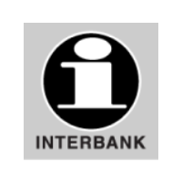
The ICA initially opted for a simple logo using black and white. As the association operated in the financial sector, it chose a serious style: a lowercase “i,” but bold and imposing, in a black circle. The name Interbank was added below the symbol to help it stick in consumers' minds. This strategy aimed to assert Interbank's identity and what they offered, an innovative initiative that brought together several banks around a single product.
1968 to 1979

There was a big change for this new version! The organization gave their product an official name, Master Charge, and an original logo. The visual identity was now embodied in two interlocking circles: one red, the other yellowish-brown. The Interbank logo was kept, in small print in the lower right corner, and the words “THE INTERBANK CARD” were also incorporated into the logo to ensure that people quickly made the connection between Master Charge and the ICA.
This change was aimed at strengthening brand recognition, an objective that was certainly achieved, as most of the current population could associate this logo to the Mastercard company.
1979 to 1990

At the end of 1979, an identity change was in store for Master Charge, which then became Mastercard. The logo was simplified and any reference to Interbank disappeared. The basic shape was kept, and the two intersecting circles remained at the heart of the brand image.
This powerful visual symbol continued to encapsulate the values that Mastercard wished to convey. First, the overlapping circles evoked connection, and the intersection of the colors illustrated unity. This message was particularly relevant at this time, as the company expanded its services to new markets: Africa and Australia in the 1970s, then Asia and Latin America in the 1980s. Furthermore, the shape of the circles themselves was significant. It reinforced the brand's values of inclusivity and accessibility. These principles would later be reinforced by the brand's flagship advertising message: priceless possibilities.
1990 to 1996

This new version of the logo kept the key components of the previous one, that way, people could continue to recognize Mastercard at first glance. However, two major changes were made.
First, the word “Mastercard” was now displayed in italics, with the slanted letters suggesting movement and looking forward to the future. Second, the third color at the junction of the two circles was replaced by 23 alternating red and yellow lines from the two shapes. This dynamic design evoked the idea of interconnection, which was at the heart of the company's mission.
1996 to 2016

The new details of this version weren't many, but strategic. To improve the readability of the name and strengthen the visual recognition of the brand, a drop shadow was added to the name of the company. In addition, the number of lines at the intersection of the circles was reduced, lightening the visual while keeping the symbol of interconnection. What was the objective of this redesign? Strengthen the brand in a landscape where visual identities became pillars of trust and recognition.
2016 to today

In 2016, Mastercard returned to its roots by replacing the interlaced lines with a third color, as in the versions preceding the one launched in 1990. The company name, now placed under the symbol, was moved out of the central visual to improve clarity. This combined logo follows the minimalist trend, which also helps it to be more suitable for digital platforms.
With this rebranding, Mastercard positioned itself as a cutting-edge technology company that put people at the center so that they had access to invaluable opportunities.
At the beginning of 2019, the brand took another step forward: the name “Mastercard” was removed from the logo in certain contexts, particularly on credit cards. This was a carefully considered decision. In fact, it was the result of many years of work on brand positioning and recognition. Over the years, the company has built a strong visual identity that has earned a place in people's mind.
How Mastercard can inspire you
Mastercard is an excellent example of consistency and adaptation. They evolved their logo without ever compromising its essence. The brand has managed to remain consistent while adapting to design trends and digital uses. Its journey shows that a good logo doesn't need to be complex to be impactful. Most importantly, it must be recognized, aligned with your values, and capable of evolving with the business. Be inspired from this approach to create a strong, lasting, and unforgettable identity.
Want to create a logo as memorable as Mastercard's? Try FreeLogo Design: a simple, fast, and free platform for designing a professional logo that reflects your image. Get started today and bring your brand to life!
More tips and tricks on the blog

