Blog
The Meaning and Evolution of the 7UP logo
After Pepsi and Coca-Cola, we continue to discover soft drink logo stories. Today, we are looking at one of the most famous tonics in the world, which previously contained a certain drug: 7UP. Spoiler Alert: this drug is no longer used in the manufacturing of the drink!
A few words on the history and creation of the 7UP brand
Why 7up is called this way? Who now makes 7up products?
In 1929, in Missouri, USA Charles Leiper Grigg founded 7UP. At the time, it was called Bib-Label Lithiated Lemon-Lime Soda, which is a pretty long name to write on a carbonated beverage bottle. As you may have noticed in the name, 7UP originally included the ingredient Lithium. We reassure you this is no longer the case. Lithium was used in the manufacturing of the 7UP for its reputation. People thought that lithium had a positive effect on mood, it was considered an antidepressant. It was therefore a great advantage for the company to highlight that this was in their product. Lithium remained an important ingredient in the production of 7UP until 1948.
Regarding the name of the product, the first name was simply a statement of the ingredients of 7UP. "Bib-Label Lithiated Lemon-Lime Soda" was an acidic soda, containing lemon, lime and lithium. Over time, the product name was narrowed to just three characters to form 7UP. This happened in 1936. So why 7UP? No one has ever confirmed the different theories around this name, but here are the three most popular hypotheses:
The "7" would be the number of ingredients in the original recipe: Lithium, lemon, lime, sodium citrate, carbonated water, sugar and citric acid. The "UP" represented the jovial mood of consumers which would be enhanced thanks to lithium.
The "7" could also represent the atomic mass of lithium which is 7.
Finally, this name could have been chosen in order to taunt their main competitor, Coca-Cola, on the size of the bottle. The "7" may have represented the ingredients of the drink and the "UP" would refer to the size of the bottle which would be larger than that of Coca-Cola.
There are other theories such as references to different games. Unfortunately, there is little chance of knowing the real reason.
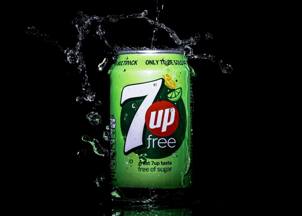
Today, there are 3 7UP products: the original recipe, which is not the recipe of the 30s, the sugar-free version and a cherry version. As well, the company remained in the hands of its creator for a long time, but it is now Keurig who owns the rights to 7UP.
It's now time to discover the history of the different logos of 7UP.
The first 7UP logo
We are going to talk about the first logo with the name 7UP, as the original name did not have a logo to speak of.
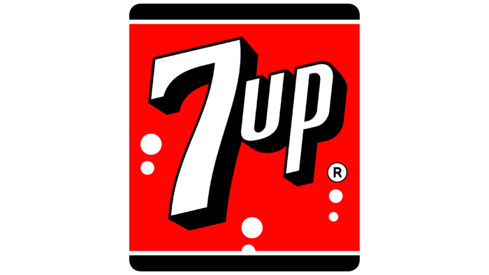
The first 7UP logo appeared in the 40s and would remain the same for almost 30 years. In this badge logo, we see the name of the product 7UP written in white sans serif font with a black 3D effect that added depth. There was also a red background. Red, in the case of 7UP, may have represented consumers' love of the drink. In fact, thanks to lithium it was considered a medicinal drink, making it very popular. The several white circles represented bubbles of course, the gaseous effect of the drink and brings a lightness effect. Similar to Red Bull with wings, drinking 7UP will make you feel light. We can also see at the top and bottom of the badge, a black line, like the movie frames of the films of the 30s. It could be a nod to the rise of color cinema.
The evolution of the 7UP logo, beverages, and flavors
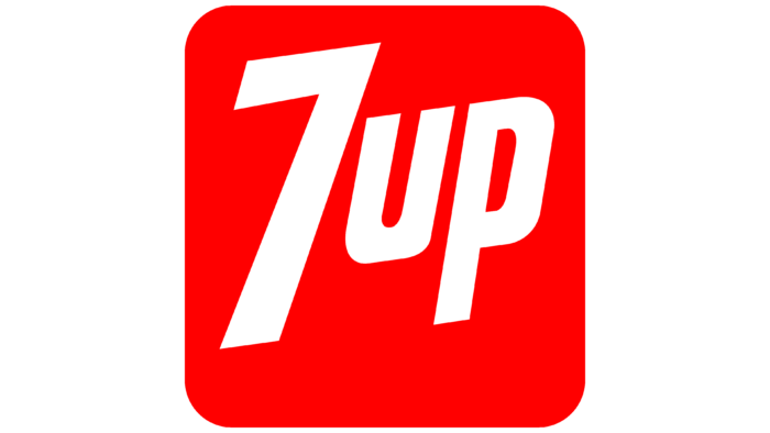
There are different reasons that led to the redesign of the 7UP logo. One of them was a drop in sales. Sales began to drop when lithium was removed from the recipe which made 7UP a simple tonic. The company called on Walter Thompson to restore the image of 7UP. A very simple 7UP logo was created in the 70s. It was now an all-red rounded corner square, still signifying love. We said goodbye to 3D in the writing of the name. The text would appear only in white in the center of the red square. This logo was launched with different television advertising campaigns that helped revive the lemon-lime soda brand.
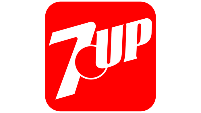
A few years later, in 1980, a new component appeared on the logo: a red circle that separated the "7" and "UP". This circle could refer to the small bubbles of the first logo. It also referred to the mascot used in commercial advertisements.
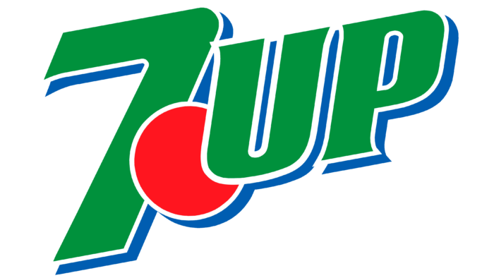
IIt was barely 7 years later that the design of the 7 UP logo changed. We said goodbye to the red badge square. We saw a slightly combined logo with the name of the product and the red circle from the previous redesign. Another change: the logo was again in 3D to add a depth effect. The name also changed color: goodbye white and hello green. The green color referred to one of the ingredients, lime, but also to the natural side of the drink.
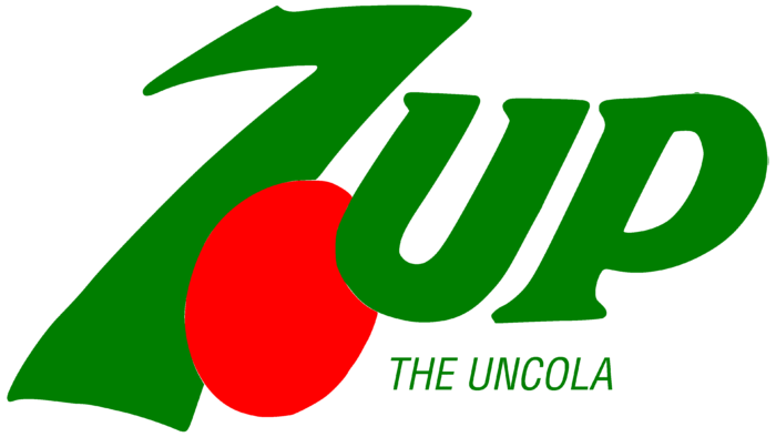
In 1995, a new logo was created, following the acquisition of the company. There would only be 5 years left. It was a logo in the art nouveau style. It was a logo with a more asymmetrical shape with a red circle that now looked like a lime and an elongated 7. They also added the text "the uncola" to say that it was not cola, in reference to a successful commercial from the 70s.
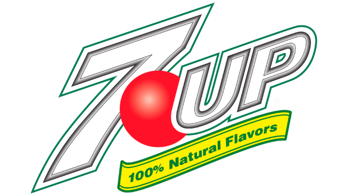
Finally, the brand would decide to emphasize its natural side, whether in terms of typography or ingredients. 7UP was again written in white with a green outline. The red circle grew in size to represent the mascot, who was now a game character. To show the natural side, there was now a banner stating that they use natural flavors in yellow and green, the colors of lemon and lime. The entire logo was now tilted upwards to show the good effects of the drink.
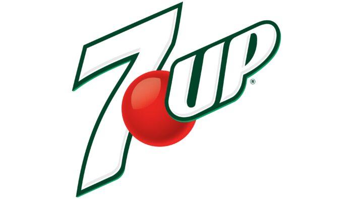
In 2010, the second last logo was released, which looked a lot like the emblem we know today. This logo was created by paying homage to the old logos. We see emerald-green as the outline of 7UP. The red circle remained the same as the previous logo. The tilt of the logo has also intensified.

The current 7UP logo appeared in 2015. It has many similarities with the previous logo. However, we saw that the colors were more matte and the outline of 7UP was a less vibrant green and more forest green.
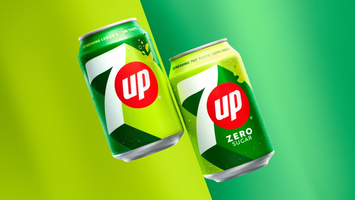
Update: New 7UP logo for 2023
As we have seen, brands like to refresh their logo from time to time. 7UP aimed for a new look in 2023, and we must say that the result is quite interesting! First, they used a 3D effect that is both not too much and modern using different colors and shadings. Second, it is simple, but efficient. Third, the packaging works well with the new look. Fourth, the rebrand is successful because it includes parts of the past versions. We must say that it is one of our favorite new logos of this year!
How to get inspired by 7UP to create your logo?
The main component you can use to create your logo is simplicity. Whether in the name of the product or the colors used. 7UP took the main colors of the ingredients to create their basic logo, but also for their various redesigns over the years. There was also consistency in the 7UP logo versions. They kept the basic design of the logo and played with certain components to see which one worked best.
Now you know everything you need to know about the history of 7UP. Discover now the evolution of the Pepsi logo, one of the great competitors of Coca-Cola and 7UP.
More tips and tricks on the blog

