Blog
The Origin and Evolution of the Sony Logo
Today, we are going to immerse ourselves in the multimedia industry with Sony. We know that there are many facets to this business: audio, televisions, PlayStations, cameras, etc. Sony knows how to sell their products to both individuals and professionals. However, do you know the origin of their logo and name? Let's find out now!
A few words on Sony
On May 7, 1946, in Japan, the Sony company was founded. The creators, Masaru Ibuka and Akio Morita, were engineers and physicists, first establishing this company under the name Tokyo Tsushin Kogyo (or TTK). It wasn't until 1958 that the company’s name was officially changed to Sony. But what does Sony mean? It is a mixture of the Latin word 'sonus' (meaning sound) and the word 'sunny' which in Japan represents a young boy with a free spirit. The word Sony already appeared on some products of the brand before its officialization. Sony is mainly known for having launched many innovations such as color television, the walkman, cassettes, CD players, and the PlayStation.
Sony also has many subsidiaries with different logos for each such as:
Sony mobile: who has never heard of the Sony Ericsson?
Sony Pictures Entertainment: Who has never seen Spider-Man or Men in Black?
Sony Interactive Entertainment: Who hasn't played a Gran Turismo on the PlayStation 1?
Of course, Sony has several subsidiaries. It has always been able to meet and even surpass the competition in certain areas.
Sony's slogans
Sony has had different slogans during their existence. Their most recent slogan is "Be moved". Today, it is not really used. The first slogan was "Sony: The one and only", followed by "It's Sony", then "like no other" and finally one of the best known "make believe". You can see a connection between Sony’s slogans: when you buy a Sony product, you do not just buy any television, camera, or smartphone, you buy from a reliable brand and a company that is proud of their products.
Sony's first logo
Sony is one of those brands that has not seen many logo changes during their existence. The Japanese company has only experienced three major logo changes. These changes appeared in the first twelve years after the company was founded. Thereafter, the Sony logo has remained pretty much the same.

The first Sony logo represented the first name of the company: Tokyo Tsushin Kogyo. It was an emblem logo. It looked like it could have been a car logo. It had a geometric shape with abstract edges of the letter T which was surrounded by a black circle. In the black circle, the letter T could represent an inverted triangle with the tip of a diamond. If we rely on the representation of these two shapes, the first Sony logo is a symbol of exchange, sharing, energy, and movement. In view of all the innovations of the brand, we can say that the creators were right in terms of the meaning of these geometric symbols. Sony kept this emblem logo for about ten years.
The evolution of the Sony logo
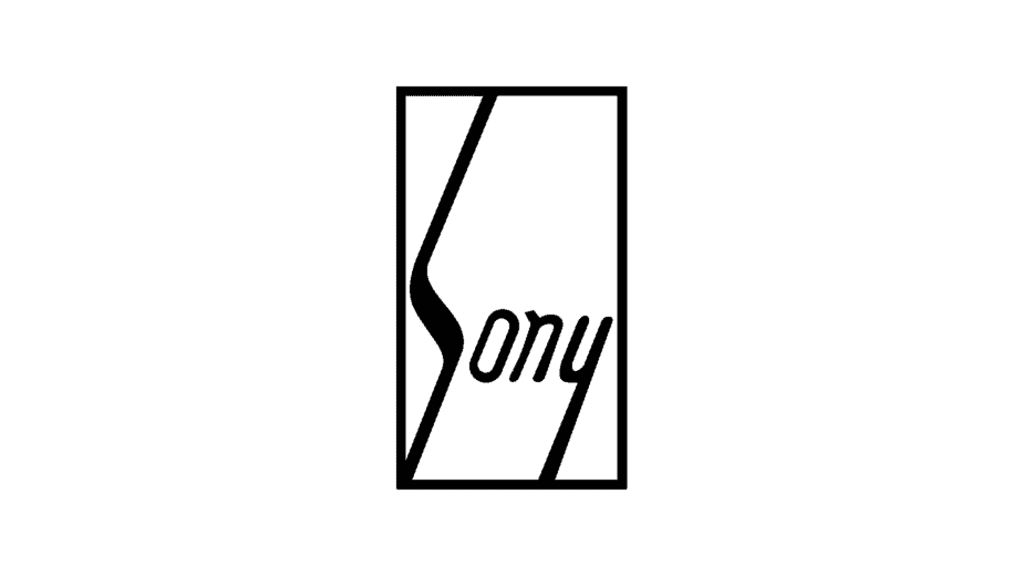
Before officially changing the company name to Sony, the brand's creators already had a logo ready for use on some products. This logo would only be on the market from 1955 to 1957. It was a logo with Sony written in black cursive sans-serif letters, in a vertical rectangle with a black outline. The peculiarity of the logo was that the letter "s" was lengthened from one end of the rectangle to the other. As well, the tip of the letter "y" was stretched towards the bottom of the rectangle. This is what the first Sony logo looked like, which like the following version was a signature logo.
Then, in 1957, the official version of the Sony logo appeared. It was almost the same version as the current logo. We would see it later, but Sony has changed its logo four times, all with barely noticeable changes.
Sony's new logo was created by Yasuo Kuroki, an employee of the company. This time, there was only the name of the brand written in capital letters, bold and with a serif font. To the right of the name, there was a letter "R" to show that the trademark was registered.
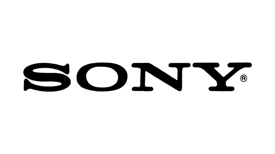
From 1961 until 1973, the Sony logo underwent slight changes. For example, the letter "R" disappeared, and more space was added between the letters. The height of the letter "S" was increased to meet the height of the other letters, etc. There have been many other changes. The final version was created in 1973 in bold and black serif font. The font was similar to Clarendon's with slight changes. The letters had less extensions at the end, and they were straighter and higher. Sony found their version, a long time ago!

The company also wanted to change their logo in the 80s. On Sony's 30th anniversary, a big competition was held to find a new brand image. However, after choosing the three finalists, the company decided to split the prize between these three designers and keep the current logo. Here's what the Sony logo might have looked like:

How to be inspired by the Sony logo to create your logo
We will not hide it from you, Sony's logo is unbelievably basic. But is it okay to have such a simple logo? Of course! We always recommend simplicity rather than extravagance for your logo. They continue to choose simplicity with the black color that represents classic, integrity. Regarding the shape of the logo, if you like your company name, you don't need to embed a symbol, you can just make it your logo, as simple as that. This type of logo is a signature logo, which is a logo only of the name of the company.
And that's it, you have everything you need to know about the Sony logo! We haven't (yet) delved into the PlayStation universe, but if you want to learn more about the logo of one of the most famous video game brands, we've analyzed the Ubisoft logo for you.
More tips and tricks on the blog


