Blog
The History and Meaning of the Ubisoft Logo
Today, we dive into the video games category with a French company that has built a worldwide reputation: Ubisoft. With offices around the world, we wanted to know more about the origin of the Ubisoft logo. How has their logo stood the test of time and grown with an entire generation? You are now going to discover the evolution of the Ubisoft logo!
The creation of Ubisoft
Ubisoft, formerly known as Ubi Soft Entertainment Software, is a video game distribution, development, and publishing company. It was created in 1986 by the Guillemot brothers in Carentoir, Brittany. Before publishing and developing their own video games, the five Guillemot brothers created "Guillemot International" in order to diversify their agricultural activities. This company specializes in the distribution of video games, mainly on the consoles of Amstrad and Atari. After a trip to England, they decided to move into the video game business. Michel Guillemot, one of the brothers, discovered that video games sold for less in England than in France. Subsequently, another brother, Yves Guillemot, went to study commerce in San Francisco.
In 1986, the 5 Guillemot brothers: Yves, Michel, Claude, Gérard and Christian, were ready to create Ubisoft. In addition to distributing video games to American companies, they also developed their own video games. The same year, Ubisoft released its first video game "Zombi", which would sell in part of Europe. Very quickly everything came together, and Ubisoft went public nearly 10 years later, in 1996. Thanks to the creation of Rayman Legends, Ubisoft also achieved sales in the United States and Japan. Today, we can say that the 5 brothers have succeeded both in France and internationally with many games like Splinter Cell, Just Dance, the Rabbids, and Assassin's Creed.
So, where does the name Ubisoft come from? There were many rumors that "Ubi" came from the Union of Independent Bretons, but one of the brothers finally denied it. In fact, "ubi" comes from the word "ubiquity" meaning "to exist everywhere at once". You can see that they were clearly right with this prefix.
So, what does their logo mean? That's what we're going to find out.
Ubisoft's first logo
Created in 1986, Ubisoft's first logo was a wordmark logo, meaning it was only the name of the company. To put this into context, it was the 80s in France. The logo was therefore pinkish purple with light blue added to very thick letters U, B, I that created a 3D effect. The word 'ubisoft' or 'soft' was in white, handwritten font. The colors of the logo were showy and almost flashy while presenting a serene and soothing side. Together, they created calm and trust. On the other hand, typography made it possible to be assertive in this environment. The logo was imposing because of its voluminous 3D side. This first logo represented Ubisoft for about ten years.
With the trend of the 80s making a comeback in recent years, it would not be strange to see a logo like this today!
The evolution of the Ubisoft logo
In 1989, a much simpler logo appeared. We said goodbye to colors and 3D typography. The logo was black and white with the same typography. Ubisoft was written in upper case, bold, sans-serif letters. And just below, 'Entertainment Software' was the same font, but written in italics. This was reminiscent of some of the versions of the Microsoft logo.

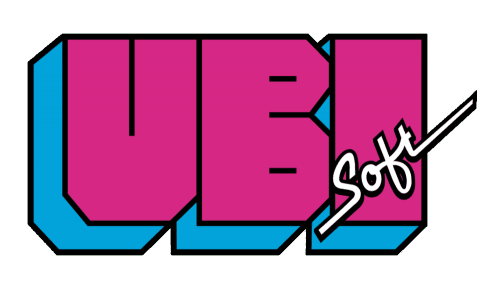
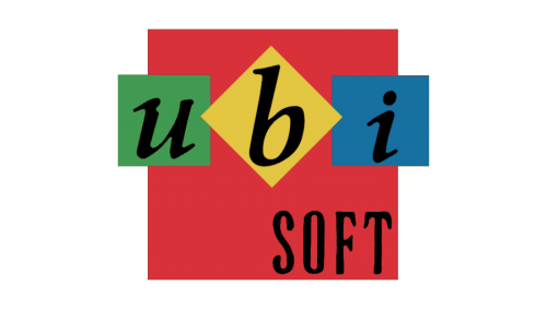
Barely 4 years later, Ubisoft decided once again to start from scratch for their future logo. This was a rather peculiar and colorful logo. The word Ubisoft was still separated into two parts. The letters U,B,I were lowercase, italic text. Each letter was in a different colored square: green, yellow and blue. All in a red background with the word 'Soft' written in black uppercase letters. All these colors placed together represented entertainment well, and this was what the brand offered, while having a childish side, because the colors were quite pale. But honestly, this logo was not a great success.
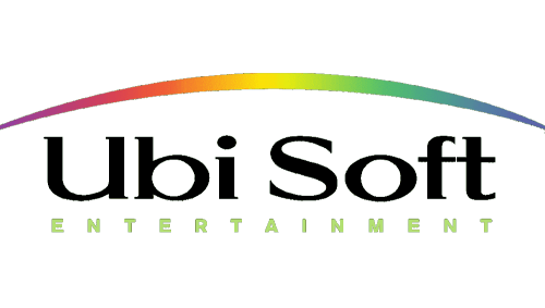
That's why a year later, in 1994, the company changed the logo again. Following the opening of offices abroad and the launch of Rayman Legends, a new Ubisoft logo was born! This time, it was a combined logo, much more simplistic than the previous one. The word 'Ubisoft' was a simple, black, serif font. With the word 'Entertainment' underneath, written in sans-serif uppercase letters that were fairly spaced apart. The whole thing was placed under a rainbow arch, a symbol of universality, which was what the company ultimately wanted to represent. We will also not hide the fact that it was trendy to have the colors of the rainbow, or just a rainbow, like Apple. Quick note, at this time the original Amazon logo did not have any arch yet.
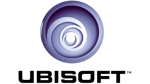
A new event marked the redesign of the logo. In 2003, Ubisoft acquired the Tom Clancy license. This license brought a more mature audience and was a sign of change. A new logo was therefore necessary. So it was that year that the famous spiral logo was born! Unlike other logos, Ubisoft was written as one word in a simple, uppercase, sans-serif font. Let's look at the spiral. It was blue which means wisdom, freshness, and calm, which is what the brand wanted to represent. This famous spiral with an eye in the center could represent infinity or even being everywhere and seeing everything at once, diversity. The director of the brand explained that it represented the 'original creation'. You can see that without an explanation from the director, we could have imagined different scenarios for this logo.
Ubisoft's latest logo
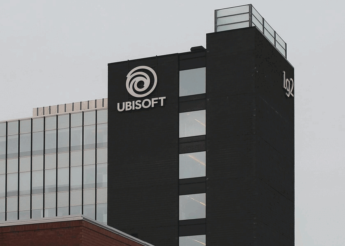
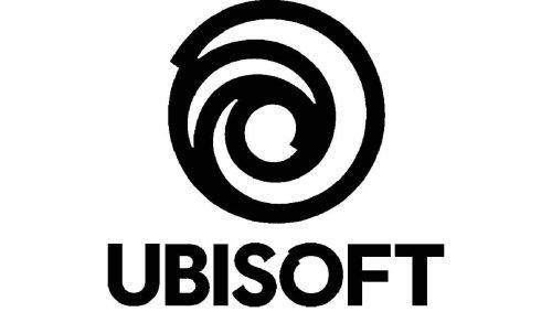
In 2017, the last Ubisoft logo appeared. It was similar to the logo from 2003, but with some differences. First, the famous blue disappeared. It was now a monochromatic logo in 2D that brought simplicity, modern and elegance. This is often what black and white logos give off. The eye is not really present anymore, it is more of an 'O', a way to simplify the logo. We noticed that the whirlpool (or spiral) has a more human touch as it looks like a person has drawn it. The typography also changed, Ubisoft now has their own font, 'Ubisoft sans'. It looks like the Arial font, but the letter 'O' is different. This logo is in 2D because it is easier to animate it for each video game, allowing for a personalized experience.
How to get inspired by the Ubisoft logo for your logo?
As you can see, Ubisoft has always been inspired by fashion, whether with its first logo in flashy colors, the logo with the rainbow or the monochromatic logo. These logos have been very successful, so feel free to follow the trends!
Ubisoft also started with a signature logo, maybe the brothers wanted a combined logo, but they couldn't find the perfect symbol to represent them. So be patient! If you want a combined logo but can't find the symbol or icon that represents you, jump in with a more simplistic logo and do a redesign when you come up with an icon.
That's it, you now know everything about the Ubisoft logo! If you can't find the symbol you need, here's a quick guide to creating a logo using letters.
More tips and tricks on the blog


