Blog
The Evolution of the Uber Logo
For a while, we have analyzed many logos of car brands: Peugeot, Toyota. Today we are going to talk about cars, but more specifically about a company in the transport field: Uber. If you feel like you've always taken an Uber, know that the company has been a part of our lives for only 12 years. Let's discover the evolution of the Uber logo.
Who invented Uber?
The idea for Uber, UberCab at the beginning, was created by Garrett Camp and Travis Kalanick. In 2008, one night in Paris, they couldn't find a cab and quickly wondered if it wouldn't be easier to get a ride using their cellphone or a mobile app. They decided to develop the idea and in March 2009, they created the company Uber. The first ride took place in July 2010, and the global application was launched in December 2011 in Paris.
But what does Uber mean? The word originates from a Germanic expression that means super or above. They wanted to show that Uber was a taxi service superior to others. Then, in 2011, Uber removed the cab name due to a legal dispute as they were not a licensed taxi company. They were regularly attacked by taxi drivers' associations.
Since then, Uber has grown a lot, adding various services like Uber Eats and Uber Freight. They continue to help millions of people get from point A to point B.
What was the first Uber logo?
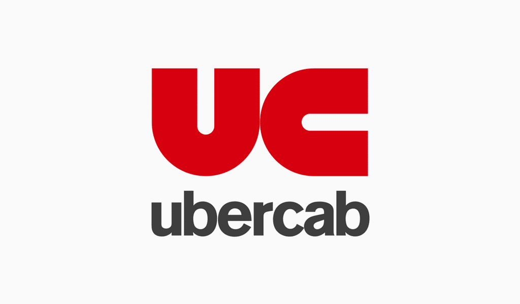
In 2010, the first Uber logo, at the time Uber Cab, appeared. The design was quite simple and reflected the name well. The letters U and C were a red sans-serif font. You’ll notice that these two letters are exactly the same shapes. That is, if we turn the letter U 90 degrees to the right then it looks like the C. Just below the UC, the brand name Uber Cab was a black sans serif font. If the brand had chosen to put only the two letters, most people would not have recognized the brand, or would not have known what it represented. The first Uber logo was therefore a monogram logo.
The evolution of the Uber logos over time - why did they change their logo?
The Uber logo meaning explained
The Uber logo has gone through 6 logo redesigns in the space of 10 years. We are going to discover the different design styles that the company has gone through.
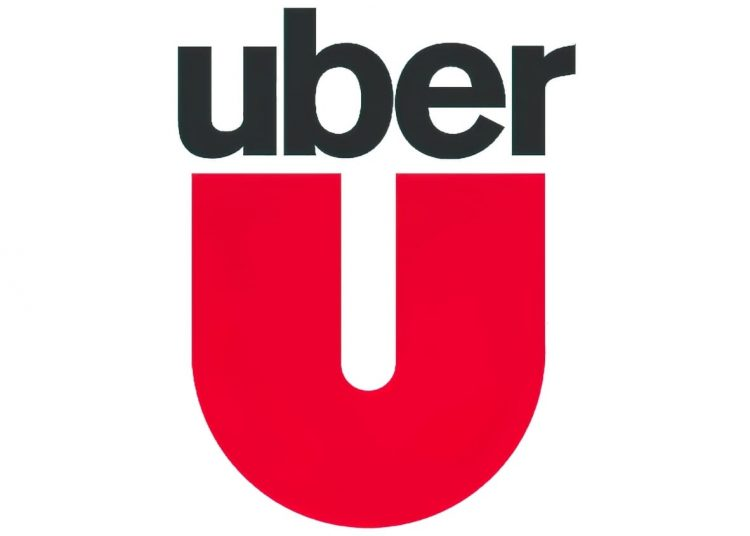
In 2011, following the lawsuits against Uber Cab mentioned above, the company became Uber and therefore a logo change was required. Uber made it as simple as possible at that time. They only removed the letter C, and removed the word cab from Uber Cab. They made a slight change in the placement of the word Uber which was now above the letter U.
Of course, this new logo didn't last long. In 2012, Uber began a major redesign of their logo. It was now a much more luxurious and modern design. This is partly thanks to using the colors combination gray, silver and black. The U also changed. A much thinner, silver U with the ends turned inwards in a black and grey square. The font also changed. It was still sans-serif, but like the logo, it was thinner. One of the ends for letters the U and R became longer, which you might say represented a path or a road. The path begins by ordering an Uber, representing this is an extension of the U at the top. Then, the path is travelled together. You see the end of the path at the bottom of the R. Initially, only the logo was changed. It took some time before the application and the website looked the same as the logo.
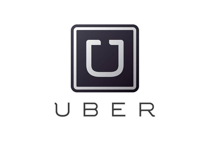
This logo was also in another version. The letter U was black in a gradient of gray square with rounded corners.
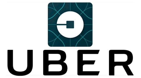
After several years, in 2016, Uber started a new redesign. This time, we forgot about the letter U. The name of the company Uber was kept in bold, capital letters. A new symbol appeared. Above the word Uber, was a square with rounded corners. Inside the square was a light blue abstract pattern and white circle. The circle represented the location of the customer. Fun fact, depending on the client's country, the small light blue abstract shapes were another color. The company wanted to have a brand image that was both futuristic and modern.
The current Uber company logo: font and icon
In 2018, Uber would change their logo to a signature logo – a logo that is only the name of the company. It was also a GIF, that is, in motion. The logo from 2016 was not really profitable for the company and by changing to a GIF, it gave the idea of moving forward. The font was called Uber Move and a reference to the sans-serif font used for traffic signs. If we analyze how this GIF logo plays out, we see that it begins with the layout of two roads then forms the word Uber. It is the same when the logo fades. Therefore, Uber is moving towards new paths with this logo.

A good variation logo: Uber Eats
It is likely that you ordered some food using a mobile app like Uber Eats in the last months. We want to mention that the Uber Eats logo is a well-done variation logo of Uber. Indeed, we know immediately that Uber Eats is related to Uber because they use the same branding elements. The regular Uber logo is used for the Uber Eats version; however it stands out because of the use of the green color. It is a simple but efficient new logo that respects the general brand.
How to get inspired by the Uber emblem and brand
There are different ways to get inspired by Uber's logo. First, Uber used red for the logo for a lasting impression and to make it flashy. As they gained notoriety, they chose a new symbol to represent themselves in a more modern way. The monochrome colors and thin font created this renewed effect. In 2016, when they bet on a futuristic logo, it was a failure, because it was considered too complex to understand. That’s why saw the return to a logo with only the name of the company. This made the brand simple and accessible. So, the advice is to keep it simple when creating your logo. Even if you have a logo that has many meanings and visual details in mind, try to simplify it as much as possible. Sometimes, you only need to use your company name as main inspiration, like the Amazon logo as well.
There you have it, you know everything you need to know about the Uber logo, and where this innovative idea came from. Paris and its traffic continue to inspire new ideas! Do not hesitate to discover other evolutions of logos of well-known companies on our blog or tips on creating and succeeding in the redesign of your logo.
More tips and tricks on the blog

