Blog
How to Use Different Colors to Create a Great Logo
No matter what type of logo you want to create (symbol, combined, monogram, signature, etc.), chances are you'll have to choose one or more colors. This choice should not be taken lightly, as colors can help convey a message or your values. So here are some tips to using different colors when creating your logo, but also some interesting color combinations to try!
Error to avoid – using too many colors
Look at the logos of big companies. You'll quickly notice that most use only two or three colors. There are many reasons why you shouldn't use too many colors when creating your logo. Most of the time, this gives an inharmonious result that is difficult to replicate. That's why Slack decided to change their logo in 2019. At the time, their original logo was complicated to use because it was made up of 11 different shades.
The meaning of colors
We have said this in many articles: colors have meanings. So, you have to keep that in mind when you create your logo. For example, if you have an accounting firm and want to show that you're credible, you shouldn't choose shades like bright orange, which is often associated with entertainment and youth. Think about the values you want to project. The logos of large companies often use blue, as it is a color that is both popular and representative of confidence.
The importance of contrast
An important element regarding the use of different colors for your logo is contrast. To have more impact, it is advisable to have some contrast between the different colors of your logo. A high contrast has the particularity to attract the eye, which is a great advantage for a logo. In addition, it also allows people with visual impairments to better distinguish the different details of your logo. Often, contrast is important when there is text, but it remains relevant for the legibility of shapes and for visibility in general. If you want your company name or slogan to be readable, there must be a sufficient difference between the color of the text and the background. If necessary, you can use color contrast checkers on the web. The important thing here is ideally to have a contrast ratio greater than 4.5. This has been determined by mathematical calculation.
Use black and white as needed
Black and white are interesting color options for your logo. They go well with all other shades, so it's easy to use them. This is the reason why many logos of two or three colors use white or black, or vibrant versions of them like chalk white or enriched black. On the other hand, black is associated with elegance, while white often represents purity. If these are values you want to put forward with your logo, feel free to try them in our publisher!
Note that a logo with a lot of white does not look good when displayed on paper for example. Make sure you can see your logo, no matter what the medium. Or turn your logo in different colors or versions.
Some ideas for combining 2 colors
Here are some suggestions for two-color combinations for your logo. We've added the color codes so you can easily use them in the FreeLogoDesign maker.
Light Coral (F67E7D) and Dark Slate Grey (404E4D)
These two colors are directly inspired by two colors of the year identified by Pantone. Light Coral was the color of 2019, while grey is one of the two colors of 2021. Together, they form an interesting choice for your logo. Grey adds a stable and serious touch, while coral makes everything livelier and more elegant.

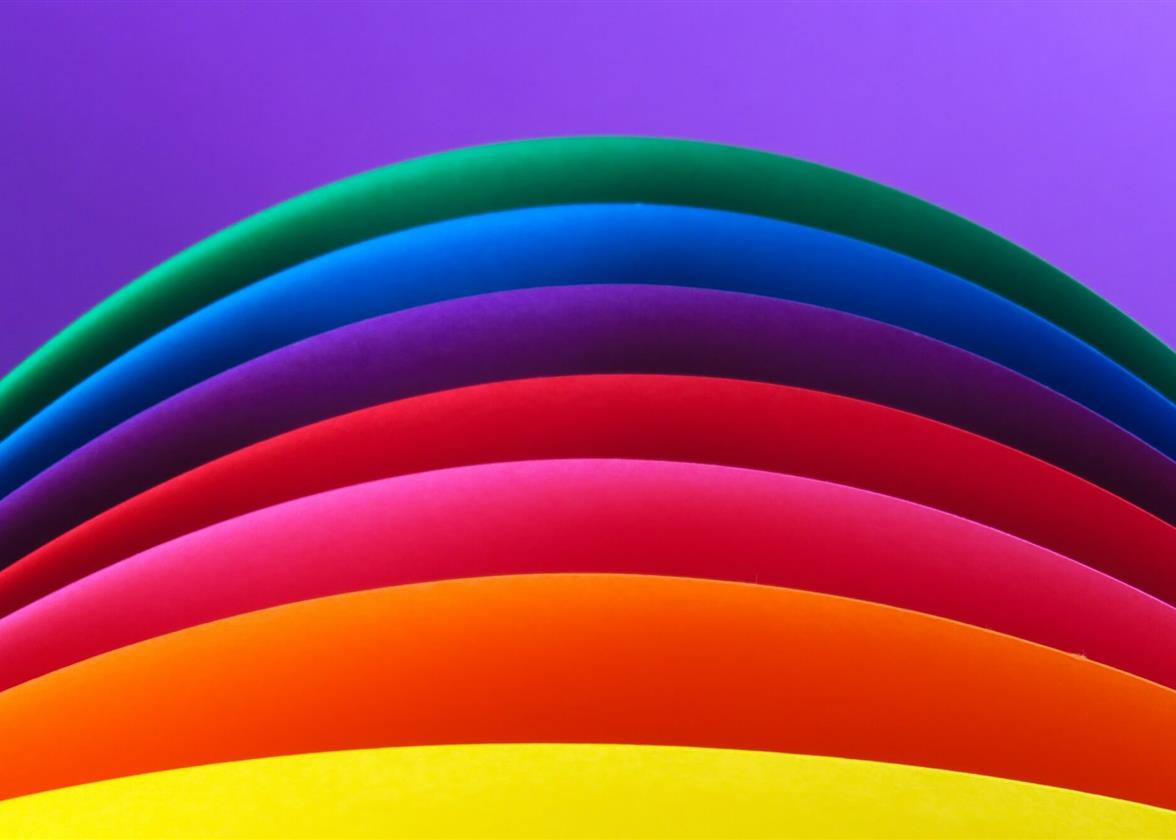
Prussian Blue (052F5F) and Green Munsell (06A77D)
Blue and green are two colors that generally go very well together. When there's enough contrast, these two cool shades can help you create a strong brand image. These are also colors used a lot for logos, as they are generally appreciated by people.
Carnelian (BD1E1E) and Mandarin (EF8354)
Warm colors can attract attention more easily than cool ones. The important thing is not to overuse the strong colors so that it is not too aggressive. When using a color like red, use a lighter shade to balance. Also, did you know that red is a color widely used by food and restaurant logos?
Some ideas for the combination of 3 colors
Here are some suggestions for three-color combinations for your logo. We added the color codes so you can easily use them in the FreeLogoDesign editor.
White (FFFFFF), Oxford Blue (OB132B) and Maximum Blue Green
Turquoise shades are very popular these days as are other pastel colors. Add white and a darker color to further highlight the main hue. This combination of colors also has a nice contrast, and this makes the different elements stand out.
Scarlet (FF2E00), Yellow Orange (FEA82F) and Black Bean (3D1308)
When you create a logo that includes three colors, the balance between shades is essential. First, you have to choose a main color. Then choose a secondary color for text for example. With this example, as the coffee house has been around since 1958, we wanted to give a slightly retro look by adding yellow and brown to the logo.

Middle Green (5B8C5A), Bone (ECE2D0) and Raisin Black (211A1E)
As mentioned above, white and black look really nice together for your logo. Among other things, these colors allow the emphasis to be placed on other shades. There are also different shades of white and black that we invite you to explore. In the case of this logo, the white chosen draws on the grey.

In conclusion, colors are an essential part of your logo. As a result, it may take a few times to find the perfect shades. If necessary, we suggest using tools like Coolors, a color palette generator. You will then have access to hundreds of combinations of different shades, there will certainly be one that will inspire you for your logo!
More tips and tricks on the blog

