Blog

Should you Choose a Serif or Sans Serif Font for Your Logo?
You have a ton of things to think about when creating your logo. You must find a memorable name and create your logo in line with your field of business and values. Then there is also the question of which font to use if you have words in your logo. There are now thousands of different fonts that you can choose to represent your company and give a unique touch to your image. Do you prefer sans serif or serif fonts? Do you know the difference between the two? Let's take a few minutes to explain the difference, their advantages, and some examples.
What is Serif, Exactly?
To begin, let's look at the base. The serif is actually an English word for the wheelbase. So, what is a wheelbase? Serifs are small extensions that are the ends of characters. Specifically, lines added around letters to create a distinct effect. According to Wikipedia, it would be "the trace left by tools such as a feather or a brush when the hand rises after completing a gesture of writing." Serif fonts have been used quite a bit over time, because serifs create an imaginary line at the top and bottom of the text, making it easier to read. But is a serif font what you need for your logo or should you avoid them?
The Benefits of Using a Serif Font
As mentioned above, serif fonts have been widely used since the invention of printing as serifs create imaginary lines that make it easier to follow the text. The use of serif fonts can be found elsewhere other than in literary works. You can opt for this type of font for several reasons. First of all, the serif fonts bring a decorative and artistic effect to the texts. This can give a refined effect, which may be best if you work in a field related to the arts or beauty. There is also a historical and classic aspect to these fonts because they have been used for a long time, which can give credibility and authority to your logo.
On FreeLogoDesign, we suggest serif fonts Alice, Bitter, Free Baskerville and Trocchi.
Some Examples of Logos with a Serif Font
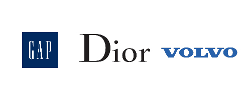
Businesses in fashion and beauty and older or conservative businesses are more likely to opt for serif fonts for their logos: for example, the famous fashion magazine Vogue, and haute couture companies like Dior, Giorgio Armani, and Rolex. Outside of high-end brands, the American company GAP, and car companies, Honda and Volvo use a logo with serif. The Wikipedia logo is also a good example of a logo using a serif font.
The Benefits of Using a Sans Serif Font
There are more and more companies that are opting for a sans serif font or as some would say, without the little details on the letters that unnecessarily complicate. It is becoming more and more popular to return to the basics, to use sans serif fonts. One example of this, and quite recent, is Google's redesign logo to a sans serif logo. When it happened, everyone was shocked because it seemed to be missing something - people felt the logo had become too simple. Now the change has been accepted, unlike other logo redesigns that went wrong. Most of the time, it is easier to read texts using sans serif fonts on the web and computer screens. So it is normal that the giants of the web and those wishing to achieve this status opt more and more for this type of font. As well, it projects a simpler, more accessible, young, modern and open image.
On FreeLogoDesign, we suggest Raleway Montserrat, Work Sans, Roboto and Monda serif fonts.
Some Examples of Logos with a Sans Serif Font
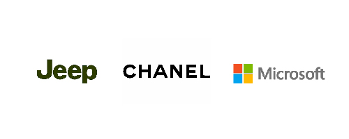
Google is not the only one that uses a sans serif font in its logo. For a more inclusive appearance, many companies around the world are now opting for the simplicity of sans serif fonts. For example, logos in the field of fashion, Calvin Klein or Chanel, are both simple and striking. In the field of technology, Microsoft has a logo without extravagance, which is also the case for Facebook or Airbnb. As well, companies like Jeep or FedEx have also opted for this type of font.
There you have it! You now know the difference between a sans serif font and a serif font. So you now know what the word "sans" after the name of a particular font means! You must now ask yourself this question: what type of image do you want to project through your logo? What would be the best font for your logo? Are you looking to be more refined and conservative? Or, do you want to be accessible and modern? There is no wrong answer, you have the last word. However, you should think about the clientele you want to connect with!
More tips and tricks on the blog

