Blog

Inspiration to Create a Blue Logo
When creating your brand image, you will have to choose colors that will represent you. Did you know that blue is the most used color for company logos? If you are looking for inspiration to create your logo, here are some tips for using the color blue, its meaning, and our choices for the most successful blue logos.
Why use blue for your logo?
There are so many colors and hues available, so why choose blue for your company logo? Before we begin, it's important to understand the meaning of this color, which is already widely used for logos. As colors carry a message, it is important to understand the subtleties of shades so that you can choose those that will best represent your company, your products, but also your values. According to our page on the meaning of colors, blue is obviously associated with the sea and the sky, but also with qualities such as confidence, calm and knowledge. In addition, classic blue was chosen as the Pantone color for the year 2020. As we all know, blue is as timeless a color as a pair of jeans!
Blue is one of the three primary colors, and it is one of the most loved colors by people. It is probably for this reason that several companies have chosen blue when creating their logo. Blue is also the second most popular color on country flags, after red. This is certainly a color to consider if you want a brand image accessible to all. For this, we only have to think of the Walmart logo or the Ford logo that use blue as the main color for their logo.
Some tips for using blue when creating your logo
As blue is the most used color for logos, whether it's company or sports team logos, the issue here is how to stand out. If there are a lot of blue logos, it can be a little more difficult to attract attention. Blue is a cold color, so it is a shade that has the characteristic of being soothing. You will need to pair it with a warm color if you want to look energetic. This is probably why the blue-red-white combination is used so much.
Otherwise, blue is a color that goes well with several other hues. We recommend white, yellow, green and purple. If you want to play on contrasts, orange is the complementary color of blue.
The most effective blue logos in our opinion
It is difficult to choose the best blue logos, however there are several that have had a strong brand image over the years. Let's see what these logos have and how blue has been used within the brand.
Let's start our list of blue logos with the king (at least right now) of social media: Facebook. As we mentioned above, blue is a color associated with accessibility. Therefore, many companies that want to target everyone use blue for their logo. This is the case for Facebook. They have always used blue for their logo, but also their website and their brand image in general. It should be noted that in their early days, the text on the Facebook logo was written in pale blue. Fortunately, this has been changed to white, which creates a better contrast between the background and the text.
BMW
Blue has been used for hundreds of years to represent countries, duchies and cities. Our team has always had a soft spot for the BMW logo: it is simple, representative, and elegant. Do you know why BMW decided to use blue and white for their brand image? It is because blue and white are the colors of the coat of arms of Bavaria, their region of origin. Do not hesitate to use shades associated with your region when creating your logo.
Microsoft Edge
Well, the Microsoft Edge browser may not be your favorite tool for browsing the web, but we can't ignore their latest redesign. One of the main trends of logo creation in recent years has been the use of color gradient. We can see here that this was certainly one of the first inspirations for the redesign of the Edge logo. Instead of a simple monochrome icon, this new version uses three different shades of blue, as well as green. The result is modern and refreshes the overall image of this web browser.
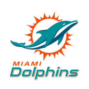
Miami Dolphins
Blue is often used for sports team logos. In this situation, what should be done to stand out? The Miami Dolphins football team chose to use blue for their brand image, but also a touch of orange. This combination of complementary colors is used very little for team or company logos. As Miami is a very sunny city, orange is there to emphasize this, but also to make the team's logo more energetic. In addition, two different shades of blue are also used: Blue Lagoon and Eastern Blue.

In conclusion, do you think blue can be the perfect color for your logo? If so, do not forget to find a way to stand out since it is a color that is already widely used in the world of logos. If you live in Sweden, you probably already know that yellow and blue are the national colors. That is why IKEA decided to use these colors for their logo, at least for this version. The first IKEA logo was red then brown!
More tips and tricks on the blog


