Blog
Why Slack Changed Their Logo
A few weeks ago, we shared the new Slack app logo on social media and as you know there is always a reaction to every action. Especially when it comes to the image of a known and loved brand. A logo change is very often a thoughtful and necessary step - at least from the point of view of the company. There are often several agencies or departments working to design the new brand identity. Did Slack app succeed in this case?
A Few Words about Slack
For starters, let us introduce you to Slack if do not know them. Slack is an IT tool, a collaborative platform used at work. Simply put, it is an internal company chat program that allows employees to communicate and send files to each other. The name of the company comes from the acronym "Searchable Log of All Conversation and Knowledge", which can be translated to searchable database of all conversations and knowledge. Launched in 2014 as a video game solution, the company has rapidly gained value which now exceeds one billion dollars. It should be noted though that the team behind Slack consists of several members who created and sold the Flickr Photo Network.
Slack is used by the FreeLogoDesign team. The tool allows us to follow up with colleagues and share photos of dogs, in addition to many other more important things!
The Old Logo
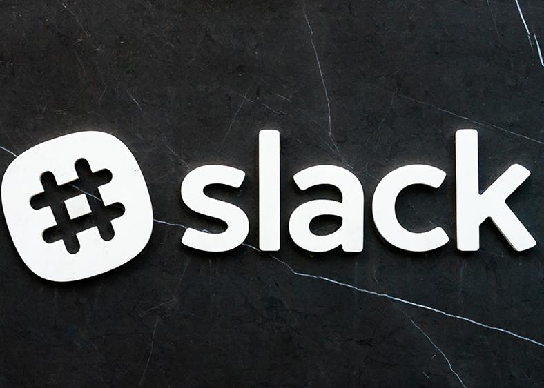
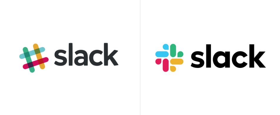
The company's first logo was created shortly before Slack was created in 2013. The logo was octothorp-shaped like a music sharp symbol or the famous "hashtag". It was before the advent of Instagram, so everything seemed very original and easily recognizable. A total of eleven different colors (yes, you read that correctly) made up the original Slack logo and the image had to be in a precise 18-degree angle. What could have pushed management of the company to opt for a new image in 2019?
Why Slack's Logo had to Change
The complexity of the logo increasingly became a burden for the company. They said it was very easy to make a mistake in the color or angle of the old logo which would have been disastrous for their image. As well, according to Slack, the logo could not be used with backgrounds that had different colors as they would clash. To correct this problem, Slack created different versions of its logo for different formats. However, their logo for the app was different from the first logo, as if Slack did not have a plan for their branding. By the way, the famous "hashtag" has become much too common nowadays. It was the team at Pentagram and Michael Bierut who worked on the new image.
The new Slack logo is a simplification of the octothorp and the original logo. There are no longer an angle and a combination of 11 colors. Unveiled last January, the logo is composed of four colors, red, gold, green and blue, four small bubbles and four rectangles with rounded corners. Other background colors can now be used with the logo, including black and dark purple. The new Slack logo is more harmonious and meets more needs.
Feedback on Their New Logo
A few days before the official launch, some New Yorkers noticed a Slack advertisement in two newspapers in the city. Was it a logo mistake made by the publisher? It is rare to see an image change elsewhere than on the web first. The comments were quick to arrive during the launch. Despite the fact that the company took the time to explain why they needed this change in a blog post, many had already decided that Slack’s new look had lost its soul or become mundane. Some people thought that the new logo looked like a windmill, ducks, or even four eggplants. Take note that no company is immune to criticism during an image change.
The co-founder of Slack, with his experience, predicted that Slack's logo change would shock some users. However, he also anticipated that after a month, everything would calm down. It has been more than a month now since the logo changed and critics seem to be fading. Unlike Gap who decided to return to their old image when people made negative comments after their logo change, Slack had the maturity to wait and stick to its plan.
In short, you never know the future and that is why you should take the time to work on your first logo to prevent a situation similar to the one Slack experienced. The company had an image recognized by its users, however, it was complicated and did not go with other formats. By the way, 11 colors are way too much. Remember to stay simple by opting for 3 different colors in the 60-30-10 ratio. And why not use complementary colors for your logo? This will definitely help grab the attention of potential customers.
Images: https://www.underconsideration.com/brandnew/archives/
More tips and tricks on the blog

