Blog

How You Can Create Your Own Logo: The Steps to Follow
Whether you are an artist or not, we believe that everyone is capable of creating their own logo. You don't need a marketing team or a budget of several thousand dollars to design the basics of your brand. It often only takes an idea, a piece of paper, pencil and well-structured plan. So, here are 7 steps to help you create your first logo yourself.
How can I make my own custom logo?
Tips for creating the perfect logo for your brand using an online logo builder
At FreeLogoDesign, we believe that everyone is able to design a logo. Indeed, you are likely the person who knows your business or project the most; therefore, why not give it a try? To help you with the logo creation process, we made you a list of seven steps to follow to design the perfect symbol for your company. Moreover, there are a lot of design tools that can help you create a great logo. Let us see this more closely.
1. Decide what values your product or business represent
Before you start anything, it's important to take a moment to analyze your business world or product. When you create a logo, you create something unique that represents your values, not those of your competitors. Therefore, make a list of all the benefits and values associated to your business. Write everything down that comes to mind; you never know what elements are going to stand out and allow you to create a unique logo. It could also be relevant to already have an idea of your business name at this point.
2. Take note of the logo ideas you like
Once your list is made, look for inspiration. Of course, it's not about copying an existing logo; it's about figuring out which styles you like and why. Browse the web; there are several resources to help you create your logo. The FreeLogoDesign website also has links to resources that can help you design your logo. This logo maker also has hundreds of logo templates to help you start the process. Also, we like to look at what Pinterest has to offer. Keep in mind, however, that your business or product should always remain your primary source of inspiration.
3- Choose the type of logo
Did you know that there are different types of logos? We suggest you not pick just one, but simply choose a few types of logos you prefer before you start designing. There is:
The monogram or lettermark logo
The monogram or lettermark logo is an acronym of a company's name. It is a logotype using only a few letters.
Examples of well-known monogram logos are NASA, IKEA and General Electric.
The signature or wordmark logo
The signature or wordmark logo is a fairly simple logo. It is composed only of a word, more specifically the company name. It is therefore important to choose a font that makes it stand out.
Examples of wordmark logos are Google, Netflix and Coca-Cola.
The symbol logo
The symbol logo is a logo of only an icon, and there is no company name. This type of logo is mainly used by well-known brands.
Examples of symbol logos include Apple, Toyota and Snapchat.
The combination mark logo
The combined logo, as the name suggests, is a logo composed of both the company's name and an icon. This type of logo is among the most common for companies and startups.
Examples of well-known combined logos are Pepsi, Adidas, and Reddit.
The coat of arms or badge logo
The badge or coat of arms logo is used by companies that wish to highlight their seriousness and longevity. The coat of arms displays the credible side to the logos that opt for this type.
UPS, Harvard and Cadillac use badge-type logos.
4. Choose a color palette and fonts
After choosing the type of logo you like, it's time to think about the right colors and fonts. First, it's important to choose these graphics carefully, as they can help your logo give off an energy. Did you know that colors have meaning? For example, purple is associated with luxury, while orange is often entertainment. Moreover, you can strengthen your message by opting for the perfect color combinations.
Then, take a look at different fonts for your logo. We know it's hard to choose because there are so many! Start by deciding if you want a font with or without serifs, then do some testing. Like colours, the chosen font must reflect who you are. For example, professional designers know that logo styles may vary according to the chosen font. If you are looking for a more traditional look, a serif font could be a great option.
5. Start drawing – try different possibilities
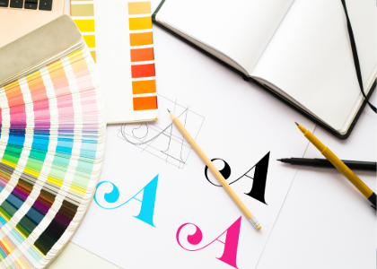
With all the items in hand: your list of values, logotype, examples you like, colors and fonts, now it's time to get to work. Take out a pencil and piece of paper and let your imagination run wild. Play with your business name, change letters, try various hues and fonts. If you don't know where to start, why not try the FreeLogoDesign editor? We have several basic logo templates that you can customize. You can also try our free online logo maker to use icons to test different possibilities.
6- Design different versions
Once you have your first sketch, we advise you design different versions of your logo. The reason is simple: you need to use your logo everywhere. For example, if you decide to create a combined logo, you should have a version of your logo that is only the icon for your Favicon. Have fun and try different ways to present your creation.
7. Write it all down in a brand guide
Finally, when you're satisfied with your new custom logo, write down, in a brand guide, everything you used to create it. It should include your values, inspirations, as well as the colors and fonts you chose. You can also add a guide that explains which variation of your logo to use depending on the medium. By having all the branding elements in the same place, it will be easier to implement brand consistency.
Where can I use my company logo once created?
Whatever your logo style, once created, you should be able to use your business logo everywhere. Nowadays, it is essential to use your custom logo on printed documents and online. You might need various logo files to meet all your needs.
For example, your logo should appear on your website and social media platforms as the profile picture. It should also be used as a Favicon icon and as the symbol of your app if you have one.
Your logo creation should also be used on print materials. A legitimate business will use their logo on their invoices, contracts, and all important documents. It could also be relevant to use your logo on your storefront, ads, packaging, and employee uniforms.
What tools can help me design logos?
Several logo makers and logo generators can help you with the creation process. You can check for ideas and logo templates on various websites like Pinterest or use AI to get a logo in just a few minutes.
Among the available online tools, FreeLogoDesign remains an easy-to-use logo maker with a great choice of templates and customization options. You can even create a logo for free using your business name.
Can AI help me create a logo?
Nowadays, more and more people use artificial intelligence tools for logo creation; however, it is important to mention that you still have to do some work in order to design the perfect logo. AI can surely help, but it will not come up with the perfect logo designing magically.
As we mentioned, the first step of the logo creating process is to analyze your business and values. You also need to think about the logo styles you like. Artificial intelligence can generate some suggestions, but you must ensure that it really fits your needs. There are great chances that these AI-tools will be improved in the future, but for not, they are more of an assistant than a professional artist or graphic designer.
How to make a graphic logo for free for my business?
It is possible to create a free logo using the right logo builder tool. Indeed, several logo makers like FreeLogoDesign give you the possibility to make and download a free version of your logo; however, check this before starting the creation process. Also, please note that your free logo might come in a low-resolution format. If you have professional needs, you might need some high-resolution vector files to ensure using your brand logo everywhere.
To conclude, let us remind you of the criteria of a good logo: memorable, adaptable, simple, timeless and distinctive. Memorable, because it must stand out from the crowd and represent you well. Adaptable, because you need to be able to use it everywhere easily, both on print and on the web. Simple, because the trends at the moment are minimalism. Timeless, because a logo that lasts over time often equals a stronger brand image. Finally, distinctive, because it is your logo, and it must represent you 100%!
More tips and tricks on the blog


