Blog
The New Logos of 2020
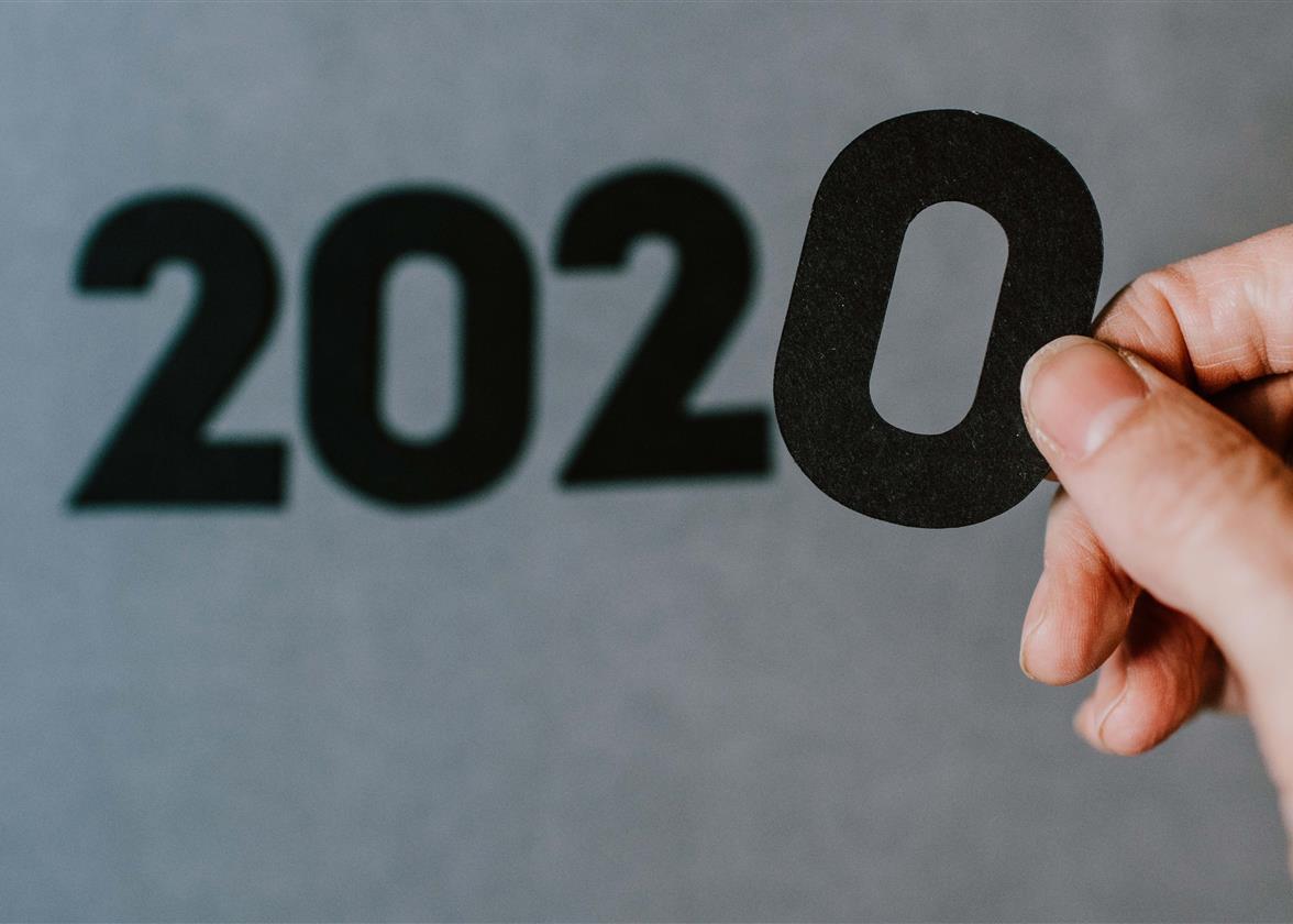
For many companies, 2020 is a year to forget. This may explain why so few decided to create a new logo or do a redesign. It was clear that their priorities were elsewhere. Nevertheless, we found 9 new logos from 2020 that we would like to tell you about. These examples will most certainly help you create your own logo!
GoDaddy
One of the first companies that changed their logo in 2020 was GoDaddy, and to say the least, it was a big change. After having their famous combined logo for nearly 20 years (a red-haired man with glasses straight out of the late 1990s), GoDaddy finally decided to update the logo at the beginning of the year. They opted for a monogram logo consisting of the letters G and O. In addition to forming a heart, the initials also spell the word go. This is clearly one of the most successful and necessary redesigns of 2020. They needed a logo as credible as their company and products.

Source: Underconsideration
BMW
Since automakers must have a strong brand image, they don't often change their logo. Despite this, in 2020, the German company BMW decided to modernize their logo. One of the current trends for logos is minimalism, the result has to look good on the web and in person. For this new version, BMW removed the black in the logo and added white to the contours. This logo is very clean and modern, even futuristic!
Source: wapcar
Tripadvisor
In a similar vein, Tripadvisor also decided to simplify its logo during 2020. The original version consisted of five colors: black, white, yellow, green and red. In this redesign, the details in the owl were removed and now there are only two colors, black and a new shade of green. This creates a more current and energetic look. It is a modern logo and more suitable for the web. It is recommended to use no more than three colors when creating your logo. If you do, it can create an effect that is not harmonious making it more difficult to reproduce the logo on different mediums.

Source: Underconsideration
Nissan
It wasn't just BMW that decided to change its image, Nissan also redesigned its logo in 2020. Once again, minimalism is the trend this year. For this redesign, the Japanese manufacturer removed elements of its logo to leave only the outline and the name of the company. There is nice continuity from the original logo. It remains to be seen how this very modern logo will look on vehicles.

Source: Dezeen.com
Intel
Intel is a U.S. semiconductor chip manufacturing company. In 2020, they decided to update their logo. Like many others, the company decided to divest itself of the superfluous details of their logo for this redesign. The circle around the logo disappeared, as well as the small details at the end of some letters. The only addition was to change the color of the square at the top of the letter i. This a nod to the products that this company designs and builds.

Source: Underconsideration
Rolls-Royce
When you feel that your logo is out of date, you don't need to throw everything away. Sometimes it only takes a few changes to bring your logo back to life. This is what Rolls-Royce did. They kept their famous monogram logo and decided to change other aspects of their branding such as font and color palette. The result was done with care and we can easily see the prestigious universe of this company.

Source: Underconsideration
Popeyes
When you want to redesign your logo, but don't know where to start, think about what you are known for. What do people like about you, what is your specialty? This is what the American restaurant chain Popeyes did with their new logo. Best known for their chicken sandwiches, the company decided to put a chicken icon in the center of its logo. Their branding was also simplified. For example, the color palette went from three shades to two.

Source: MarketingInteractive
Cadbury
Sometimes it's the little details that make all the difference. Cadbury, the chocolate company, made a minor change to its logo that improved it considerably. They changed the angle at which the company name appeared. Initially, the name/logo was slightly tilted up and now it is flat. The letters are also thinner. The whole thing is more readable giving a more refined effect.

Source: CreativBloq
Seattle Kraken
We would like to make a special mention of the Settle hockey team logo. As this is a new team, they had to come up with an entire brand and we find the result superb. First, the choice of colours stands out from other teams, giving it a unique look. The logo is also very representative of the city of Seattle which is a coastal city. In short, this is certainly one of our team's favorites!

Source: NHL.com
In conclusion, whatever your reason, don't hesitate to consider redesigning your logo. Whether it's updating things like Rolls-Royce or starting from scratch like GoDaddy, try different combinations until you come across what your business stands for today. If you need more inspiration, don't hesitate to take a look at the logo redesigns of 2019. Enjoy creating!
More tips and tricks on the blog

