Blog

The Meaning of Facebook’s Logo
Facebook doesn't need an introduction. It is the most important social media platforms on the planet at the moment and is considered one of the giants of the web along with Google, Apple and Amazon. Have you ever wondered where Mark Zuckerberg's company logo came from? Did he have many versions of it at the beginning? Let's take a closer look at what the Facebook logo means and its history.
A Few Words About the Creation of Facebook
For those who are curious or who don't know the origin of this social media platform, Facebook was founded in 2004 by Harvard University students, which included Mark Zuckerberg. It was originally a platform reserved for students of this prestigious school; however, because of the excitement about it, Facebook quickly became accessible to other universities and then to everyone in 2006. It revolutionized and democratized the use of social media. Since then, more than a billion people visit Facebook every day, despite the platform's recent and numerous scandals.
Facebook's First Few Logos
At the very beginning, Facebook was called TheFacebook. This name was used from 2004 to 2005. The first Facebook logo was simply the name, TheFacebook, in pale blue with the same blue background as seen today. Brackets had also been added to the logo to give a box appearance. When the company decided to get rid of "The," they used the name in white instead of pale blue for better contrast. The font used since then is a modified version of Klavika. A San Francisco agency called the Cuban Council that was responsible for this first overhaul. Like many technology companies, the company chose a sans serif font, as it is more readable on the web. The logo has changed very little since then and could be getting simpler. To see this, we only have to think of the favicon of Facebook which uses only the first letter of the company's name.
As well, many people suspect that the Facebook logo is blue because Mark Zuckerberg has a kind of color blindness and cannot see red and green. However, blue is the most commonly used color for company logos.
Source: Wikipedia
A Few Small Changes in 2015
Did you know that the Facebook logo was redesigned in 2015? You likely did not notice as it remained very similar. The name and colors remained the same. It was just the font that changed slightly. The font was thinned a little–you have to look at both versions to notice this. It was also modified to look more modern. In short, these changes were not very big.
A Common Signature for Facebook Products
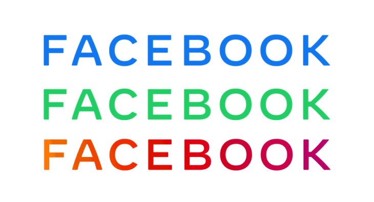
Since its inception, Facebook has acquired several other companies for which it has popularized–like Instagram and Whatsapp. In the interests of uniformity, the social media platform announced last November that they would make their image consistent. This is not a new logo for the platform, but a logo for the company as a whole. Facebook, however, remained simple once again by opting for a signature logo: only their name. The logo for their application changed to now being written in capital letters.
So far, there have been three variations of this logo. First, there was the blue version to represent Facebook, the social media platform. Then there was the green version to represent WhatsApp, then a version of shades from orange to pink for Instagram. Is this a sign of a refresh to come for the Facebook logo? Only time will tell, it is increasingly rare for a company to keep the same logo for more than 10 years.

Source: Techcrunch
How to be Inspired by the Facebook Logo
There are many ways to be inspired by the Facebook logo when creating yours. First, why not focus on simplicity? It is often what makes a good logo. In any case, the current trend is minimalism and superfluous details seem to vanish like snow in the springtime during redesigns. Also, try not to use more than three colors when creating your logo. There should be a predominant color and an accent color.
Similarly, do you know the meaning of colors? Each color carries a message. So, it's important to choose the right colors when creating your logo. In the case of Facebook, blue is a widely used color for logos. It's also most people’s favorite color. Blue is considered a soothing color, which inspires confidence and is associated with knowledge. If one of your business values is accessibility, you could do what Facebook did and use blue for your logo.
In conclusion, you now know where the Facebook logo comes from. When creating your logo, you don't have to rack your brain. On the contrary, keep it simple, like what this social platform did. Start by trying several different fonts, then find the colors that will represent your values. Check out the history of the Mozilla Firefox logo now!
Sources:
https://fr.wikipedia.org/wiki/Facebook
https://www.creativefreedom.co.uk/icon-designers-blog/logo-histories-facebook/
https://1000logos.net/facebook-logo/
https://mashable.com/2015/07/01/facebook-logo-change/
https://www.phonandroid.com/facebook-whasapp-instagram-partagent-desormais-meme-logo.html
More tips and tricks on the blog


