Blog
The Story Behind the Mozilla Firefox Logo
The web has just turned 30! There are so many companies and websites that have left their mark in the past decades, for good and bad. There has been advancement for some companies and decline for others. The big names in technology have changed over the years too, like Google. Today we are looking at a logo that you have surely seen in your life-time, most likely as an internet browser: Mozilla Firefox! Although you surely know this image, let's take a second to see where the logo and the name came from.
A Few Words on the History of Mozilla Firefox
Contrary to what you may think, Mozilla Firefox is not a recent creation! In 1994, when the company was created it was called Netscape. This must tell you something - it was one of the first internet browsers. (Indeed, did you know that Google is not the first browser?) Unfortunately, Netscape was at a disadvantage because Internet Explorer came with all Windows products. The company responded by making their browser open source. Then in the late 1990s, Netscape was bought by AOL.
This sale resulted in a need for novelty so the team started working on a new product called "Phoenix". However, they soon had to change their name because it had already been taken by another company in the field of technology. It is very important to check the availability of a name and a domain name before starting! In 2004, the Mozilla Firefox browser was finally launched. In 2008, despite a good performance in general, the browser had to fight against a new web giant, Google Chrome. In fact, following the arrival of this new player, Firefox went from 30% market share to 10%. Ten years later, Mozilla Firefox is still present despite the rise of the cell phone and other competitors like Safari.
The creation of the Mozilla Firefox logo and icon
Is the Firefox logo a red panda or a fox? What does the Firefox logo mean?
The very first Mozilla logo, after the decline of Netscape, was a phoenix reborn from its flames. We were far from the cute little orange fox branding. When they had to change their name, they opted for an animal that was not well known on the web at the time, but not quite a mythological creature. It was the red panda. Unfortunately, people thought that the animal on the Mozilla Firefox logo was a fox. This "firefox" is actually a red panda which is a protected species in Asia. A mistake when translating red panda from Chinese to English is how we got firefox. So, no, there is no fox on the Mozilla Firefox browser logo.
The composition of the logo has not changed since 2004: a red panda encircling a blue globe representing the earth. The use of complementary colors orange and blue create an interesting dynamic that brings out the warm colors of the logo. The underlying message is that Firefox is everywhere to help you navigate the web. The creator of the logo was inspired by a passage from his childhood bible about jackals whose tails were on fire.
The Mozilla Firefox logo evolution
Since the beginning, 2004, the Mozilla Firefox browser logo has not changed much. Even today, after nearly 15 years, the current logo is very similar to the original - a little too much. We have seen 5 versions in all and the general consensus is that the logo has been simplified over time. The details on the blue planet and the red panda have disappeared to give a more simplified image. The logo did become more colorful in 2017. This has been one of the trends for logo redesigns in the last decade - just think of recent MasterCard or Starbucks logo redesigns.
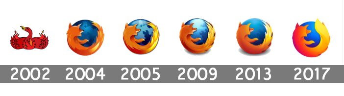
Source: 1000 Logos
A new logo for Firefox
Why did Firefox change its logo in 2019?
Since it had been 15 years since Mozilla Firefox had had a major overhaul of its image, the company decided in 2018 to test the waters, which is a great idea if you want to ensure having a good logo to present. They decided to show different options of their new design and visual identity. They do not just want to change their main logo but also create a whole new family of icons consistent with the brand. This last point was Slack’s main argument during their redesign earlier this year.
Two designs have been shown to the public so far and they are very promising. Once again we find it a minimalist appearance with warm colors like orange. We should know more about this redesign very soon, at least we hope!
UPDATE JUNE 13TH. 2019
The new Firefox emblem has been revealed! The red panda and the Earth have disappeared and the final result is quite minimalistic. What do you think of it? Do you like its warm color choice and gradient shades?
Finally, a version mixing the flaming tail and the older Firefox brand has been chosen and used since 2019. Both logos are used for the Firefox brand.

Source: @Mozilla
What we like about the current Firefox browser logo
We like a lot of things regarding the Firefox brand. First, we can say that their name stands out. It is essential to get an original and representative business name when starting a new product. Also, whatever the symbol used, it is possible to recognize the previous versions since they make the brand evolve instead of starting from scratch.
It is not only its name that stands out, but its color choice as well. Do you know a lot of brands that use orange and blue? And what about the current purple globe? It is a perfect example of a trendy technology logo.
In conclusion, as you may have noticed, you never know where a company will be in 10 years. Will it be declining, thriving, or will it have disappeared? Netscape's evolution to Mozilla Firefox is a good example of the importance of adapting to your environment in order to survive. It is the same for your image. You must always make sure you are up to date so as not to lose market share to competitors!
Sources:
https://itsfoss.com/history-of-firefox/
https://www.memoclic.com/593-firefox/17543-origine-logo-firefox.html
https://gs.statcounter.com/browser-market-share
https://www.theverge.com/2018/7/30/17631766/firefox-logo-redesign-mozilla-user-feedback
More tips and tricks on the blog


