Blog
The Disney Logo: More than Just a Castle!
Once upon a time, there was a man who persevered with lots of imagination and provided wonderful stories to generations. You may know this man as Walt Disney. You probably also know the timeless logo, which is an inspiration of the castle in Sleeping Beauty or Cinderella. You may also know the distinct font used for Disney’s brand image. But did you know that the logo you have in mind was not used by Mr. Disney? Let's take a moment to discover the history of the logos used by the Disney company so that you can get inspired when creating your own logo!
No Defined Logo for Disney for Several Years
Walt Disney does not really need an introduction but if you need one, he is the creator of Mickey Mouse and the American company Disney. The first company created in 1923 was called Disney Brothers Studios and changed to Walt Disney Productions a few years later. First were the animated films of Mickey Mouse for which the company is known, and then came the success of the film Snow White and the Seven Dwarfs. At that time, the logo of the studio was simply the name of the founder in a nice font. The versions of this logo often differed with the projects. Mickey Mouse, however, was introduced and represented the company without a defined brand image. It's something you cannot afford to do today!
Important Logo Change in 1985
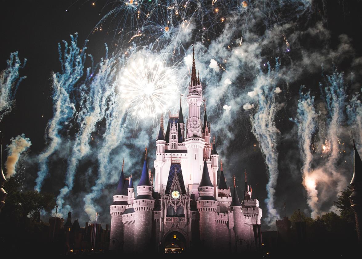
In 1985, more than 50 years after the creation, we finally saw a logo worthy of the name for Disney at the end of the movie Taram and the Magic Cauldron. This logo may be one of the most important of your childhood. The background is a silhouette of the Sleeping Beauty castle we can find in one of the Disney parks today. The colors go from white to blue on a darker blue background with Disney’s signature. The font used in this logo is unique and well protected. If you like, it is possible to use a similar one called Waltograph. A luminous circle completes the composition with stars that fulfill wishes. As you may know, wishes are a part of many Disney films. Unfortunately, the designer never had a chance to see the logo as he died in 1966.

Source: Wiki Disney Fandom
New Modifications and Simplification
In 1995, during the launch of the animated film Toy Story, the company tried the first variation of their enchanted logo with the help of Pixar. The castle was livelier and more modern representing the world of Toy Story. The criticisms were mixed as the logo seemed to be moving away from the original image of fairy tales. Disney persisted and continued to vary its logos according to the world in its films. For example, the background of the logo was changed to a jungle in Tarzan while the logo was lit by a green light ray in Lilo & Stitch.
Then in 2006, another major change occurred. The Sleeping Beauty castle was replaced by the Cinderella castle. However, it is the animation in 3D that is the biggest contrast with the old logo. In the animation, we are taken from a valley to a river, then by a small train to the very detailed majestic castle. Obviously, this version is used for movies and is adapted to the world in the film. By the way, the name has recently been simplified to Disney or Walt Disney. The Disney name alone with its special font also now serves as the company's logo when it's not in an animated production.

Source: CGnews
How to Vary Your Logo According to Your Products like Disney
As mentioned in the last paragraph, Disney has created many variations of its logo according to its products or films. Despite these changes, it is still possible to recognize the company as its brand image is strong. When you design your logo, keep in mind that you may need to change it in the future to meet different needs. That's why we advise you to keep it adaptable, either in shape or color for example. You can also create different versions of your logo from its design: a black and white version, with one or only a simplified picture. Several choices of logo types are available to you. In addition, several logos have been simplified in recent years, including MasterCard or Starbucks. In short, you should first create a strong logo, then try different variations to be ready to respond to different needs over time.
In conclusion, as we have seen in another century-old giant, Nintendo, today's big companies have not necessarily started with strong branding or a perfect logo. It took several decades for Disney to find its first logo, both strong and magical, that created dreams for many children around the world. So, what does this multinational company have for us now? Will they go in the direction of simplifying their logo or will they proudly keep their castles? Only time will tell!
More tips and tricks on the blog