Blog
The Nintendo Logo Over Time: Chaos and Stability
The video games created by the Japanese company Nintendo were most likely a part of your childhood. Whether it was Mario, Link or Donkey Kong, these heroes have become legends. Regardless of the console or game, as long as you saw the company's traditional red and white logo, you knew it was guaranteed good quality. This company has had a multitude of logos over the years. Did you know that Nintendo has been a company for more than a century? We are going to take a look at the history of Nintendo's logos during its existence.
A Summary of the Nintendo Story
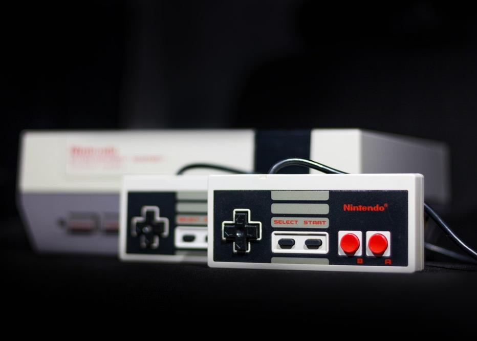
As mentioned above, Nintendo is a company that is over 100 years old! It was founded in 1889 in Kyoto, Japan. In 1889, Nintendo had not yet become one of the leading companies in the field of video games and our famous Mario was far from existing. Nintendo specialized in card games until 1970, in addition to doing business in a few other areas before embarking on another type of entertainment. If you are not familiar with the company, know that they are the ones who launched the popular NES consoles, SNES, Nintendo 64, Game Boy and more recently the Wii and Switch.
The Pre-Console Era: In Search of its Identity
Initially, in the late 19th century, the first logo used by Nintendo was simply the name of the company written in dark blue Japanese characters, Kanji. Then, following the Second World War and the massive arrival of Americanization in Japan, the Japanese company opted for a logo of its name and a spade. After that, its name was only in calligraphy in the 1960s.
There were later versions of the name in different shades, then different fonts, some sans-serif, other serif, to go with their different products. At that time, Nintendo was not only making playing cards but also toys, in addition to having a taxi company, a hotel chain, a television channel and a rice production company. Nintendo also had sales exclusivity for certain toys from the company MB. As a result, it added a lot of logos to its already existing collection, much like its counterpart in the United States. One of which has the letters NG for Nintendo Game. In short, Nintendo back then had no guidance about its image. It was as if the company was looking for its own way, an image for a main product.
The Console Era: Return to Stability
Fortunately, with the advent of consoles, Nintendo finally found its way and became the empire we know today. Since 1967 its logo has stabilized to resemble the one we know today following the creation of a toy that launched a baseball. This product was a huge success in Japan, as baseball is a popular sport in Japan. The name Nintendo then appeared on the box, white on a white background. The font stayed the same for a long time, then the logo became a red hexagon with the name of the company inside. In 1972, the classic version that we know well today was invented - the hexagon disappeared for an oval shape around the name. Although Nintendo continued to use other versions of its logos for various products, the logo of its encircled name became more and more present. When the consoles arrived, Nintendo decided to use the same logo.
So what does the Nintendo logo now project as it has not changed in over 30 years? First, red is a color that catches the eye and is closely linked to entertainment. The predominantly red logos are often associated with companies that stand out especially in their industry. Lately, the logo has been appearing more and more with a silver-tone, which relates to the field of advanced technology and neutrality. Also, the exact font used for the Nintendo logo is unfortunately unknown, but both clean and well representative of the company. It is a sans-serif and bold font that seems sophisticated, simple and classic at the same time. Finally, encapsulation of the name increases its importance. These are elements that can certainly inspire you in the creation of your next logo!
In conclusion, it would have been easy to think that Nintendo has always had the same logo as their image comes across as conservative - at least that’s how it seems to have been in recent years. It is normal for a company to experiment and logo change over the course of its existence, as it is necessary to follow trends. As well, the vision of the company can change over time. Therefore, always keep in mind who you are and your values in creating your logo.
Sources:
https://kotaku.com/nintendos-great-logo-identity-crisis-5893485
More tips and tricks on the blog

