Blog

The Evolution of the Famous McDonald's Logo
The McDonald's fast food chain does not really need an introduction. Located in most countries around the world, the big yellow M is a symbol of global Americanization, at least since the end of the Second World War. You've probably tasted one of their Big Macs or salty fries; however, have you ever taken a few seconds to ask yourself how this famous logo entered into the world?
A Brief Recap of McDonald's History
The first McDonald's restaurant was created in the 1930s in California, but it didn't resemble any of the modern restaurants we find today. The menu was varied and people were served at their car. It was only a little later that this small establishment had on a menu of hamburger and french fries, strict production, and took orders at a checkout instead of a car. These practices impressed entrepreneur Ray Kroc who decided to work with the McDonald brothers to expand across the country. Kroc ended up buying the company with several ideas in mind. In 1963, the fish fillet sandwich made its debut. In 1968, it was the Big Mac’s turn to be marketed.
In 1967, McDonald's restaurants came to Canada, then South America, Asia, Europe and finally in Oceania. In the new millennium, despite commitments to the Olympic Games and the Ronald McDonald Foundation, the company has received many criticisms: their working conditions, quality of food and ecological footprint. Nevertheless, McDonald's remains one of the most relevant companies with respect to revenue, the number of establishments and employees.
Logos Over Time
McDonald's is more than 50 years old and its image has evolved over time to meet different needs. Despite what you may think, McDonald's first logo was not a yellow M, but a smiling man whose head was a hamburger. Named "Speedy", he represented the fast service at the restaurant. Truth be known, it took a long time to get the burgers to the car. McDonald's has been one of the pillars in creating what we call fast-food restaurants. Under any circumstance, when hungry, is it not aggravating to have to wait several minutes?
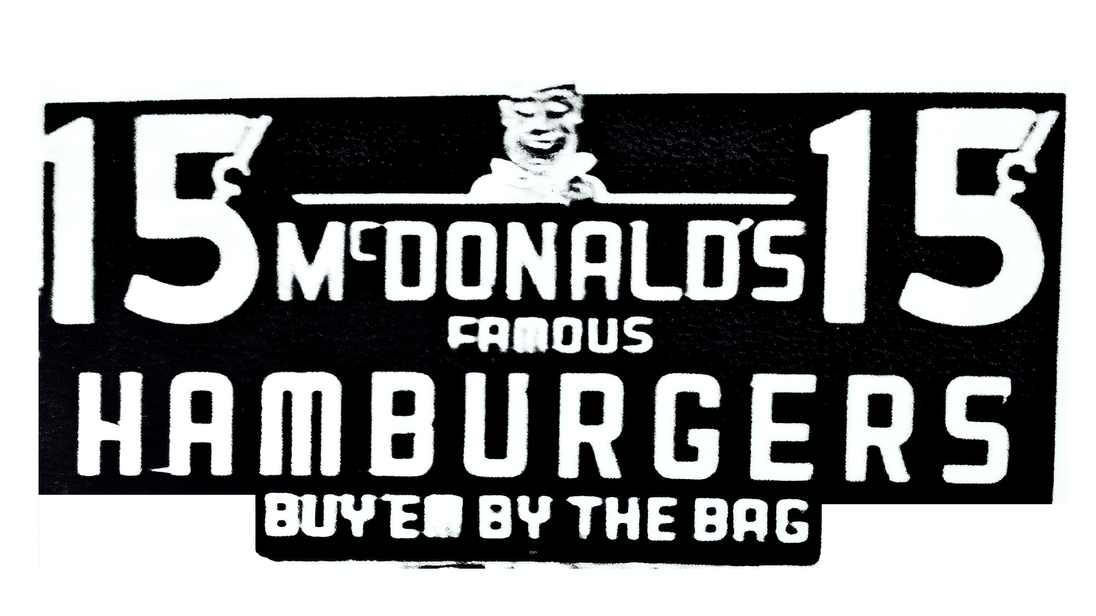
Source: Graphiste.com
In the sixties, after Kroc purchased McDonald's, came the famous yellow arches. The golden arches were placed in several restaurants to attract attention and from a particular angle, these arches formed an M. The arches also had an arrow going through them. In 1968, Kroc made some changes to the brand and decided to remove the arrow and join the two golden arches to create the logo as we know it today. For more than 30 years, the name of the restaurant has been red and the logo has virtually remained the same. It is rare today to see a logo last for such a long time! Marketing strategies for McDonald's have tried to target families and especially children by using a clown as a mascot, giving small toys inside Happy Meals combos or offering game rooms in restaurants.
In 2003, McDonald's decided to modernize its image with its "I'm Lovin It" campaign. The golden arches were slightly modified to show a shadow and depth. This modification imitated the look of the logo in front of the restaurant. The background of the logo was changed to green at the McDonald’s in France to communicate a so-called more environmentally friendly image.
Source: Quora
How to be Inspired by McDonald's logo
The McDonald's logo can inspire you when creating your logo. Over the years, these arches have projected a strong image and have become recognizable almost everywhere. For starters, McDonald's uses two primary colors for its logo. They use yellow, a radiant color linked to joy and power, and red, a color related to strong emotions like love and hate. The duality of these two bright colors reinforce the simple and strong image of the M. As well, as we have seen in other logo examples, like Google or Starbucks, the trend in recent years is minimalism. Therefore, we suggest that the look of your logo not be overloaded or too complex. It will make the logo easier to remember, ensuring a certain relatable aspect.
In conclusion, although they are not perfect, for the last fifty years McDonald's has built an empire which includes a logo recognized around the world. When creating your logo, remember to use strong colors related to your message and make it simple. Like McDonald's, you could be inspired by letters from your name or the name of your company! We discuss this topic in our article on logotypes and how to choose the right one for you!
Sources:
https://blog.logomyway.com/mcdonalds-logo-history/
https://www.designhill.com/design-blog/mcdonalds-iconic-logo-story-evolution/
More tips and tricks on the blog


