Blog
Google's Logo History
There are many, many search engines, yet Google is the most used in the world. We use Google every day for internet searches, to browse websites, to check our emails and to store documents and photos on its servers. But how was this colorful logo created? What is its significance?
Where does Google come from?
In the 90's, more precisely 1996, Larry Page and Sergey Brin, both students at Stanford, decided to create BackRub. It was their first search engine, and at the time they were using Stanford's servers. In 1997-1998, as a graduation project, they decided to rename BackRub Google.
This term comes from a mathematical word "googol" meaning a 1 followed by 100 zeros, a very large number that is difficult to write. However, it strongly represented Page and Brin’s idea. From there, many theories exist about why the spelling became "Google." Some say it was a spelling mistake when writing the name of the domain, others think that it was deliberate because the word "googol" already existed. Some believe there is also a reference to "Lego" by using similar colors in the logo, and others believe the name has something to do with the word "goggles." We may never know.
The first Google logos
The first beta version of the logo, released in 1997, was in 3D.
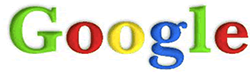
This version was quickly replaced in 1998. The first official logo was created in the GIMP application, and used the font Baskerville Bold. Although the logo certainly didn't win any design awards at the time, you can already see some of the principles of the current logo in place, including the use of colors.
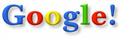
Later in the year, with the introduction of Google Beta, they added an exclamation mark at the end of the logo, an inspiration from Yahoo!
Once Google was well established, Page and Brin hired Ruth Kedar to redesign their logo. After several proposals from Kedar, they decided to change the font to Catull Typeface in order to give a more sophisticated look. The exclamation point was also phased out.

After removing the drop shadow from the logo in 2010, Google continued its transition to a slightly more current logo. In 2013, to keep up with the rise of the "flat design" trend, a few changes were made to the logo using solid colors for the letters. In addition, they made some adjustments to the font.

The 2015 redesign
The year 2015 marked the biggest change in Google's brand identity since the introduction of the Catull font in 1999. With the arrival of the mobile era, the logo needed to be flexible and versatile. The old serif font did not allow the adaptability needed. This was a big change for the Google brand; we saw the introduction of a new brand identity. The old logo gave way to a new custom linear font for Google (Product Sans), as well as several variations of the logo. For example, the rainbow G, which was used as a favicon and for the application icon, or the four dots, which are used in different situations and can also be animated.
After all of the logo and font iterations, one detail has not changed: the logo's colors! What do the colors represent?
The two "G’s" in blue speak of reliability and strength.
The first "O" and the "E" in red indicate emotion and youth.
The second "O" in yellow refers to optimism and warmth.
And finally, the letter "L" in green defines health and growth.
Letters are specifically important to Google, just like the Amazon logos. We notice that the first three colors are primary colors and only one is a secondary color. This shows that Google is a simple and friendly company, but that it is ready to surpass itself and that it "does not follow any rules" according to Ruth Kedar, the designer of the logo.
A popular feature of Google
When the founders of Google launched their search engine, a feature called Google Doodles appeared at the same time. These Doodles, a special version of their logo, are only present during a specific period of time, either for a specific event such as a national sporting celebration or to pay homage to famous people or historical circumstances.
The first was for the “Burning Man” festival in 1998.
Since then, thousands of other Doodles have been created and are presented as images, videos or even video games from the Google logo. A Doodle can appear in several countries at the same time or be displayed only in the country where the event is relevant.
A controversial decision?
Some criticize Google's decision to use a sans-serif font, and accuse it of taking away from the brand's personality and looking childish. Others say that with a brand of Google's magnitude, there's no need to try to stand out. However, it should be noted that most of the big web companies have chosen a logo with a sans-serif font, as they are often considered more accessible and modern.
In conclusion, it is important to have an identity that is understandable, but particularly adaptive and dynamic, something that Google does with flying colors while maintaining it’s simple and friendly side.
More tips and tricks on the blog

