Blog

The Story Behind the Nike Logo Origin
You would think that a logo as popular as the Nike logo must have cost thousands of dollars and hundreds of hours of hard work to achieve such a successful result. However, the story behind the Nike swoosh is proof that the best ideas don't necessarily require the most work. Indeed, the famous swoosh symbol was created by one designer only.
A few words about the history of Nike
Nike was founded in 1971 by Bill Bowerman and Phil Knight, both of whom were track athletes at the time. Finding that the market was too closed and not very accessible for people who liked to run, they decided to create their own brand. Six years before the creation of Nike and one of the most famous logos in the world, they had created a resale shoe brand, Blue Ribbon Sports.
The creation of the famous Nike symbol
Who designed the Swoosh logo and what is the meaning of the brand?
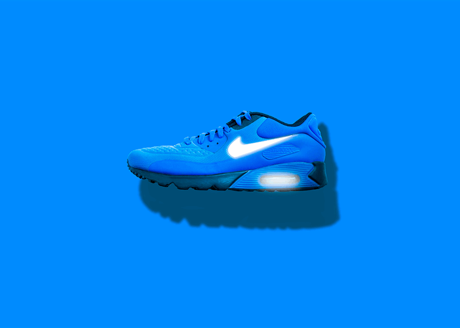
The well-known swoosh - that is, the comma used as the emblem of the Nike logo - was created in 1971 by graphic design student Carolyn Davidson. The logo was created for the company that was then called Blue Ribbon Sports.
One of the founders, Phil Knight, who was her accounting professor at the time, approached Davidson to design a logo inspired by the Adidas brand. He wanted a logo that encouraged movement. She designed several logo proposals and Knight chose the swoosh, a shape inspired by the wings of the Greek goddess Nike. Her wings motivated her fighters to be daring and courageous and when they won, they would say "Nike" to each other as a token of thanks.
Although Knight was not completely satisfied with the logo, his budget didn’t allow him to design another one and he figured he would grow to like it.
How much was Carolyn Davidson paid for the Nike logo?
Davidson was paid $35 for creating the Nike logo (or $2/hour), which she considered sufficient based on her work. She continued to work for the business doing as a designer until the job became too cumbersome for one person and was taken over by an advertising agency in 1976.
In 1983, Davidson was invited to a company executive dinner and was given a diamond-set ring engraved with the swoosh, as well as company stock, which has since more than tripled in value.
The Nike logo evolution over the years
In 1978, the logo’s font was changed to bold, capital letters. This logo was subsequently adapted in several colors, including red and blue. Most of the time, Nike uses its Swoosh logo in black.
The creators of Nike understood that the brand did not have to be restricted to the track category, but that it could expand to other sports. That's exactly what they did in the years that followed.
Minor graphic elements changes were added to Nike's visual identity, such as the Jumpman designed in 1984 for the Nike Air Jordan, which happens to be the silhouette of the basketball player, Michael Jordan. Below you can see the original magazine photograph that Nike used to create the logo. However, because of the photographer’s image rights, Nike had to recreate the photoshoot to avoid being sued.
Nike knows how to partner with sports celebrities to increase the recognition of their brand. Over time, besides Michael Jordan, they worked with Lebron James, Roger Federer, and Serena Williams.
We can't ignore the famous "Just Do It" slogan, which was added to the logo in 1988. This slogan is peculiar because it was inspired by a murderer who suffered the death penalty in 1976 and his last words were "Let's do it." Only the words "do it" were kept for the logo. Nike then launched an ad with the slogan "Just Do It" starring an 80-year-old runner, Walt Stack, showing that anyone can start sports at any age, you just have to do it ("Just Do It").
The Nike brand was quite identifiable by the comma swoosh, so they decided to get rid of the word "Nike," and the logo consisting of the Swoosh alone was introduced in 1995 and is still present today. When a logo goes from a combination logo to an emblem logo, it indicates that the company has a strong brand that is widely recognized. It is indeed one of the most iconic logos in the world. Whether it is on shoes or a t-shirt, the Swoosh symbol is still distinctive and memorable.
How do you get inspiration from the Nike logo to make your own?
First of all, don't go spending thousands of dollars to make a logo, your brand can be as successful as any other publicly traded brand. FreeLogoDesign is also here to help you for free.
Second, keep it simple. Choose different adjectives to describe your brand, and try to keep your visual message clear so it stays in the minds of consumers. Nike wanted a shape that represented movement and speed. All they needed was a curved line, a swoosh, as a symbol to represent their brand. Therefore, dare to use lettering and geometric shapes to create your new logo.
Lastly, take inspiration from what you see around you to create a slogan or a variation of your logo, even if it means creating an original story for the brand.
More tips and tricks on the blog


