Blog
Meaning and Evolution of the H&M Logo
If you were asked to name a Swedish company, chances are you'd say IKEA. However, this well-known furniture manufacturer is not the only popular brand to come out of the Nordic country. In fact, H&M is another flagship of Sweden. In this article, let us introduce you to the meaning, but also the evolution of the H&M logo over time.
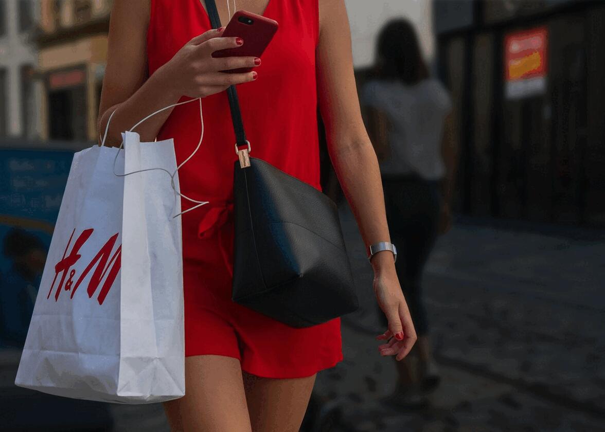
A few words about H&M clothing stores
What was H&M originally called?
Chances are you're familiar with H&M stores, but not necessarily with the company's history. It all began in 1947 when Erling Persson returned from a trip to the United States and launched his first boutique called Hennes, which means "she" in Swedish. Erling wanted to implement what he had seen in America and offer fashionable clothes at a competitive price.
In 1968, the founder acquired Mauritz Widforss, which specialized in fishing tackle. It wasn't hooks and rods that interested Erling, it was his collection of men's clothing. The company changed its name to Hennes & Mauritz, and then to H&M.
In the 1990s, H&M stores began to appear outside Scandinavia, and after a few years, they could be found all over the world, including the USA, France, Chile, and China. Over the years, the Swedish company has forged a number of partnerships with celebrities and designers and faced a number of controversies.
The first H&M logo
What does the H&M logo mean?
The first H&M logo was in fact the logo of the Hennes boutiques. At that time, Mauritz Widforss had not yet been acquired to create the H&M brand we know today. The Hennes logo was a signature logo, consisting solely of the company name. The whole thing was slightly slanted and in a script font, reminiscent of handwriting.

Hennes & Mauritz was founded in 1968, and a new logo was needed - what could be considered the first official H&M logo. First, the Hennes & Mauritz name was written on each side using an early, simple, and classic sans-serif font. Second, an acronym was used with the letters H&M in a circle in the center. For the initials, a script font was used. It was easy to recognize today's H&M logo.
The evolution of H&M's brand
Why is the new H&M logo design red? What about the font?
Unfortunately, the logo with the full Hennes & Mauritz name was not used for very long. In fact, H&M decided to use a simplified version as early as 1968, consisting only of the initials. Surprising that the H&M logo is over 50 years old, isn't it? The H&M logo is a very good example of a monogram logo, i.e. a logo made up of letters only.
As there are no icons on monogram logos, visual components such as the color palette and typography must be used to create a particular graphic style and convey the right message. In the case of H&M, the main brand color is red, because it's both a color associated with passion and youth and one that attracts attention. As for the font, a simple, yet effective and youthful script font was used. It's reminiscent of writing with a marker. Note that the '&' symbol is not the same size as the letters to emphasize the H and M.
You'd think there'd been no changes to the H&M logo since then, but there was indeed a slight redesign in 1999. Red remained the brand's main color, but there was a change in the font. The ends of the letters were straighter and the strokes slightly more pronounced. Even the '&' was improved. It all added up to an even more professional and legible look, which was a successful change. As well, this change came at the same time as the brand's worldwide expansion.
How to get inspired by Hennes & Mauritz when designing your logo
Now, if you want to create a logo, how can you make your emblem as timeless as the H&M logo? How can you draw inspiration from it?
First, it's important to point out that the H&M logo is relatively simple. A simple logo is less likely to become outdated quickly. In addition to simplicity, this Swedish brand has also kept a youthful look by opting for a color and font that convey its message well. It's also representative since the initials of the company's name are used as the basis for the logo.
Monogram logos are also a type of logo used by many fashion-related brands. So, if you're in the clothing or beauty business, this could be the logo style for you.
In conclusion, the H&M logo is another example of why it's best to opt for simplicity when creating your brand image. As we've seen here, a simple logo can be used for longer. It's up to you to decide which visual components you want to emphasize. If need be, take a look at our tips for creating a timeless logo. We wish you every success!
More tips and tricks on the blog

