Blog
The Origin and Evolution of the KFC Logo
Among the best-known American fast-food restaurant chains worldwide are McDonald's, Subway, and Burger King. However, one of them stands out from the rest by using their founder as the foundation of their brand image: KFC or Kentucky Fried Chicken. Let's take a closer look at the evolution of the KFC logo, and the history of their famous colonel and fried chicken.
A few words about KFC's history and restaurants
Who was the founder of KFC? Where did it start?
Harland David Sanders, better known by his nickname Colonel Sanders, has had many different careers and businesses in his lifetime. However, Harland has always had a particular affection for cooking. When he operated a service station in the 1940s, he finally had the opportunity to share his recipes with his customers and enjoyed his first culinary successes.
The first Kentucky Fried Chicken restaurant opened in Salt Lake City in 1952. The number of franchises soon exploded. As KFC opened in many countries, and particularly successful in Asia, Colonel Sanders was the face of the company to promote the chain. Unusual fact, China is home to the largest number of KFC restaurants today.
Several major changes took place in the 80s and 90s. First, the restaurants were bought out by PepsiCo. Later, the name was changed to KFC. Today, KFC employs thousands of people and serves millions of customers every year.
What does KFC stand for? What is KFC's real company name?
For those we did not know, KFC is an abbreviation for Kentucky Fried Chicken. Since the brand was more and more known around the world, the use of the full name became unnecessary. Indeed, three words for a company name can be considered as too long. Also, the letters can also change according to the country. For example, in Quebec, Canada, KFC is replaced by PFK to follow local laws.
The first Kentucky Fried Chicken logo
What does the KFC logo mean?
As mentioned earlier, Colonel Sanders has been the foundation of KFC's brand image since the very beginning. The first logo for Kentucky Fried Chicken restaurants was a combination logo, a type of logo consisting of both the company name and an icon. In this case, the icon is the portrait of the founder. The whole thing is quite simple: in this version, only black and white are used.

Let's move on to the font used. The first KFC logo used a sans-serif font, rather decorative with a cartoonish edge. The intention here was to show that the restaurants are for families, accessible to all. This KFC logo was used from 1952 to 1978.
The evolution of the KFC brand over time
Almost 25 years after the creation of the first restaurant, KFC was redesigning their logo and brand. The changes were far from drastic, but rather an update. The colonel's head icon was still present but moved to the left. Then, the name of the chain was moved three lines to the right. The most important change was the font, which was modernized and with a serif font, no doubt to show that this was a well-recognized fast-food restaurant chain.
From 1991 onwards, a number of important changes were introduced, including a new KFC logo that was very different from the last two. First, the name on the logo changed to the acronym KFC. A serif font with capital letters was used. Colonel Sanders' head stayed on the right. The biggest change was the use of a new color scheme. Red, white and blue were now used for the logo, brand and the various products. From then on, red became the main color of the KFC logo and brand.
A new redesign took place in 1997, and this time the focus was on the portrait of the founder element. Not only the head, but also his shoulders were used. The colonel was shown smiling and friendly. As for the palette, blue was used for shading, while white and red remained the predominant colors. Finally, the letters KFC was added in the lower right-hand corner.
Ten years later, the logo was updated once again. The blue disappeared for black, one of the original colors of the KFC logo and brand. The colonel was given an apron and a more modern look. In 2014, however, the whole thing was simplified and only the head of Colonel Sanders with KFC remained, in black and white. It was reminiscent of early Kentucky Fried Chicken logos.
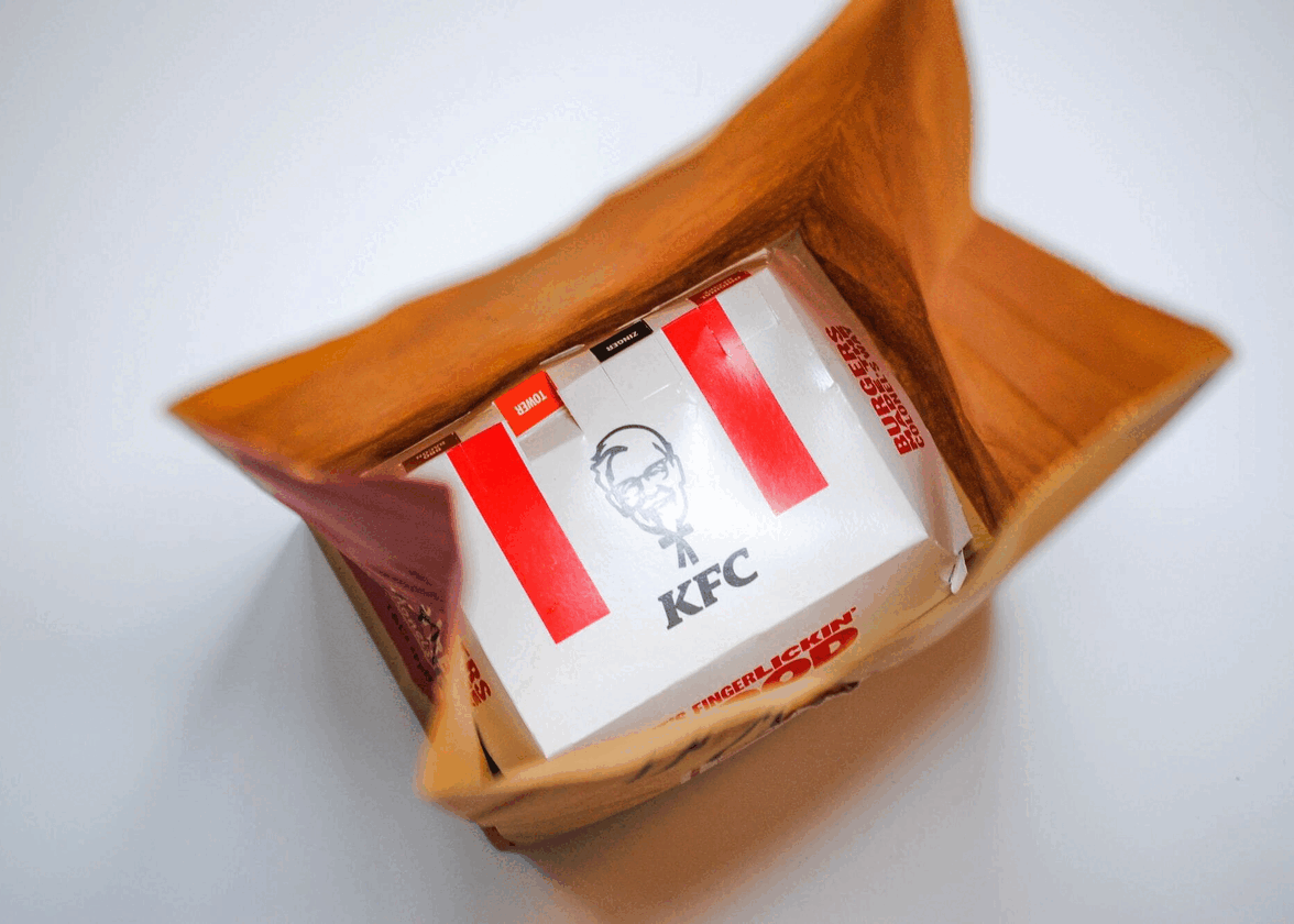
The latest update to the KFC logo finally came in 2018. The colonel's head and the names of the restaurants were still there, but everything was now displayed in a rectangle reminiscent of chicken barrels. Two red stripes were also added to the side to accentuate everything and give a little retro touch to the brand in general.
How to be inspired by the KFC emblem when designing your custom logo
Now, how can you get inspiration from KFC restaurants when creating your logo? The first step should be to ask yourself what component you want to promote. In this case, the foundation of Kentucky Fried Chicken is Colonel Sanders. The portrait of the founder has appeared on every KFC logo. It's certainly a way of standing out from other fast-food restaurant chains.
Next, if your company name is long or well-known to your clientele, why not use an acronym or monogram logo? Many companies have done this in the past, and it may give you more flexibility with your logo. Also, if you're looking to redesign your brand, don't hesitate to be inspired by what's been done in the past and older versions of your logo. As well as creating a guideline in your brand evolution, this could allow you to play with a nostalgic side. Retro has very much been in vogue in recent years.
In conclusion, Kentucky Fried Chicken restaurants certainly have a unique and representative brand image, two important characteristics of a good logo. Thanks to this, Colonel Sanders and its secret recipe is still known around the world, many years after the opening of his first restaurant. Why not use yourself as the face of the brand when creating your next logo?
More tips and tricks on the blog

