Blog

Brand Logo Evolution: When Is the Right Time to Refresh Your Brand Logo?
Thinking about your company's brand logo evolution could make a massive difference to your bottom line. Over the years, consumers change, and as your customers grow, as should your brand. However, knowing how to refresh your brand logo correctly is important to make a positive difference to your audience. Today, we'll go over what you need to know when starting your logo refresh. We'll review the dos and don'ts of choosing a new logo, how to choose the right timing, and what a new logo could mean for you and your company.
Brand Logo Evolution Questions to Ask Your Brand
Before you jump headfirst into hiring a professional to redesign your brand logo, it's important to answer a few questions first.
These will help you better understand whether it's time for an actual brand logo overhaul or if you should focus on other aspects of growing your brand.
Q1. Has your demographic changed?
One of the top things every company needs to keep an eye on with its growth is its demographic. Over time, your target audience will likely change; if that's the case, a logo redesign could be in order.
A nice and refreshing logo can help capture a larger chunk of your target audience, allowing you to connect with them deeper.
For example, if your company initially focused on teens and your products or services have shifted to young adults, a logo refresh is ideal. You can appear more versatile, fluid, and modern, which your audience will surely appreciate.
Q2: Is there new competition on the horizon?
Another key area to keep apprised of as a business owner is your competition. It can be helpful to check up on your top competitors once in a while, as you might find some interesting information.
It's far too common for businesses to fall behind their competition because they refuse to change and innovate like up-and-coming new brands.
If you've begun to notice that brands with a competitive edge are on your coattails, it's time to change the design style of your previous logos. You'll want to stand out against newcomers and make your brand seem fresher on the market.
Q3: Do you feel like your logo looks outdated?
No one knows your company better than you, and if you feel like your logo is outdated, it likely is.
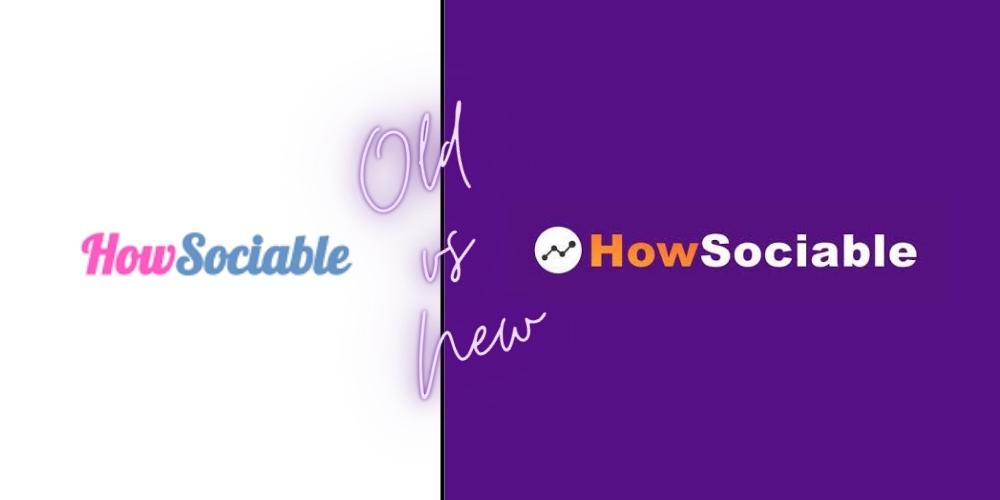
Things have likely changed since your logo was first designed, especially if you're a legacy family-owned business. It's always best to stay ahead of the curve so your customers don't feel your brand is as old as it might be! Just like HowSociable did!
Q4: Does your logo still represent your brand?
No matter how stuck in our ways we are, companies change over time to adapt to the market. If you look at your company, you might find the current version of your brand is a lot different than your original concept.
That said, you'll want to ask yourself whether your logo still accurately represents your brand or if it's time for a complete overhaul.
Did you know that 75% of customers identify a brand from its logo? If your logo doesn't accurately represent your brand, then it's time for a change.
Q5: Do I want to pay homage to the past?
The history of your company is important to remember, especially as it helped you get to where you are today. As such, you might want to use your previous logos as inspiration for designing your new logo.
Take Morton Salt as an example; their new logo pays homage to their older logo but with modern updates.

For many businesses, it can be beneficial to give the nod to your previous logo if it is truly identifiable with your brand. It's also a great way to retain a larger portion of your loyal audience, as many prefer brands that consider the cherished brand history.
That said, it depends on the type of rebranding you're interested in.
Are you looking to break away from your past completely, or do you want to simply make an improvement?
What Are Signs It's Time to Change Your Company Logo?
Once you've decided that you're ready for a branding refresh, the next step is planning the branding update. Knowing when's the right time to transform your company materials can be challenging.
Let's jump into a few common signs it's time to change your branding development.
You Created a DIY Logo
DIY logos can serve you well when starting as an underground business. However, as you begin diversifying as a brand, it's time to consider beautiful brand identities developed by professionals.
It's pretty easy for a consumer to tell whether a brand worked with a professional to create their company profile and logo or if they did it themselves.
The last thing you want is your company to be associated with poor graphic design and stock images. That said, if you're the owner of a DIY logo, there's no better time than now to focus on a complete rebrand for your logo design.
You're Looking for a Rebrand
One of the most common times people consider changing their dynamic content is when they're jumping into a complete rebrand. As a part of your comprehensive brand update, there's nothing better than refreshing the entire look of your company to stand out in your competitive market.
The first thing to consider is changing your logo, allowing you a fresh start in the market. Not only can a logo change appeal to your existing customers, but it can also help you attract a new audience.
Potential customers might think your brand is new and innovative rather than an existing company. It's a phenomenal option to feel like a new company without starting a new one.
Your Logo Is Too Busy
Business with a logo tends to work against brands more than working for them. That is why 76% of brands use one or two color tones in their logo design, making it more appealing to audiences.
In fact, 95% of the top 100 brands in the world never use more than two colors in their logo design.
That said, having a logo with a busy art style and obnoxious color schemes can be incredibly damaging to your brand. You'll want an original concept with a straightforward, easily identifiable style.
For example, the red and white of the Coca-Cola logo and the blue and yellow branding of Walmart.
Your Web Traffic Has Plummeted
Keeping an eye on your target audience can be challenging unless you have access to accurate metrics.
What is the best place to check for said metrics? Your website.
Your company website is packed with valuable information, such as the number of visitors your site attracts. If you've begun to notice a huge slump in your digital performance, it could mean it's time for new marketing campaigns, including a logo redesign.
When you use the help of a branding doctor, you can easily attract more traffic to your website and socials.
Your Audience Says So
If there's one thing you can guarantee as a business owner, your customers will always give their opinion. If you've begun to notice your audience is suggesting you change your branding efforts, it could be time for an update.
It could even help to host a poll to get your customers' input before you begin a comprehensive overhaul. This type of market research can be invaluable, as it gives you insights into what your audience wants from your brand.
It can also help you focus on a dynamic content structure rather than falling victim to a boring, average rebrand.
How Do I Design a New Brand Logo?
Making an impact on your target market, especially in American markets, can be challenging without a distinctive and iconic logo. As such, it's best to have industry-leading tips to help you get started with your logo refresh or redesign.
Let's explore a few must-know tips to help you dive into the brand logo evolution or logo redesign field easily.
Work With the Pros
As a professional company, it's best to work with branding experts who can give their professional insights into your branding initiatives. From there, you can begin finding the right color combinations and design styles that effectively capture your company's culture and image.
There's nothing more valuable than working with people who are experts in their craft, allowing you to make a massive mark in your hyper-competitive market.
With their expertise, your logo will pay close attention to trends like many of the most famous brands. You'll also be able to use their expertise across your marketing branding.
For example, if you change your company logo for your social media profiles, you'll also need new logos for your business cards, merchandise, and product packaging.
Decide Between a Rebrand or Refresh
Although they might sound similar, there is a considerable difference between a rebrand and a refresh.
With a rebrand, you'll be building a new logo from the ground up. This is often recommended for companies that want to separate themselves from an old or tarnished image of their existing business.
With a refresh, you'll keep many of the fundamentals of your existing logo but simply update it. For example, you'll stick to the same logo colors and general design but perhaps change from an all-caps design to a lower-case font.
For many companies, the choice between a rebrand or refresh mostly depends on budget, as a rebrand requires you to change the logo on all company-related products. Not only is this costly, but it can also take a lot of time to implement.
With a logo refresh, you can choose where to display your new logo and where to keep your existing logo. For example, if your website isn't as popular as your social media profiles, you can use your new logo on your Twitter and keep your older logo for your site.
Choose the Perfect Color Scheme
One thing to note when designing a new logo is that colors are the most important visual to pay close attention to. Up to 90% of customers suggest that their opinion of products is based on color alone.
That said, you will want to ensure you're making the right choice for market positioning.
First, it's important to consider the emotions you want to evoke from your branding, although when working with a professional brand doctor, they'll likely have this knowledge.
A few examples include the following:
- Purple: Often associated with mystery, royalty, and creativity
- Blue: Generally represents reliability, loyalty, and honesty
- Green: Typically known to represent wealth, abundance, and nature
- Red: Usually associated with danger, passion, and anger
Ideally, you want to choose colors that represent your brand and your products. You may also find that specific colors relate to your target audience more than others, making them an easy pick.
Do Market Research
With all the dynamic content you bring to the market, you must get your audience's opinion before releasing it to the general public. This is where market research, like focus groups, can become incredibly helpful.
By bringing your new logo to a percentage of your target audience, you can clearly understand what they like and don't like. Using this valuable input, you can refine the quality of your company logo to reflect what you have to offer better.
The best part is that you can get your customer's insights for a low cost, as focus groups are quite affordable. You'll be able to refine your logo until it perfectly captures your audience's attention before bringing it to all of your marketing materials, like emails.
Decide on Logo Features
Undoubtedly it's important to decide on the specific logo features you want to capitalize on when designing or refreshing your logo. The most important factors to consider are the following:
Logo Type
One important factor to go over with your professional branding doctor is the type of logo you want to change to. The majority of Fortune 500 companies use either letter marks (5%), emblems (2.4%), wordmarks (31%), or a combination (61%) in their logos.
Font
Interestingly, your font choice is another major thing to note when designing a logo.
Certain fonts, such as Serif (luxury brands like Prada) and Sans serif (tech companies like Facebook), seem to be the most popular. Other common choices include Helvetica, Bodoni, Open Sans, and Cursive.
When choosing a font, you must make a choice that will relate directly to your brand image. You'll also want to choose a recognizable font that doesn't take away from the other elements of your logo.
Imagery
The imagery in your company logo is the third most important thing to keep in mind.
The right image could become the most recognizable part of your branding and contribute to evoking the right emotions in your audience. For example, 88% of adults immediately recognize Shell's and McDonald's logos.
What Are Some Examples of Successful Logo Redesigns?
Surprisingly, some of the world's most popular brands underwent logo refreshes this year. Here are a few examples of fantastic logo redesigns you'll recognize:
Sprite
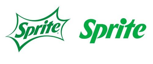
Sprite is one of the fascinating brands on this list because it had a logo rebrand and an entire packaging rebrand.
As one of the most popular beverages Coca-Cola Group produced, their rebranding was a surprise. Not only did they strip down and modernize their existing logo, removing the background imagery, but they also changed their bottles from green to clear.
If there's one thing to be said about Sprite's rebrand, it brings a new visual appeal to the table. Simple changes to the logo's font put forth a new and refreshing look for the brand.
M&Ms
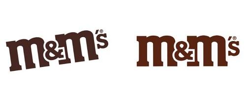
M&Ms is another great example of a popular brand that made a slight shift in branding that makes a world of difference. By straightening their logo and brightening the color, M&Ms completely changes the perspective of their logo.
With subtle changes, your eyes now focus on the ampersand, a subtle design element that's iconic to the M&Ms brand.
Baskin Robbins
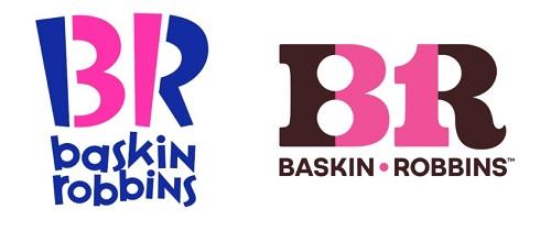
If you want an example of a massive difference, Baskin Robbins' update to their existing logo is as close to a rebrand as possible.
Their stylistic updates to their branding are far more attractive to a larger audience, ditching the original retro style of their old logo. That said, they didn't forego their past entirely.
With the new logo, Baskin Robbins' new primary colors are pink and brown, the two colors used in their original marketing campaigns in 1953. Returning to their original roots, they're maintaining their family-friendly image while simultaneously refreshing their look.
There's No Better Time to Refresh Your Logo
If you've found that your company is falling behind in your creative competition, it's time to consider refreshing your logo.
Whether it's by changing your capitalized typography, focusing on 3D design trends, or returning to your roots, the options are endless. Work with a branding specialist today for you brand logo evolution needs and design the perfect logo that captures your brand today.
Author Bio:
Uday Tank is an astute business enthusiast with more than eight years of experience helping businesses reach their full potential. He is the owner of Rankwisely, providing invaluable support & services for businesses to leverage SEO, content marketing, keyword research, and Link Building to 25x their marketing ROI.
More tips and tricks on the blog


