Blog

The Importance of Spacing When Creating Your Logo
If you want to create a logo, you already know that there are several things to consider: colors, logo type, fonts, etc. Another component that can also make a difference is spacing. For this, we only have to think of the redesign of the ZARA company logo which reduced the space between the letters of their logo. In short, today we take a closer look at the importance of spacing when creating your logo.
What to consider regarding spacing
First, what exactly is spacing? According to the dictionary, this is the distance between two components. When creating your logo, you can play with spacing to create different effects. Do you want to create something sleek or with several components in a small space? Spacing can become very important if you decide to use a type of logo that has only letters like a monogram or signature logo. Since there is no icon, the spacing, along with the font and color, can help you create a specific style.
Right now, logo trends revolve around simplicity and minimalism. Therefore, be careful not to weigh down your logo with too many components to avoid an overloaded effect. You must also be able to read the name of the company easily, so remember to have sufficient spacing between letters and words. Let's take a closer look at the different ways to create spacing when creating your logo.
Spacing between letters
First, there is the spacing between the letters. When you create your logo, you can decide whether to have a lot of space between the different letters or not. As we just saw, it is important that the name of your company remain clearly legible, regardless of how you display it.
One company that has played a lot with the spacing between the letters is the Spanish company ZARA. ZARA has always had a wordmark type logo, consisting only of the name of the company. In 2008, during a redesign, the space between the letters was increased. Then, in 2019, it was the opposite; the letters overlapped. At the time, this redesign was criticized; however, it is important to mention that there was still brand continuity as they kept the serif font. Hence, the importance of choosing the right font if you want to play with spacing.
Spacing between words
Then, after spacing between letters, there is the spacing between the words. If your logo is composed of several words or the name of your company has a slogan, it is important to take into consideration the space available between the different components. To get started, ask yourself which word on your logo is the most important. It is relevant if it is bigger than the other words.
Here's a little trick to help you find the perfect sizes for your logo: use the golden ratio, which is 1.618. This number is used in several fields, be it architecture or design. When creating your logo, multiply the size of your slogan by 1.618 to determine the size of your company name. If you don't have a slogan on your logo, you can use this number to determine the size of important components or amount of space in your logo so that you maintain a nice balance.
The spacing between the different parts of your logo
If you decide to create a logo with several parts, such as a combined logo, you should also think about the space between the different components. One of the mistakes we frequently see when logos are created by our customers is that they have too much or not enough space between the different parts of their logo.
So, how do you make sure that there is enough space between the different parts of your logo? First, start by asking yourself if all the components are necessary and bring value to your logo. Next, try playing with the rule of thirds, another very popular design rule that involves separating your creation into three equal sections. Also, try to keep the spacing between the different components the same size for consistency.
How to play with spacing in FreeLogoDesign
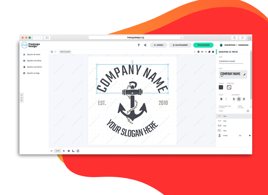
If you have chosen to use the FreeLogoDesign maker to create your logo, we have different tools at your disposal for you to manage the spacing. For example, at the bottom is the option to add various grids.

Letter spacing
First, how to play with the spacing between the letters. It's easy. In the editor, click the text. On the right are different customization options, such as color, alignment font, and spacing between the letters. You only have to increase the amount of spacing for more space between the letters on your logo.
Spacing between parts of your logo
Now, how to play with the spacing between the different parts of your logo. As the FreeLogoDesign maker uses the drag and drop functionality, you only have to click on one of the components to move it. If necessary, use the different rules at your disposal to help you create a well-balanced logo. Don't forget the golden rule and the rule of thirds!
In conclusion, spacing is one of the things to keep in mind when creating your logo. Are you looking for a particular style like ZARA or are you aiming for a more accessible look like Google or Microsoft? Often, the font can make a big difference. On this subject, do you know which font to use for your logo? Is it better to use a font with or without serifs? Enjoy creating!
More tips and tricks on the blog


