Blog
The History of the Microsoft Logo
Along with Apple and Google, Microsoft is one of the largest and most powerful technology companies in the world today. At one point, everyone has used one of their many products, be it Windows, Word, the Xbox console, LinkedIn or Skype–just to name a few. Did you know that Microsoft has been around for more than 40 years? Do you remember the company's first logos or products? Let's take a trip down memory lane and look at the various Microsoft logos.
A Few Words About Microsoft
When you hear someone say Microsoft, you most likely think of its founder, the famous and wealthy Bill Gates. The company was founded in 1975 by Gates and Paul Allen in Albuquerque. They then specialized in the development and sale of computer programs for early computers and became subcontractors for IBM fairly quickly. Microsoft created its Windows operating system in the 1990s, and later they had other successes like Internet Explorer (for its time), the Office suite and games like Flight Simulator or the Encarta dictionary. Microsoft even bought the company behind the popular Minecraft game in 2014! Its revenue is more than 80 billion per year and the company employs more than 100,000 people worldwide.
The name Microsoft comes from two English words, microcomputer, and software. Initially, the company wrote its name with a hyphen, but it disappeared quite quickly for the version we know today. When you are looking for your company name, be sure to choose something simple!
What Is the Story Behind Microsoft's First Ever Logo and Brand?
How did Bill Gates come up with the original Microsoft logo?
Microsoft's two founders, Bill Gates and Paul Allen, were behind the company's first logo. The logo may have even been created from a programming language. It was made up of the company's name in a fairly original sans serif font and represents the 70s and the Disco years well. Several so-called concentric lines form the letters creating a depth effect on some. It is also the only Microsoft logo to be on two lines.
Do you like the retro style of the letters in Microsoft's first logo? If so, take a look at the Monoton font on the editor of FreeLogoDesign!
The 1980 Redesign: A rock star look for the new logo
In 1980, Microsoft decided to do the first redesign of its logo. This new brand image seemed to be directly inspired by the look of the heavy metal bands of this decade. This is a very different look from the first logo design. First, the name of the company was now written on one line and not two. Second, Microsoft relied on a much oilier font and on a more aggressive letter drawing with sharp angles–exploiting a lot of diagonals. The letters M, R and F also surpass the rest of the logo, strangely resembling the Metallica or Iron Maiden logo. Unfortunately (or fortunately), this Microsoft logo would only be used for 2 years.
In short, it is important to create a timeless logo so that you don't have to change it as soon as trends change! This is one of the top 5 reasons why logos need a brand overhaul.
The Arrival of Blibbet: another major design change
In 1982, the logo affectionately nicknamed the "Blibbet" appeared. Microsoft was moving away from its rocker side to a much more corporate look. First, the name of the company was in a very common sans serif font. The only thing that made this logo design recognizable was the horizontal lines in the letter O which resembled a CD. The O was also used alone as the company's symbol logo. This logo was apparently quite loved by Microsoft employees. They even made petitions to keep the "Blibbet" during the 1987 brand redesign.
The Pac Man logo, Used for More Than 20 Years
The longest-used Microsoft logo was created in the late 1980s. Nicknamed the "Pac Man" logo, the company wanted to show the strength and importance of their business market shares. The Helvetica font (in italics in our case), was chosen to create the logo. It is a well-known font and still widely used today. Unlike the "Blibbet" logo, there were no special features in the new logo. It is composed only of the company's name, except for a space between the O and the S. This seems to be a nod to when the company was called Micro-soft. It is an important part of Microsoft's logo evolution and history.
In 2006, Microsoft added their new slogan to their logo. In 2011, they changed their slogan. It is important to create a flexible logo that can be used in different contexts using creative thinking.
The Current Microsoft Logo Meaning and Branding
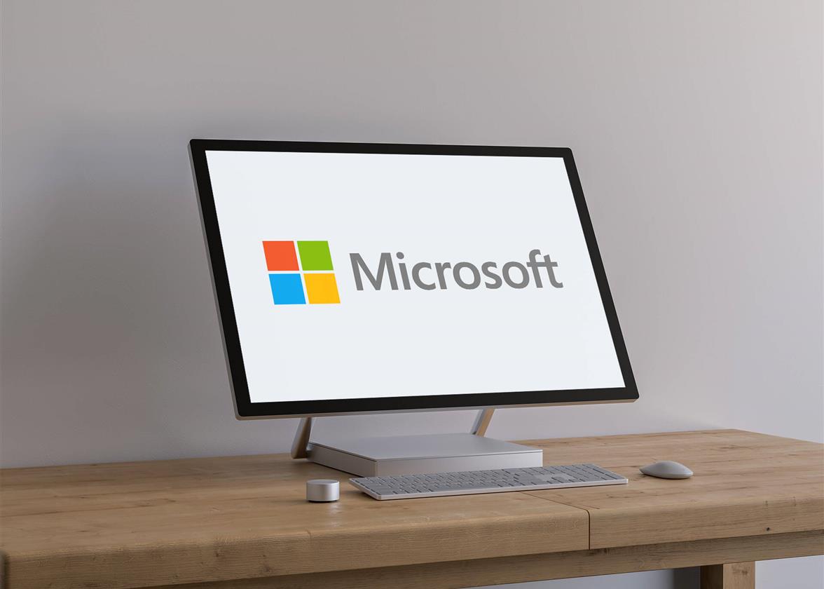
A major overhaul of Microsoft's logo took place in 2012. This logo, still used today, is the creation of Microsoft employees after several meetings. The bold and italic side of the previous logo disappeared to be replaced by the Segoe UI font. However, it is the addition of a colorful symbol that makes it so different from the other logos. Four squares of different colors form a window obviously reminiscent of Windows–one of the important products of the company. According to some, the Microsoft ecosystem was the main inspiration: the red square represents PowerPoint or the Office suite, the blue square for Word or Windows, the green square for the Xbox or Excel console and the yellow square for Outlook or Bing. In short, this logo seems to be here to stay.
Why is the Microsoft logo iconic?
The Microsoft logo may seem overlooked at first, but we believe it is iconic. Over time, their brand evolved according to the latest trends, but now they are strong enough to continue with their current branding. It is simple, modern and efficient. It also represents well one of their main products, Windows, while incorporating others like their Office suite. Nowadays, the symbol part of the Microsoft logo can be used alone, just like Apple, their main competitor.
Does it stand out? Not really, but it has this comfortable feeling of something we know and recognize.
In conclusion, why not ask your friends or employees for help when creating your logo? They will certainly give you a hand or give you constructive feedback. As you may have seen in this article, it can be tempting to follow trends when creating your logo. However, it is better to choose something timeless. If you need more inspiration, feel free to discover Amazon logo history.
We would like to thank Anthony Boyd Graphics for his incredible mockup.

FreeLogoDesign has nominated as one of the best free logo maker by Fixthephoto.com!
More tips and tricks on the blog


