Blog
The History of the Peugeot Logo
Many stories about automotive logos (BMW, Audi, Ford) have already been analyzed on this blog. Today, one of the oldest car manufacturer brands will have our attention: Peugeot. Where does the lion come from, which has survived for decades? What did the first logo of this French car brand look like? That's what we're going to discover!
A few words about the history of Peugeot family and origins
What nationality is Peugeot car?
In 1810, brothers Jean-Pierre II Peugeot and Jean-Frédéric Peugeot founded the French family business, Peugeot. The family embarked on the creation of products like steel, whether springs, coffee grinders, tools, etc. by transforming a mill into a steel mill not far from Montbéliard in eastern France and by accosting the Swiss border. In 1889, during the Exposition Universelle in Paris, the first motor tricycle was introduced. The automotive adventure then began for Peugeot.
Is Peugeot the oldest car brand?
Peugeot is indeed considered as the older car company. For example, among the older companies, Alfa Romeo was only created in 1910 and General Motors in 1908.
The first Peugeot logo and meaning
Why is the Peugeot logo a lion?
The first Peugeot logo was created in the 1850s. It was designed by Emily Peugeot and made by the goldsmith Justin Blazer. Of course, it is a tribute to the coat of arms of Franche-Comté, a French region where Peugeot was born. But it was also a tribute to one of the company's star tools: a saw. It was described as fast, sharp and flexible. These adjectives are also similar to attributes of a lion, "the sharpness of the teeth like that of the lion's teeth, the flexibility of the blade as an imitation of the flexibility of the lion's backbone, the speed of the cut in the image of that of a leaping lion''. This first logo was not used on automobiles, but on other company products.

The evolution of Peugeot's logos
In the 1920s, it was in fashion to have custom radiator caps with the emblem of the car manufacturer. Peugeot therefore followed the trend by sculpting a 3D version of their lion. Two versions existed. In 1923, the first one was created by René Baudichon and in 1927, the second one was created Maurice-Roger Marx.
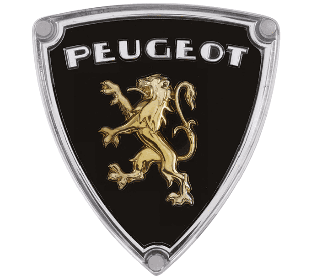
In the 30's, the radiator caps were gone and a lion on the hood was replaced by a 3D version with a 301 in the color of the French flag. In 1936, there was a new crest. Do you notice a difference in the lion? It seems that it became a lioness. This debate is still open.
However, this version would be confirmed because at the end of the 1940s Peugeot decided to change the gender of its ornament by putting a lioness. A new crest appeared with the presence of the lion of Franche-Comté.
Depending on the model of the car, the badge was different, however the lion remained the same.
In the 1960s, a brand-new lion was revealed. Peugeot decided to keep only the lion's head, taking out the body, like a zoomed-in version, where we got the impression that the lion had become more ferocious, ready to attack. It was topped with the name of Peugeot and in the shape of a crest.
Finally, in 1968, two new logos were released. What did they have in common? No more frame and name at the top, only a lion's head shape and the outline of the lion. This style made the lion more refined and less imposing, which was what are targeted as the new brand identity.
A few years later, in 1975, gold gradually disappeared to give way to silver. Peugeot decided to keep the shape of the lion of Franche-Comté but hollowed it out, naming it "the lion thread". This logo made its appearance following the acquisition of Citroën and Chrysler. It marks a certain return to the roots for Peugeot, a reminder of the previous logos.
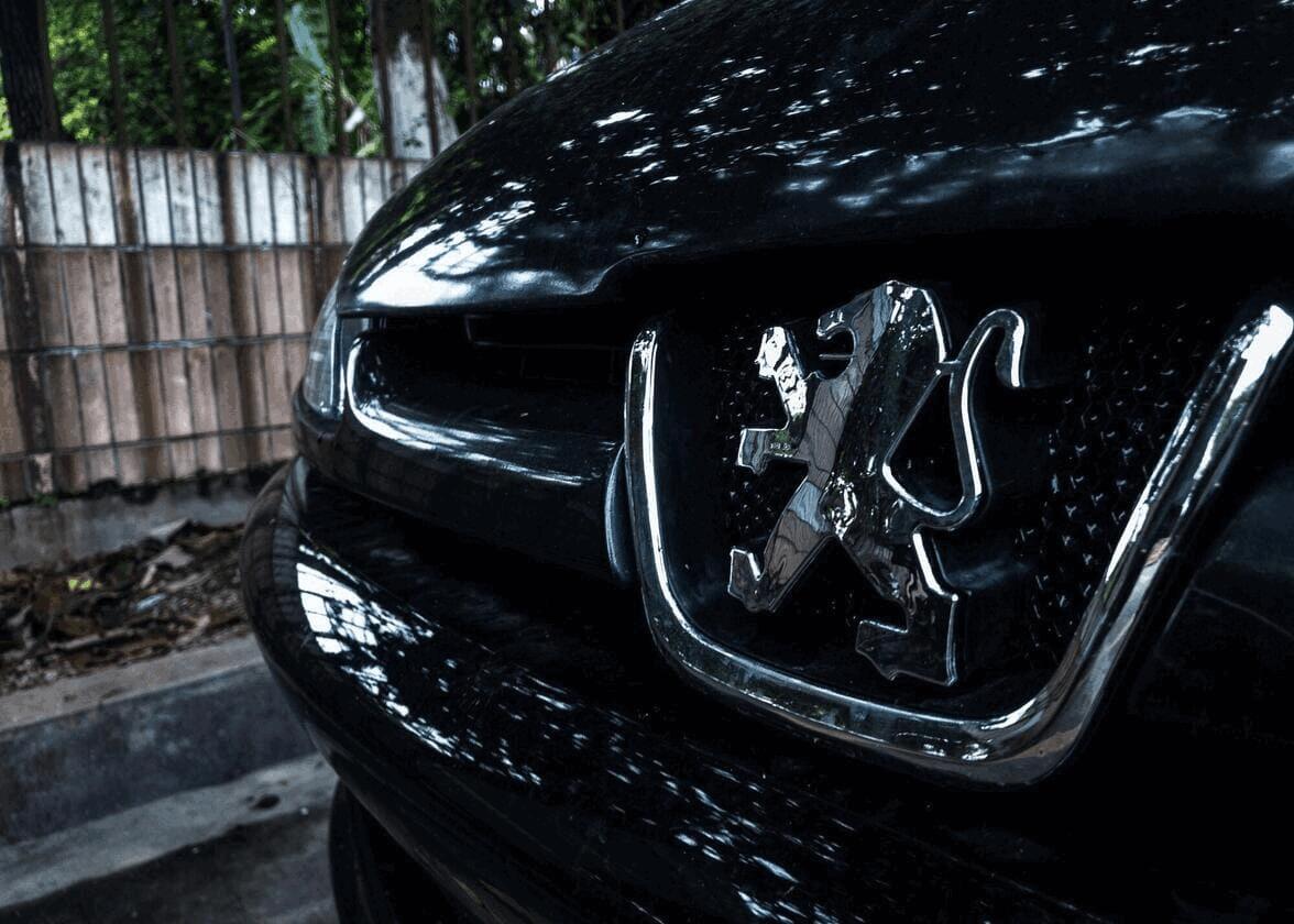
About 28 years later, Peugeot decided to modernize their 1968 logo, leaving out some details of the lion of Franche-Comté and making it more dynamic and bigger. This logo is often juxtaposed on a blue background.

This logo template would remain until 2021. In fact, in 2010, some modifications were made. The lion was both matte and shiny with even more depth.
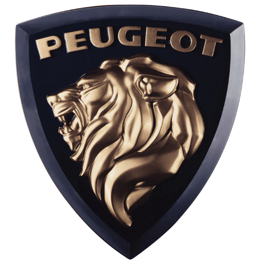
Recently, Peugeot set themselves a new challenge by wanting to modernize their brand and create a more contemporary style. The designers were inspired by the logo of the 1960s for this new identity. The logo is a black and white "flat" lion's head roaring, showing all its power. For Peugeot, this new logo "is a link between the brand's DNA and their vision for the future".

A feature of the Peugeot company is that they are very well positioned in the world of sportscars. Their different sportscars have won several cups around the world! The sticker placed on their cars is reminiscent of their logo from the 1930s!
How to get inspiration from Peugeot when creating your logo
The history behind the Peugeot logo and company is both rich and meaningful. There are several aspects that can inspire you when creating your logo. First, let's talk about the main emblem of Peugeot, a lion. It is the emblem of the company's home region. When creating your logo, consider the symbols associated with your region as insipiration. This was the case of the BMW logo , another important european car manufacturer: blue and white are the colors of the coat of arms of Bavaria, the place where the company was founded. In addition, blue has also long been used in the Peugeot logo. It should be noted that this is a color often associated with trust, but also with accessibility and reliability. It is therefore a very relevant color for the automotive world.
Interestingly, during the last redesign of the Peugeot logo, the company went from a combined logo to a coat of arms logo. This type of logo is often used by luxurious car brands like Porsche or Lamborghini. If you want to add a high-end touch to your logo, do like Peugeot and choose this type of logo. Again, the latest version is rather uncluttered, which fits well with current logo design trends.
Despite two centuries of existence, Peugeot has managed to remain brand faithful to their image and values. So, don't try to start your identity from scratch, just find a way to make it more energetic and modern by keeping your foundational features. This is one of the keys to successfully redesigning a logo.
More tips and tricks on the blog


