Blog
Inspiration to Create an Orange Logo
When creating your brand image, you will have to choose the colors that will represent you. Why not take the opportunity to use orange for your logo? Although it is a color not often used for company logos, it is a warm color with a potential that is often underestimated. If you are looking for inspiration to create your logo, here are some tips to use orange, what it means, and our choices for the most beautiful logos using this hue.
Why you should use orange for your logo
Blue and red are the most used colors for logos in general. If you want to stand out from your competitors or simply attract attention, why not try creating an orange logo? Before you start creating your logo or saying that few people like this color, do you know what the meaning of orange is? In our opinion, it is important to know the hidden messages of colors before making your final choice.
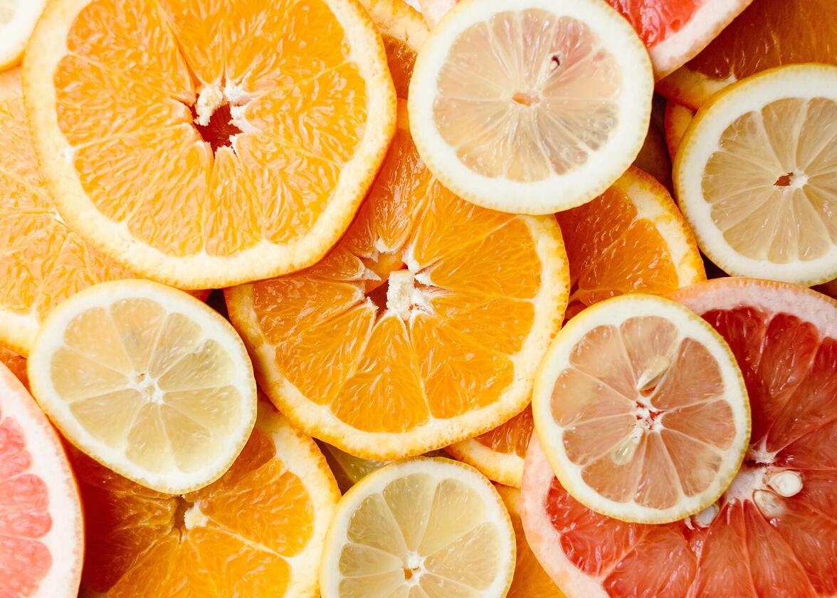
According to our page on the meaning of colors, orange is a dynamic warm color that is associated with entertainment, youth, and freshness. That is why this color is related to the food industry. Do not forget that several foods are orange: various cheeses, pumpkin, carrot, citrus fruits, etc. Orange can also be associated with the autumn season or with various religious movements such as Protestantism or Buddhism. Therefore, if you want to target a young audience or have a company in the food industry, it may be appropriate to use orange for your logo.
Some tips when using orange for your logo
Many claim that orange does not go with anything, but we disagree with this comment. We believe that all shades can be arranged harmoniously. So, how do you use orange in your logo?
First, since orange is a warm color that attracts attention, it may be useful to match it with more neutral or cool colors. This is why we often see white used with orange. You can also decide to use orange as an accent color to make a logo more dynamic. On the other hand, if you are looking for great contrast, you can use blue (especially a darker shade) with orange. Blue and orange are complementary colors. The result will certainly attract attention!
The most effective orange logos in our opinion
Just because we said above that orange is not widely used for logos, that does not mean there are no logos with this shade. There are plenty of logos that proudly sport orange. So, the FreeLogoDesign team decided to show you some of them that we think look particularly good.
The Home Depot
As we said before, the advantage of using orange is that it attracts attention. This is probably why it is a color often used in the world of construction and renovation. And speaking of renovation, The Home Depot is a great example. The image of this American company stands out by using orange everywhere: their logo, posters, and even their employees' uniforms.

If you like the color used by The Home Depot, you can use a similar shade called Safety Orange (F96302) for your logo.
Harley-Davidson
Now let's move on to the world of entertainment and adrenaline with Harley-Davidson. We should mention that this American company has a strong brand image and passionate customers. It is not uncommon to see their followers owning various products with the image of Harley-Davidson. Regarding the logo, it is a badge logo. It is the name of the company and Motor Company. Three colors with a lot of contrast are used: orange, black and white.

If you want to draw attention to the name of your company, you can do like Harley-Davidson and choose a different shade for the name on your logo.
The New York Mets
The world of sports is filled with wonderful logos and different color combinations. This is one of the areas where we find the most orange logos: for example, the New York Mets baseball team. Without a doubt, this logo is composed of the color orange, as well as blue and white.

Did you know that orange is a color associated with New York City? If you look at the official flag of the city, you will see orange, white and blue – as is the case of the Mets logo. But why? Simply because New York was once a colony belonging to the Netherlands, and orange is their official color.
Etsy
Just because you want to sell on the web doesn't mean you should put orange aside when creating your logo. When it comes to online sales, Etsy is one of the most important players right now. And guess what color their logo is? Yes, orange! Etsy's logo is relatively simple. It is a signature logo, which means that it is only of the name of the company. Perhaps the company chose orange to attract attention.

Note that Etsy uses different variations of its logo as needed. For example, you will notice that for their Favicon, the American company uses orange in the background with the text in white. Everything remains very harmonious.
In conclusion, we hope we have managed to encourage you to use orange for your logo. There are many beautiful logos that use this color and in several areas of business. If you want to learn more about the origin and meaning of this color, we invite you to take a look at our article: The color orange for dummies. Enjoy!
More tips and tricks on the blog


