Blog
Get Inspired by French Luxury Brands When Creating Your Logo
Dior, Chanel, Yves St. Laurent, Louis Vuitton, these luxury French brands do not need an introduction. No matter where in the world, these names bring to mind an image of expertise that has survived decades. Do you work in an aesthetic or artistic field? What can you do to make your logo exude the same refinement present in French luxury brands? What makes it so easy for these fashion companies to stand out?
Be Proud of Your Name
First, when you come across a list of the top French brands, you will notice that most simply carry the name of the creator as the company name. You will notice just as quickly that their logo is often a composition of the creator’s name. This type of logo is called a signature logo. It takes a certain amount of self-confidence to present yourself in such a way. However, if you work in an artistic field and you do high-quality work, why not use your name when creating your logo?
If you do not feel comfortable with this, you can also create a different version of your image from your name. Chanel did this with the two intersecting C letters. Givenchy as well with the inverted four G letters. The brands Louis Vuitton and Yves St-Laurent also created their logos from the first letters of their name which were then used to create their image. These logos are called monogram logos. In short, your own name or the name of your company can certainly be sources of inspiration when creating your logo. You do not necessarily need to add icons to attract attention.
A Logo Simple and Elegant
So, if you want to capture this notion of French class, think about using fonts both simple and elegant to showcase your name or the name of your company. Since there are hundreds of fonts available, we advise trying to find the one that will reflect who you are. Keep in mind not to take fonts that are a bit too farfetched unless it is part of your image if you want to be inspired by French luxury brands. Also, be sure to choose a font that is easy to read. Of course, try not to choose a font that is already used for a known logo. Another important point is to remember that you can play with the spacing of letters when creating your logo with FreeLogoDesign. This could give a very interesting look.
Serif or Sans-Serif?
Some people may ask if it is better to use a serif or sans serif font when creating their logo. Again, it depends on your values and your industry. For starters, sans serif fonts tend to project a more inclusive, simple and modern image. More and more sans serif fonts are being used for logo redesigns these days. For example, the Chanel logo is composed of a sans-serif font, but that does not prevent it from projecting a strong and distinguished image. The use of black also represents the company, because Coco Chanel was known for her little black dresses during her career.
Examples of sans-serif fonts on FreeLogoDesign are: Audiowide, Bungee, Chela One, and Nova Square
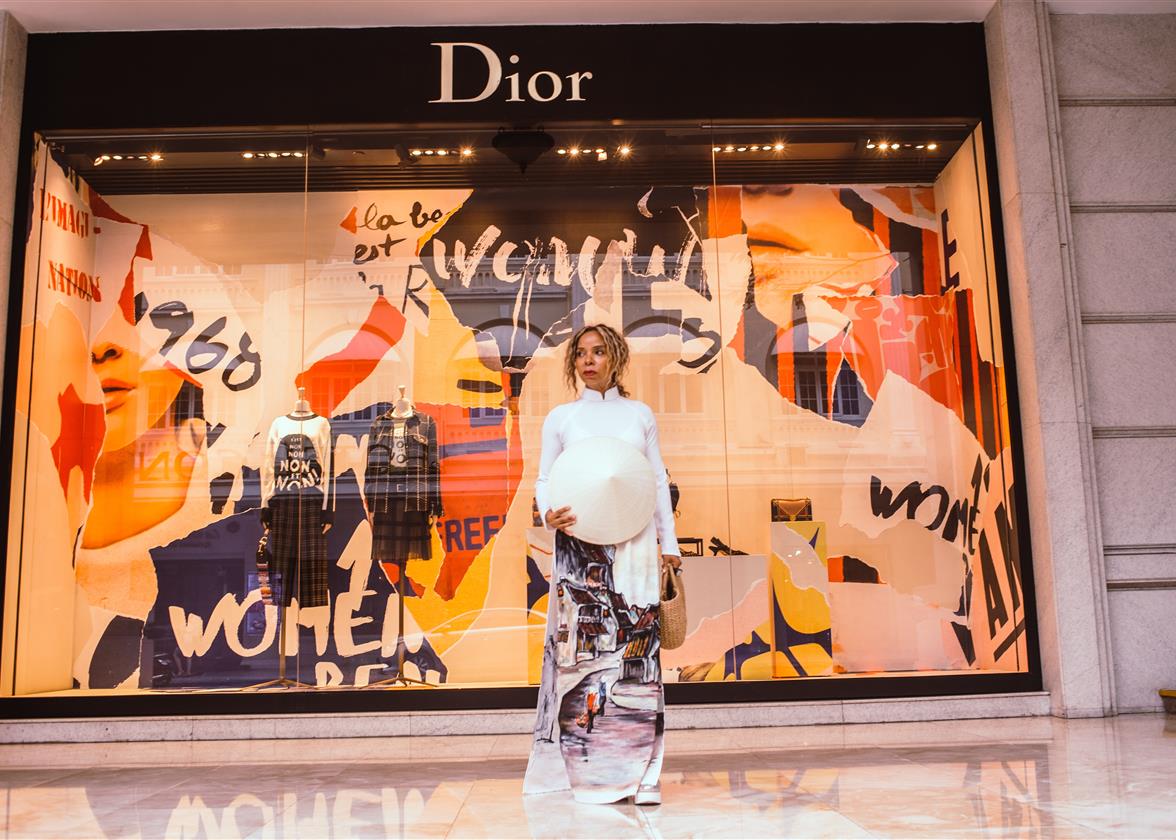
On the other hand, the brands Hermes or Dior have chosen to use a serif font over time. Serif fonts can add a touch of art to your text, which can add sophistication to your logo. If you want to give the impression that your brand has existed for several years, serif fonts can give you a more historical look than sans serif fonts. Serif fonts were originally created for the printing press for easy reading because of the imaginary boundaries that were formed by the serifs on each letter.
Examples of serif fonts on FreeLogoDesign are: Alice, Cinzel, Croissant One and Pirata
Do not Create Something Complicated
Finally, the last point you should consider when creating your logo is that you should rely on a simple logo that is not overloaded with details. Whether it is a logo of just your name or not, it needs to remain simple if you want to have the same feel as a French brand. Your logo should be easily displayed everywhere. Imagine it on the front of a store. Does it take all the space, or does it harmonize well with the rest of the decor? Also try to avoid using multiple colors or fonts. This could give a chaotic effect to your logo. In short, your logo must have that little touch of class. If necessary, do not hesitate to take the time to look at several logos of French luxury brands to inspire you. There are many of them!
In conclusion, we hope that this article brought you to Paris and the Champs-Élysées for a few moments. French luxury brands have always been known to have a little je-ne-sais-quoi. When creating your logo, try to keep in mind the use of a strong font that will represent your values. Are you daring enough to put your name in the foreground? Why not? Feel free to send us your best creations!
More tips and tricks on the blog

