Blog
Should You Use Uppercase or Lowercase Letters for Your Logo?
If you decide to include your company's name in your logo, one of the things you need to think about is finding the right font. Fonts can give your emblem a distinctive look. Another important point to consider is whether you should use uppercase or lowercase letters. This component, which may seem insignificant at first glance, can also help you achieve a precise style and meaning. Let's take a closer look.
Why is it important to think about whether or not to use capital letters and alphabet?
Lowercase or uppercase: what is the difference and meaning?
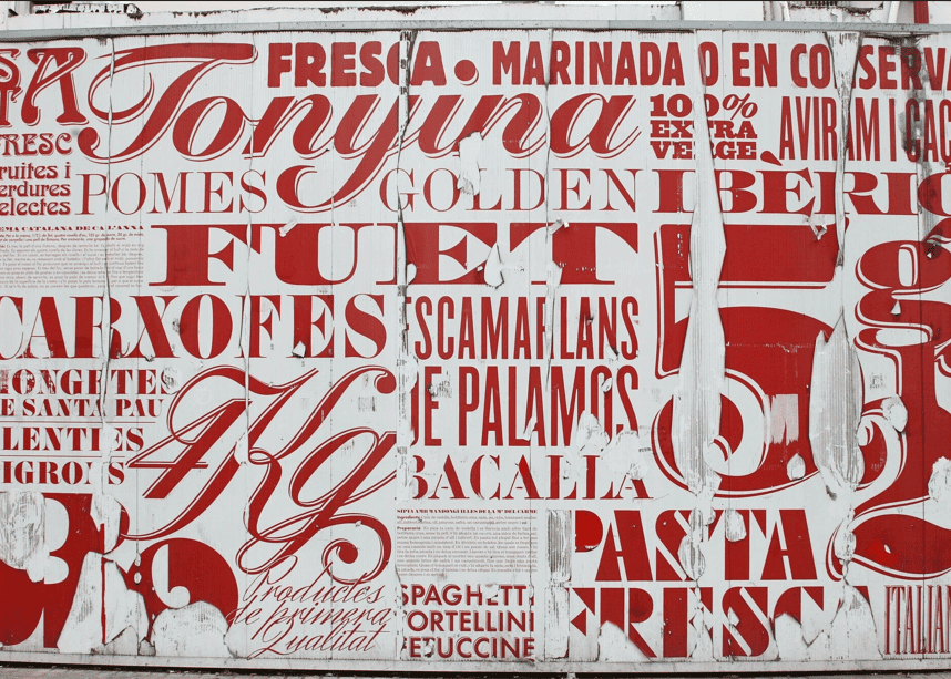
In the world of written language, letters come in two distinct forms: lowercase and uppercase. These terms refer to the size and style of alphabetic characters. Uppercase letters, also known as capital letters, are larger and typically employed at the beginning of sentences as the first letter, proper nouns, and for emphasis. They stand tall and assertive, commanding attention.
On the other hand, lowercase letters are smaller in stature and are generally used for the majority of text. They gracefully flow together, forming the body of words and sentences. Lowercase letters are the workhorses of written communication, carrying the message with a subtler presence; however, please note that these letter rules are for English. The use of lowercase and uppercase letters may vary with other languages.
In other words, should you choose upper or lowercase letters for your logo? It all depends on your corporate values and message, but also on your font. Some fonts are only available in upper or lower case. Some can have different looks or effects, depending on the option you choose. That's why we recommend you take the time to find the perfect font and try it out several times.
Use only capitalized letters or characters
If you've opted for a signature or combination logo, why might it be interesting to use only capital letters? There are several reasons. You may also have noticed that many luxury brands use only uppercase letters for their branding.
Uppercase letters can be used other than for first letters only; for example, several brands using acronyms or proper nouns chose this option. It can also be a relevant option if you want to use individual letters in your design. Capital letters give the effect of both grandeur and seriousness. So, if you're in a more traditional field, or want to boost your credibility, using capital letters could help you send a strong message. If you want to use only capital letters for your logo, we recommend fonts such as Alice, Amarante, Arsenal, and Cinzel.
What is an example of a logo using uppercase letters?
More and more companies are opting for uppercase letters for their redesigns. Let us give you two examples that we find particularly interesting and successful.
Chanel
The Chanel logo is timeless and reflects the image of its creator. First, it's important to remember that Gabrielle Chanel was particularly fond of two things: simplicity and black. Then it's hardly surprising to see these two elements in both her logo and her brand.
Chanel opted for a sans-serif font. All the letters are also capitalized. As these are luxury garments, the use of uppercase letters adds to the brand's upscale message.
Volvo
Not all logos with uppercase letters have chosen to use a sans-serif font. In fact, Volvo has opted for a serif font from the very beginning for its logo and branding.
Given Volvo's reputation for offering robust, high-quality vehicles, it's not surprising that they chose to use only uppercase letters to emphasize this. Otherwise, contrary to what you might think, the symbol on the Volvo logo isn't there to represent masculinity, but iron, because iron is of the highest quality in Sweden.
Make a logo using only lowercase letters
Now that we've seen uppercase letters, why should you choose lowercase letters for your logo instead? To start, lowercase letters have a softer, more accessible feel. So, this could be an interesting option if your products or services are aimed at everyone.
Also, if you work in less serious fields or if your target clientele is children, lowercase letters are used more often. We should also point out that lowercase letters are increasingly chosen by modern companies and those in the technological field. If you want to use only lowercase letters for your logo, we recommend fonts such as Alegreya, Erica One, Italiana, and Spartan. Remember that the first letter of your company name needs to be in lowercase, too, to get the right style. Even the slogan phrase placed under the logo could be all in lowercase letters.
Some examples of logos with lowercase letters and text
Despite that you might think, many companies have chosen to use only lowercase letters for their logos. So let us give you two examples that we find particularly interesting and successful.
Facebook
Tell us, what's the most popular social network on the planet right now? It's definitely Facebook. As it's a platform for everything, it's hardly surprising that Facebook has chosen to use only lowercase letters, even for its Favicon. It has to be as accessible as possible. Another component that demonstrates this commitment is that Facebook has chosen blue as its main color. Blue is considered one of the most popular colors among the general public.
Airbnb
Another good example of a logo using only lowercase letters is Airbnb. Once again, this is a platform that wants to appeal to everyone. When it was redesigned, Airbnb opted for a look that was both accessible and modern, although the latest version also used lowercase letters.
To stand out, however, Airbnb didn't choose blue as their main brand color, but coral pink. A similar hue was also named Pantone's Color of the Year for 2019.
In conclusion, is it better to use upper or lowercase letters when creating your logo? As we've seen, it all depends on the look you want. If you're aiming for a more serious, traditional or high-end market, capital letters are more common. On the other hand, if you want to appeal to everyone, or are in a more playful field, lower-case letters would be better. It's up to you to decide what works best with your chosen font and style guide. Have fun creating!
More tips and tricks on the blog

