Blog

The Meaning and Evolution of the Ferrari Logo
If you could buy any vehicle you wanted, what would you get? A Tesla electric car? A Mercedes? Or would you prefer a BMW? How about an Italian car like a Ferrari? Having already analyzed the branding of several car manufacturers, let's take a moment to discover the meaning and evolution of the Ferrari logo.
A few words about Ferrari's history
Becoming one of the most-known Italian brands
Ferrari is an Italian carmaker renowned as much for its luxury cars as for its participation in Formula 1 racing. Initially, Enzo Ferrari worked for Scuderia Ferrari, the Alfa Romeo team, but following a dispute, he decided to create his own team to take part in various races. That was when, in 1939, Auto Avio Costruzioni was founded.
However, it was only after the Second World War that the first real Ferraris saw the light of day. Enzo Ferrari had only one objective: to gain revenge and beat Alfa Romeo by creating high-performance racing cars. The result was a long list of victories for Ferrari, including several in Formula 1.
The first Ferrari emblem
Why is the Ferrari logo a horse? What do the letters SF mean?
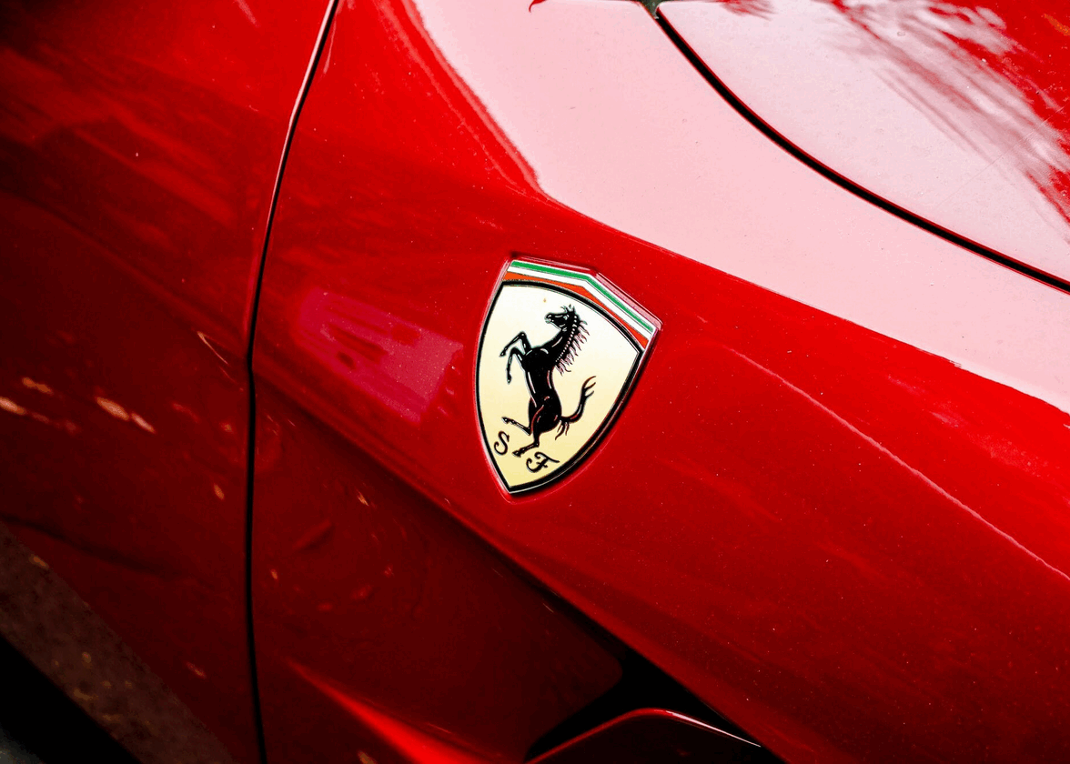
The first Ferrari logo dates back to the days of Scuderia Ferrari and Alfa Romeo. The Ferrari logo was recognizable by its black prancing horse, but what is its origin? Despite what you might think, the horse is not the symbol of Modena, Enzo Ferrari's birthplace.
The prancing horse, or Cavallino Rampante in Italian, is said to be a tribute to the Italian pilot Francesco Baracca, who fought in the First World War. This war hero decorated his plane with a black stallion. In 1929, Enzo Ferrari decided to use this animal as his main emblem.
And why yellow as the main color? Simply because yellow is the color associated with Modena. It's also a color associated with luxury and wealth. You'll also notice that the three colors of the Italian flag are added above the logo. Finally, the first Ferrari logo features the letters S and F in a decorative font as a reminder of the Scuderia Ferrari racing team. Ferrari also opted for a badge, a coat of arms type of logo throughout its history.
The logo of Auto Avio Costruzioni
A new black stallion crest for a new company
As mentioned above, when Enzo Ferrari left Alfa Romeo, he founded a new stable, Auto Avio Costruzioni. However, due to contract obligations, he was unable to use the Ferrari name for some time.
There are several similarities between the first Ferrari logo and that of Auto Avio Costruzioni. Firstly, the type of logo chosen remained a badge. Then there was the black prancing stallion, although in this version the animal was inverted and has wings. A nod to the Italian flag is always present, as is Modena yellow to represent the founder's origins. It's easy to see that the original Ferrari logo was the inspiration for the Auto Avio Costruzioni logo, albeit using the components in a different way.
The evolution of the Ferrari symbol over the years
After the war, Enzo Ferrari was finally able to launch Ferrari and use the team's original badge logo. Unlike the first logo, which was in the shape of a shield, a new version was created in 1947 using a rectangular shape. The black horse, the use of yellow, and the Italian flag were still present, but the letters S and F were replaced by the name Ferrari at the bottom of the emblem.
The Ferrari logo would undergo some minor changes over time, but all the main components and the rectangular shape would remain the same. These were more brand updates than a complete redesign. Here, a serif font called Ferro Rosso is used to give the logo a touch of personality.
The importance of colors for the Ferrari company
If you think of Ferrari, what colors come to mind? Chances are, it's yellow and red, two hues associated with this automobile brand.
First, yellow has always been present on Ferrari logos. As well as being a color associated with the founder's hometown city crest, it's a hue associated with excellence and luxury.
Then there's red. You've probably already noticed that many Ferrari cars are red, or that it's the main color of their Formula 1 team. The reason is simple: red has always been associated with Italy. It’s common for Italian luxury manufacturers to offer this color for their cars.
Yellow and red are two warm colors that work well together. They send a message of superiority and excellence, important values for Ferrari.
How to be inspired by Ferrari to create your brand logo
So how do you get inspired by Ferrari when designing your logo? First, let's talk about symbols. Enzo Ferrari chose the black stallion because it was a strong and recognized symbol of Italian culture. The animal is also a perfect choice, as it's associated with speed. Next, you could add acknowledgements of your home region directly in your logo, whether through colors or a distinctive component.
If you want to create a company that sells luxury products, we recommend you focus on a strong brand image from the outset. Whether it's Ferrari or Chanel, a timeless logo that doesn't change every year is essential for authority and brand awareness.
In conclusion, you now know more about the origin and significance of the Ferrari logo. Over the years, this Italian carmaker has carved out an important place for themselves in the luxury car and racing markets, always striving to surpass themselves. However, Ferrari is not the only company to have used aspects of their home region in the creation of their emblem: the Bavarian coat of arms can be found directly on the BMW logo. It's something to bear in mind when designing your logo!
More tips and tricks on the blog


