Blog

Overview of Pantone's Color for 2022
In December, the children look forward to the arrival of Santa Claus. For graphic designers and creators, they are eagerly awaiting the announcement of the Pantone color for the following year. This color will automatically become one of the most important trends in the coming months. So let us introduce you to Pantone's color of the year for 2022, its meaning, and how you can use it when creating logos.
What is Pantone's color of the year?
For those who are unfamiliar with the world of design and branding, Pantone is an American company that initially specialized in color charts. Since 2000, a group of wise individuals at Pantone have chosen a color to represent a new year. This has had an impact on fashion trends, decoration, and even logos! It is now a tradition to find out the new Pantone color of the year in December.
For example, the color for year 2000 was Cerulean, a very pale blue almost gray, while Tangerine Tango, an orange-red, was the color for 2012. Some years, Pantone has chosen two colors for the year instead of one.
Pantone colors for 2021
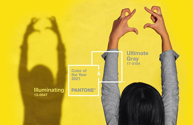
A quick reminder about the Pantone colors for 2021. There was not only one color of the year, but two. The colors were Illuminating and Ultimate Gray, a combination of yellow and gray. This turned out to be well representative of this year, because on the one hand we had the hope that things would be better than 2020, knowing that it might not be obvious. At least, that's how we saw it.
What you need to know about Pantone color 2022
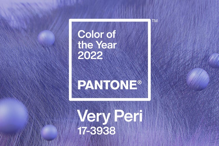
Okay, now let's move on to the important part of this article. What is the Pantone color of 2022? On December 9, we learned that the color chosen was Very Peri, a shade created by the company itself based on blue and red. Strangely, the company claims that it is not purple, although for the sake of this article, we will consider it a shade of purple. The Pantone code for this color is 17-3937. It has an effect that is both modern and calming.
Pantone director Leatrice Eiseman explains that Very Peri is here to offer a lively and joyful attitude and an energetic presence that encourages courageous creativity and imaginative expression. It is also a color that represents transition.
But why did Pantone choose an almost purple hue for its color of the year, especially since Ultra Violet was the color for 2018? Here we see two main themes: technology and the calming properties of this color.
First, let's start with the very modern look of Very Peri.
The last two years have been highly digital. Many people have had to work or study remotely using a computer. It has most certainly had an influence on our lives. In addition, the digital world is increasingly present in our everyday lives, and this will most certainly be the case in 2022. Then, as one of our colleagues said, Very Peri could be the hair color of a member of a trendy Korean music group.
As well, cold colors usually have calming properties.
As we know, 2021 has not been a year of rest, people are tired and at the end of their ropes. Very Peri can then make us think of lavender and introspection. Like last year's color (Illuminating), it was here to bring hope. The color of 2022 is here to remind you of the importance of taking care of yourself and your mental health. These will undoubtedly be important themes for this new year.
So, at first glance, Very Peri seems to represent well the important trends and themes of this beginning of the year. The key words to remember are modernity, technology, but also introspection and self-care.
How to use Very Peri when creating your logo?
The first question to ask yourself: is Very Peri a relevant color for my business? Does it represent my values and products? Obviously, as we've often said, just because there's a new trend in logo creation doesn't mean you should absolutely follow it.
Very Peri is a cold color. If you need a logo that easily catches the eye, you may need to add a warm color to make the whole thing more energetic. If you prefer calming properties, you can very well put it with white or another cool color. We see the Pantone color of 2022 being used very well for logos in the field of technology, but also for health or wellness centers.
It should be noted that Pantone codes do not work in the FreeLogoDesign editor. However, you can use the HEX code #6667AB to use the Very Peri hue when creating your logo.
Some examples of purple logos
We said above that Very Peri was not considered purple by Pantone. Since there are no logos with this exact shade yet, we found companies using a similar color in their branding.
Momenteo
One of our colleagues pointed out that the logo of our partners, Momenteo, uses a purple similar to Very Peri. This invoicing software uses a fairly original color combination for its logo: purple and cyan. The cyan gives an energetic touch to the logo while offering great contrast.
In short, it is certainly an interesting way to use a color like Very Peri.
Taco Bell
To be honest, it was the old Taco Bell logo that mostly used a shade resembling the Pantone color of 2022. During the latest redesign, this restaurant chain simplified its brand image by opting for only two colors: purple and white. Purple is indeed often used with white.

In short, a new year, new resolutions and a new Pantone color. We are sure that the Very Peri color will inspire us in the coming months. As for us, we are especially looking forward to discovering new logos with this shade. If you want to learn more about the meaning of purple or the Pantone colors of recent years, do not hesitate to take a look at our blog!
More tips and tricks on the blog

