Blog
The Origin and History of the Mountain Dew Logo
In different articles, we have analyzed the logos of several major brands in the food industry. We have talked about McDonald's, Burger King, Pepsi, and Coca-Cola. Today, we want to highlight a company that has distinguished itself from the competition with a strong and original brand image: Mountain Dew. Let's take a closer look at the origin of the Mountain Dew logo, specifically the evolution of its brand image over the years.
A few words about Mountain Dew
Where was Mountain Dew invented? Who owns this brand?
Before we begin our analysis, let's mention the history of Mountain Dew. In 1948, this beverage was officially launched. Mountain Dew was originally created because people in the Knoxville area of the United States had difficulty finding sodas that could be mixed with alcohol. Mountain Dew was also another name given to moonshine – a bootlegged alcohol made from grain. At that time, the company's brand image was quite different from what we know today.
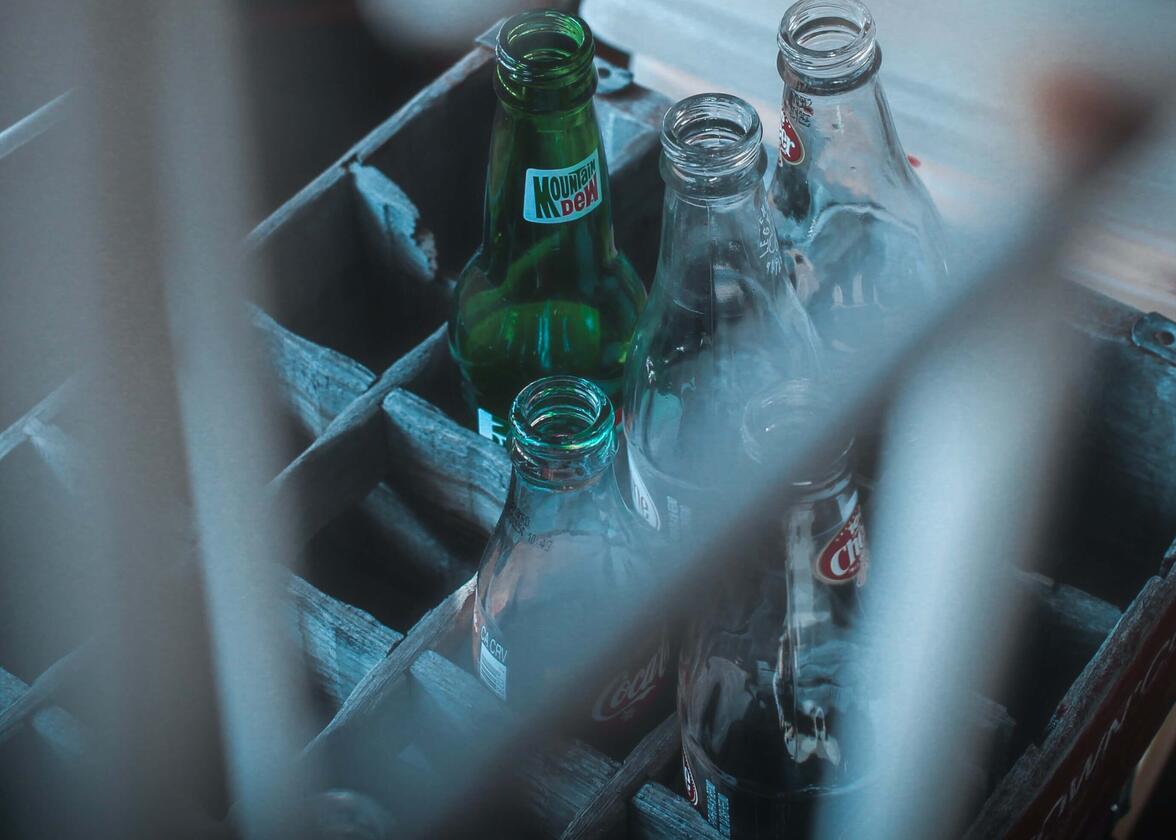
In 1964, after negotiations with Coca-Cola, it was finally the multinational PepsiCo that got its hands on the rights to Mountain Dew. Seeing the great potential of this beverage, PepsiCo then changed the entire brand image. The reason was simple. The company wanted to target a younger clientele. With its electric green color, citrus taste and high caffeine content, Mountain Dew was the 4th most consumed carbonated soft drink in the United States in 2010. Over the years, there have been numerous advertising campaigns to promote the brand and variants of its original recipe. Who doesn't remember the strange Puppy Monkey Baby advertisement from the 2016 Super Bowl?
What was the original logo of Mountain Dew?
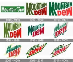
What did the first Mountain Dew logo look like? Before the company was purchased by PepsiCo, the brand image revolved around the theme of moonshine and the rural side of the central United States. Mountain Dew's original logo was then a signature logo – a logo consisting only of the company name in a sans-serif font. Back then, green, a shade reminiscent of nature, and white were used. This logo was used from 1948 to 1969.

Source: Smithsonianmag
The evolution of Mountain Dew logo designs
Why did the Mtn Dew logo change?
As was the case with Pepsi's branding, Mountain Dew has had several logo redesigns during its existence. At the dawn of the 70s, the company bet on a younger brand image thanks to a new logo that was both simple and a little psychedelic. They played with the curves and the spacing of the letters. The name of the drink was no longer presented only on a single line, but on two to make it more dynamic. At that time, green and red were used. There would then be minor redesigns of the logo in 1980, 1991 and 1996.
In 1998, a new Mountain Dew logo was born. It was to some extent a continuation of the logo of recent decades. Curves were removed for well-defined lines. A green shadow surrounded the logo and another font with slight serifs was chosen. We are far from the 70s. Then, in 2005, this logo was redesigned. They accentuated the serifs around the logo with a yellow color this time. Remember, this was a time when the tribal tattoos were fashionable. They played with the letters to create an effect of a fisheye type. This version is still used today in some countries.
Source: 1000logos
How many times have we written that one of the most important trends of the moment was minimalism? During redesigns, several companies have opted for simpler versions of their logo. This was the case with Mountain Dew. In 2009, the logo was simplified. The fisheye effect was removed, as well as the lines around the logo. Mountain was replaced by MTN, an abbreviation. It is, therefore, common to see the brand be named Mtn Dew. Green, red, white and lime green were then used. Then, in 2017, the outline was changed to black. Black has the particularity of bringing out other colors.
It is also important to note that the Mountain Dew logo was changed during various advertising campaigns to promote new flavors. There were several versions with different color palettes. For example, Mountain Dew Code Red used black, white, and red. While the Mountain Dew Voltage was in blue, red, and white.
How to be inspirated from Mountain Dew drinks and branding to create your logo
The Mountain Dew logo can certainly be an inspiration when creating your brand image. First, let's talk about colors. Mountain Dew boldly chose complementary colors, green and red. Complementary colors, since there is a great contrast, have the particularity of easily attracting attention. As PepsiCo wanted to reach a younger clientele, it was a good idea to stand out.
Then, we should mention that Mountain Dew was able to adapt to the need. The company was not afraid to create different versions of its logo and beverage for various commercial reasons, and regardless of the change, we still recognized it. Therefore, feel free to have different versions of your logo. This will allow you to meet different needs. This may be relevant to you if you are launching a new product or service. Do not forget to use it on packaging, such as bottles, when it is relevant.
In conclusion, Mountain Dew has been able to both adapt and stand out. When it was purchased by PepsiCo, the company was able to find a target clientele, creating its logo accordingly. This is certainly something to keep in mind when creating your logo. To learn more about advertising campaigns, we invite you to discover Coca-Cola's Share a Coke campaign.
More tips and tricks on the blog


