Blog

Create a Combination Mark Logo: 7 Mistakes to Avoid
As we know, there are many choices available to you when you want to create a logo. Do you want a wordmark logo to highlight the name of your company? Would you rather use a symbol to stand out? Have you thought about creating a logo that contains both an icon and text? Today, we take a closer look at what a combination mark logo is and 7 errors to avoid regarding this type of logo.
What is a combination mark logo?
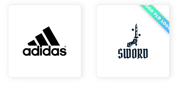
Let's start at the beginning: what exactly is a combination mark logo? The combination mark logo is one of the most popular types of logos right now. It is composed of an icon/symbol and the name of the company. Actually, most companies opt for this type of logo because it is flexible and allows you to help create a strong brand image. For example, Amazon, Microsoft, Adidas, and Reddit use combined logos.
However, just because it's a popular type of logo doesn't mean you're not immune to errors during the creation process. Here are 7 common mistakes to avoid regarding combined logos.
The chosen symbol does not represent you
As mentioned above, a combination mark logo has two main elements: the icon and the text. When creating your logo, it's essential to choose an icon that represents you well or sums up your business. At a glance, your potential customers need to have an idea of what you offer or what your values are.
Here's an example not to follow: BP. Indeed, this oil company decided to opt for an icon resembling both a sun and a yellow and green flower. The problem here is that you would think it is an environmentally friendly company and not a multinational company responsible for one of the worst oil spills in history.
The size of the symbol is inadequate
For a combination mark logo to work, the result must be balanced. In other words, there has to be a balance between the symbol and the text. When creating your logo, make sure the size of the symbol is adequate. It must not be too big nor too small. Tip: rely on the dimensions of the text as a width or height limit for the symbol.
Don't forget to center the elements of your combination mark logo. Fortunately, with the new FreeLogoDesign logo maker, new tools such as alignment lines or grid lines are available.
The size of the text is inadequate
In the same vein, the size of the text must also be adequate. It should not overshadow the icon, nor be too small to read. If necessary, take a look at different combination mark logos to find the perfect balance between the size of the symbol and the text attached to it. Don't hesitate to use the different templates created by FreeLogoDesign's graphic designers if you don't know where to start.
It would also be appropriate to choose a readable font. It may be fun to choose a font that is a bit out of the ordinary, but if no one is able to read the name of your company, it will serve no purpose. Also, use a font that works with the general style of your logo so as not to cause confusion.
There is too much or too little space between the elements
One mistake we see frequently is to attach the text to the icon. This gives an effect of lack of space, suffocation, which harms your brand image. Therefore, we advise you leave some space between the various elements for a more harmonious look. The opposite is also a mistake. If the elements are too far apart, it is more difficult to understand that they are not two logos, but one.
Also, be aware that you don't have to put the symbol at the top of your combination mark logo. There are different options that can be explored: you can put your icon to the left or right of the text, but also below it.
Not knowing how to use the logo symbol properly
A combination mark logo has the advantage of being flexible. It's easy to use on print as well as on social media. However, you need to know how to use your combination mark logo symbol properly. You may only have to use the icon of your logo, for example for the Favicon. Let's take the example of the FreeLogoDesign logo, because it is a basic combined logo. For the Favicon, we decided to only use our symbol since the text would then be too small. So, when creating your logo, consider turning your logo into a symbol logo as well.
Using too many colors
One mistake we often see when creating logos is the use of too many colors. In general, we recommend not using more than three colors for your logo so that the result is harmonious. Think of the logos of large companies. Most have only two or three colors.
Tip: why not use the same color on your symbol for your text? That's what companies like TacoBell, PayPal or Spotify have done.
Creating something complicated
Most of the logos are quite simple: there is a symbol, then the name of the company. Therefore, don't create something complicated. Every element of your logo has visual weight, so avoid small details or icons that are too complex. In addition, current trends in logos revolve around minimalism. When we analyze the logo redesigns of the big brands, we quickly see that in most cases, elements are removed instead of added.
Be on the ball: create a simple logo with a strong icon that represents you well and a font adapted to your brand.
In conclusion, if you want to learn more about other types of logos (for example, the monogram logo or badge logo), take a look at our page about the main types of logos. Happy creating!
More tips and tricks on the blog

