Blog
How to Use Your Company Logo in Email Campaigns
A logo is an element that visually represents your brand across numerous platforms, both offline and online. You use it everywhere from billboards to web push icons, and email is no exception as well.
Why you need to include a logo in your newsletters?
A well-designed logo is key to build up a solid brand identity and promote its recognition. Visual data is typically perceived faster than text, so when people see your icon, they instantly get who they’re dealing with and what the conversation would be.
A recognizable logo would also help team up all the customer communication channels you might be using – Email, Web Push, Mobile Push, SMS – and achieve smooth omnichannel experience.
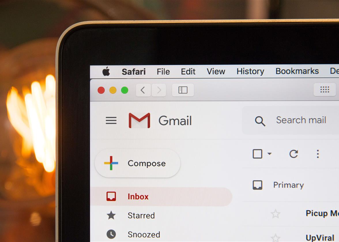
Email Web Push
A logo, alongside corporate colors, text font, contacts and email signature, helps make your emails more personalized: it’s like a Facebook or LinkedIn profile image, but for a business instead of a person. And it’s more psychologically comfortable to respond to the visualized concept of the company rather than to completely faceless offers.
Mind, that when crafting a logo, it’s better to opt for a well-thought design and come up with proper editing. This will be a one-time investment, but be sure it would pay off: your logo is your company’s face, so it should be as professional and quality as your service.
How to Make Your Logo Work for Every Email
Now, when you’ve got a nice original logo on your hands it’s time to get it working for your email marketing.
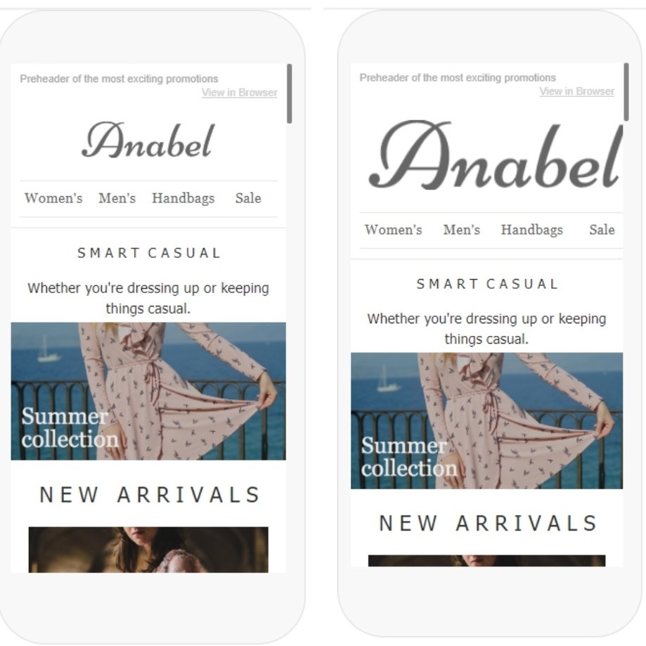
1. Make sure it’s optimized for mobiles.
Different research suggest different numbers, but in general, 65-75% of users open emails on a smartphone. Which means each element of your email should be designed to look great on both PC and gadgets. A distorted or over-the-screen-size logo makes no campaign look great.
2. Choose a color scheme.
The logo would partially dictate the color strategy for all your further campaigns. That’s why when choosing the colors for it, keep in mind you’ll have to stick to this palette throughout future newsletters.
3.Set up a transparent background.
You may be using numerous variations of your logo for different purposes, but when it comes to email, it’s better to opt for a transparent background. Otherwise, you’ll have to optimize the template color each time you’ll use it for new campaigns.
4. Comply with the overall design.
If you’ve been running email campaigns for a while, you’ve probably figured out the design that works out the best, and your logo is smoothly incorporated in the general structure. However, if you’re new to marketing, the temptation to bulge out the logo may be high. Fight it! The logo should comply with the email hierarchy and complement other elements, not steal the show.
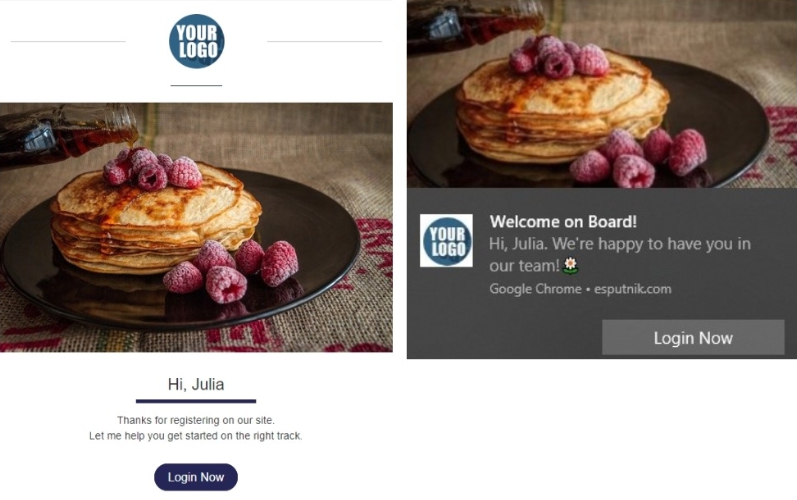
5. Find Your Ideal Placement.
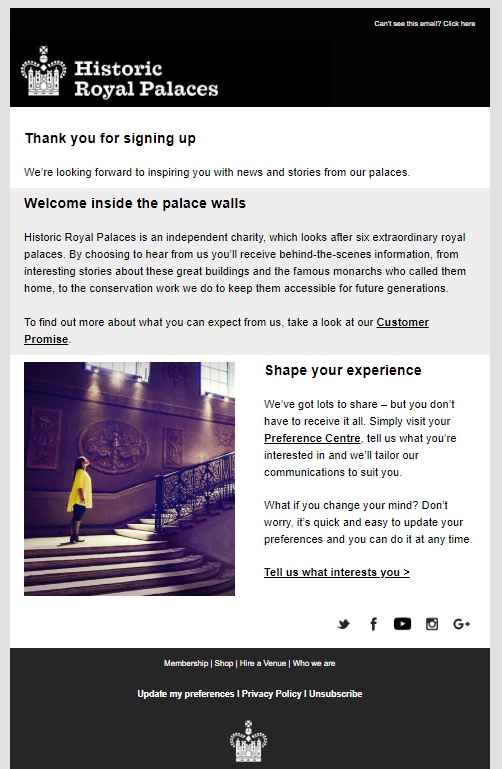
Top positioning is the most preferred place for logos, with the top left corner being #1 choice. The reason for it is that most subscribers scan the message left to right, which makes the logo the first thing they see. A top-centered location is an effective option as well, especially if you use big letters or image-based icons.
If the email lengths allow, you may place the logo two times – on top and bottom. Opt for different logo variations (image only, image + text, image inside text, etc.) to make the template look more diverse.
Double placement of the logo works especially well for B2C, educational institutions and non-profits. Their offers typically take time to read and consider, so when the subscribers make it to the end of the email, the logo serves as a reminder of who they’re interacting with at the moment.
6. Use dividers or white space.
Depending on what’s it surrounded by – images or text – consider using dividers or white space to set the logo aside from the rest of the content. It’s a separate, independent element which shouldn’t merge with the copy. This is particularly applicable to compact, space-tight templates with much information to be fit. A graphic or glyph divider will help organize everything in a cleaner and easy-to-perceive way.
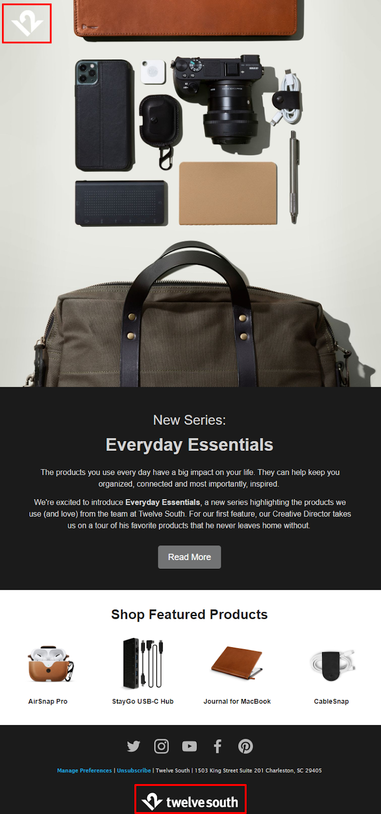
7. Copy your website header.
Many companies build their newsletter header to look like a website header, with the same logo and navigation layout. It creates a sense of browsing the website within the email and enables prompt brand recognition. It’s like you send your website straight to the Inbox.
8. Don’t forget about the alt text.
Even if you’ve got everything covered on your part, there still may be issues to affect image loading, for example, problems with a host server or user’s device. And since a logo is technically an image, the subscriber would see a default substitute instead of the actual icon. To mitigate the damage, write the alt text to let people know what’s missing.
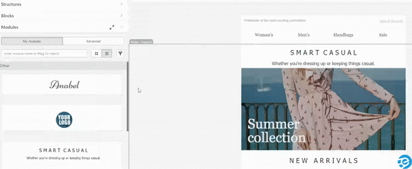
9. Save the logo as a block.
If you create (hopefully) your campaigns in a professional adaptive email builder, there is an option of saving any elements of your template, including the logo, as a block and simply drag to all future campaigns. This would save you a lot of time when crafting new messages, especially when being pressed for time.
To sum up, whatever campaign you’re making – welcome email, blog newsletter, payment confirmation, etc. – remember that a logo is your brand’s official representative, and thus should 100% resonate with the brand identity. Don’t waste time and effort on its optimization: a seemingly small element, the logo can help your company personality shine.
This article was written by Iuliia Nesterenko. She is a contributing writer at eSputnik. Her focus is on exploring current digital marketing trends and describing new strategies for email marketers.
More tips and tricks on the blog

