Blog

Everything you Need to Know About Pantone’s Colour of 2020
You probably know that colors carry messages. So, it's important to choose the right color for your logo or creation when you're designing it. Every year, Pantone, the American color company, looks at what the new trendy color should be. Their unveiling, which takes place in December, is often eagerly awaited by graphic designers and fashion designers. Let's take a closer look at what Pantone’s color of 2020 is and how you can use it for your logo.
A Few Words About Pantone
Pantone is an American company that was founded in 1866. Over the years, they have distinguished themselves by inventing a universal color palette for prints called the Pantone Matching System (PMS). This palette had a precise name and code for each color making it possible to reproduce the same color anywhere. The first to be chosen color of the year by Pantone was Cerulean in 2000. This pale blue was chosen as it reflected the technological age of the new millennium. Since then, different shades have been selected, becoming very popular and used in different fields, including decoration, graphic design, and branding. On the eve of December, several people bet on the color for the following year, while others argue that it is only a marketing stunt.
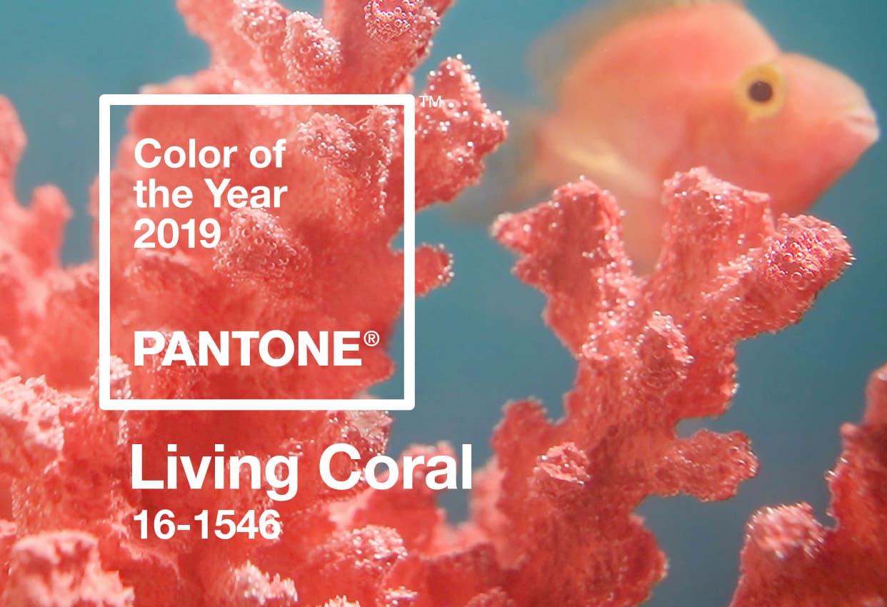
Living Coral: Pantone Colour of 2019
Before we talk about the new color of 2020, let's take a look at what Pantone chose as the color of 2019: Living Coral. This bright orange-pink shade was a nod to the corals of the sea and could give a bright touch to any design. Living Coral was also associated with joy and optimism given its golden tone. This color looked good as an accent color or as an accessory. Now that 2019 is coming to an end, it's time to give way to another color.
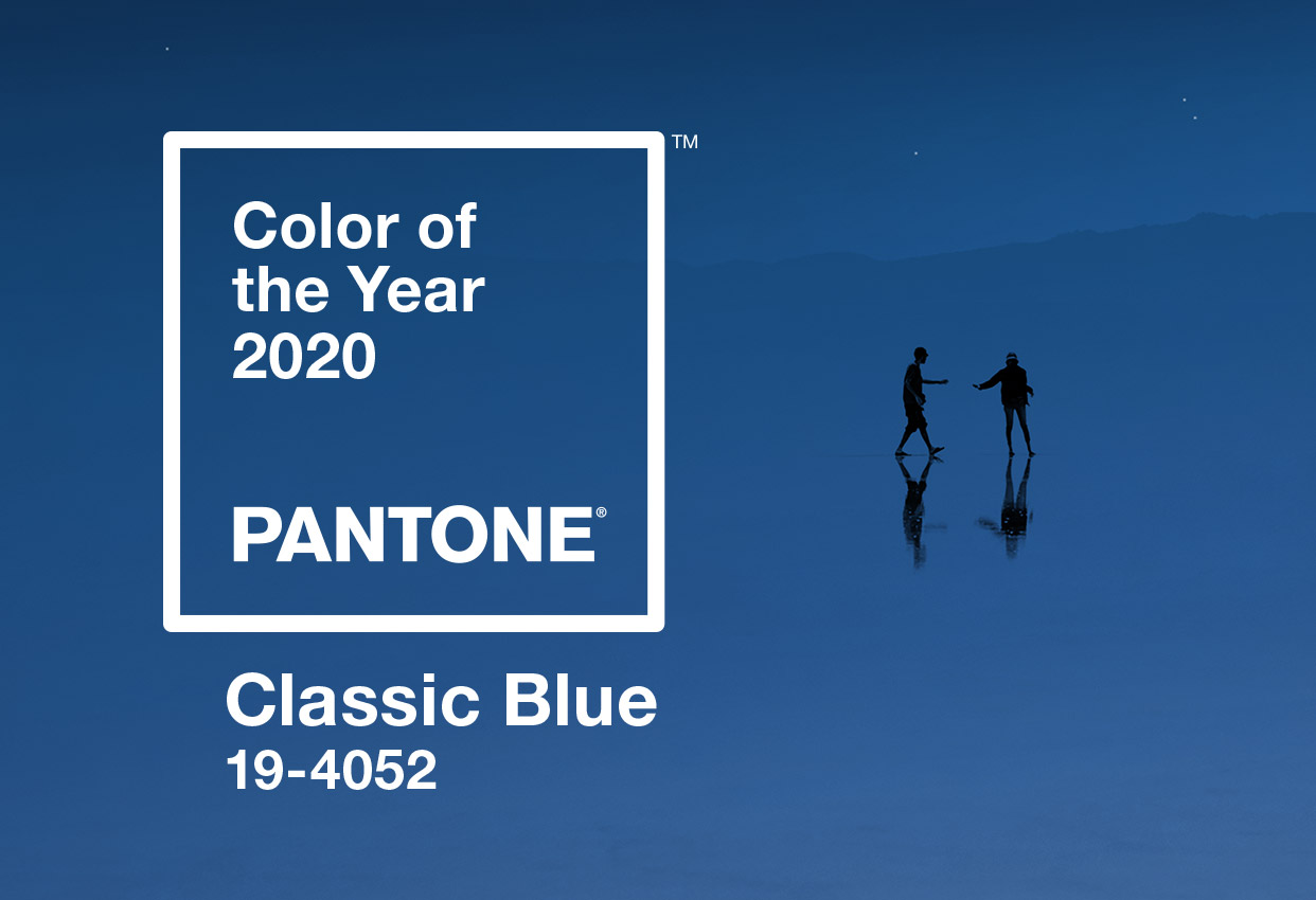
Pantone’s Colour of 2020: Classic Blue
When the wise men of Pantone meet to choose the color for the next year, they take into account the trends, but also what humanity needs right now. Last year, Living Coral was there to cheer us up and bring a touch of life to our overly connected lives. According to Pantone's director, Leatrice Eiseman, "we live in an era that requires trust and loyalty." The Classic Blue color (19-4052) was chosen for its timeless and reliable side. It is a return to your roots that the Pantone team offers.
Classic Blue is a fairly common blue reminiscent of the sea or jeans. It is a timeless color, elegant and simple. We are currently living in a period of uncertainty where everything is moving so fast, much like at the dawn of the new millennium. At the time, Cerulean had been chosen to soothe the excitement of the arrival of the year 2000 and it is easy to assume that Classic Blue was chosen for the same reasons. We all feel a little overwhelmed and this shade is here to bring calm. It is the opposite of the bright orange-pink color of 2019. Blue is also a very popular color for people and the most used for logos making it a dose of comfort in these changing times.
The Meaning of the Color Blue
Do you know the meaning of the blue color? For starters, this is one of the three primary colors. It is also a cold color that is refreshing, quiet and very common. Blue is everywhere, whether it is the sky, the sea or because it is the color most used for corporate logos. This may be due to the fact that blue is often used to represent knowledge, trust, and accessibility. Several major companies have chosen this color for their logo. Just think of Ford, Facebook or Walmart. They are also companies that want to appeal to everyone.
As well, blue is also a widely used color for flags. Again, it is often to illustrate the importance of the sea or peace.
How to use Classic Blue When Creating Your Logo
We have repeatedly told you to be wary of trends when creating your logo, however since Classic Blue is a common color, you can definitely use it. This shade can be combined with several other colors, including white, black and green. Pantone has created different color palettes to use Classic Blue properly. Since blue is a widely used color, we advise you to use more dynamic accent colors so that your logo can stand out. A touch of red, orange or yellow could make your logo look more alive if that is what you want. In short, it's hard to go wrong with a color like Classic Blue. This is among other things what makes it charming!
A quick reminder: it is an error to rely too much on a trend when creating your logo. A timeless logo will allow you to have a strong brand image that you can keep for a long time.
In conclusion, what do you think of this new color of the year? Would you have liked another shade or is Classic Blue inspiring you? What we like about this new Pantone color is that it's an easy-to-use color and all-rounder. This color can be used equally for a simple professional logo or a playful logo. In short, don't hesitate to try this shade when designing your next logo!
More tips and tricks on the blog

