Blog
An Analysis of the Logo for the 2020 Tokyo Olympics
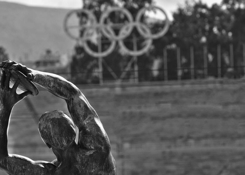
The year is coming to an end and in 2020 we will have the chance to watch the Summer Olympics in Tokyo. It will be the second time that the capital of Japan has hosted this important event which brings together athletes from all over the world. Over the years, we have seen several striking logos, some good and not so good. Let's take a closer look at what the current logo of the 2020 games means and the story of its creation.
The Application Logo
Before analyzing the final version of the logo for the Tokyo Olympics, let's take a look at the one that was used when the city submitted its application to host the 2020 Olympics. It was designed by an arts student named Ai Shimamine and it was unveiled in 2011. The application logo was round and consisted of several cherry blossoms, the sakura, which is the symbol of the city. The colors used, red, yellow, green and blue, were reminiscent of the colors of the Olympic logo. Black was replaced by purple, a color that has represented Tokyo for many years. Finally, a sans-serif font was used for the bid logo and when Tokyo was announced as the host city, the official Olympic logo was added under the bid logo pending the unveiling of the official 2020 Summer Games logo.
Source: wikipedia
The Controversy Over the Official Logo of the Tokyo Olympics
In July 2015, the official logo of the 2020 Tokyo Olympics was unveiled. The logo was a vertical black rectangle in the middle of two triangular shapes, a gold one at the top left and a light grey one at bottom right. According to the creator Kenjiro Sano, this arrangement formed the letter T to be associated with the city of Tokyo, as well as the English words "Tomorrow" and "Team". As well, a red circle was placed at the top right to represent the Japanese flag, but also the geographical position of the country. The Clarendon serif font was used for the text under the logo.
Source: wikipedia
Although the designer had won several awards of excellence during his career, opinions of this logo were mixed. The tipping point was the controversy with the Théâtre de Liège. It turns out that the logo proposed by the Japanese Olympic Committee looked oddly like the logo of the Belgian theatre, which also consists of a central vertical rectangle and two opposite triangles. The Japanese designer was accused of plagiarizing the Belgian logo and although the games' organizing committee initially defended the logo, they finally decided to drop it so as not to damage the credibility of the games less than two months away.
In Search of a New Logo
The 2020 Olympic Games then used their bid logo while waiting to come up with a new official logo. They asked the Japanese for ideas, whether they were designers or not. The inhabitants of Japan could submit their logo to the organizing committee and in less than two weeks they received 14,599 proposals from people 1 to 107 years old! After several evaluation rounds, 4 logos were selected by an independent committee. As you can imagine, the selection process was very rigorous. The Japanese Olympic Committee could not afford another image-related disaster especially before the start of the games.
The Meaning of the 2020 Olympic Games Logo
It was Asao Tokolo’s design called the symbol of the checkerboard of harmony that became the official logo of the 2020 Olympic Games. It is reminiscent of the bid logo as it has a round shape with an empty space in the middle and uses the font sans-serif font Din. At least the Sakura, Tokyo's flower, was used as an inspiration for the Olympic torch.
The logo consists of three different sizes of rectangles to make a checkered pattern design. This Japanese style is known as ichimatsu moyo and was popular during the Edo era. The various shapes of the rectangles represent the nations, which separately may seem very different, but together form a united whole. In addition, unlike the bid logo and the first logo, the final logo uses only two colors: indigo, a color considered traditional in Japanese culture, and white for peace.

Source: BBC
The Paralympic Games logo is also made up of a checked pattern using the indigo color, however, the rectangles are arranged so that the rectangles are in the middle with an opening at the top of the logo. Interestingly, there are as many rectangles in the logo for the Olympic Games as there are for the Paralympic games.
In conclusion, you will be able to tell everyone what the logo of the upcoming Summer Olympics means when you watch the competitions on TV. You can definitely get inspiration from the process of creating the logo of the Tokyo Olympics when you use FreeLogoDesign. Start by finding out what your values are, and then the colors that represent your message well. Finally, make sure your logo doesn't look like something that already exists! Enjoy Creating!
Let's make a logo!
More tips and tricks on the blog