Blog
The Cirque du Soleil Logo Over the Years
You've probably heard of the Canadian company Cirque du Soleil, whether you've been to one of their many shows or not. This circus show with its huge yellow and blue big top has been around the world several times thanks to its many fabulous acts which are greatly appreciated by the public. Can you think of this entertainment company’s logo? As you may have pictured in your head, Cirque du Soleil has a sun as its logo which has evolved over the years.
A Summary of the Company
Cirque du Soleil was founded in 1984 in Canada under the name of the Scavengers of Baie-Saint-Paul. At the time, it was a group of artists including jugglers, dancers, fire-eaters, and musicians. They had their first success in Quebec. In 1984 when the company was chosen to participate in the celebrations of the 450th anniversary of the discovery of Canada by explorer Jacques Cartier, the group changed their name to Cirque du Soleil. The sun logo was a strong symbol of energy and youth according to the founders. In addition, Cirque du Soleil was one of the first circuses to have only artists perform rather than animals.
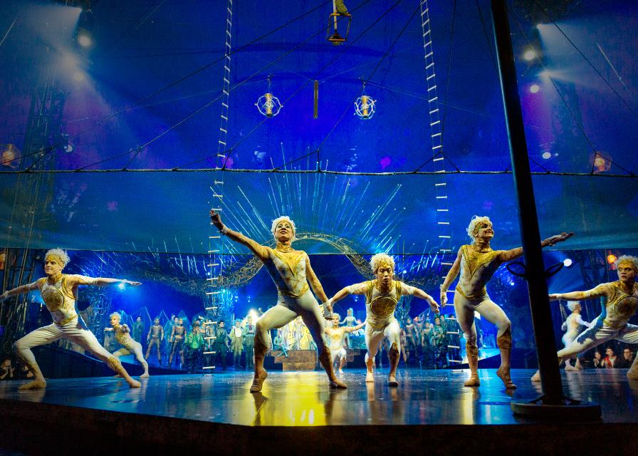
In 1987, the company did its first show in the United States and it was a great success. Then, several shows took place all around the world, whether in arenas, theatres or under their famous big tops. Many shows with great artistic talents were performed for several years. Cities such as Las Vegas, Orlando, Dubai, and Montreal have been fortunate to have had this show that attracted thousands of tourists. Perhaps you have had the chance to attend Saltimbanco, Alegria, Ovo or Kurios to name only a few. To date, Cirque du Soleil has created 32 shows, employed 5,000 people, including 1,300 artists. It is a big player in the field of entertainment.
![]()
Source: Wikipedia
Now let's talk about the Cirque du Soleil logo. The first version was in 1984 and appears handmade. The drawing is of a sun and its rays on a banner with blue in the lower background and green in the upper part. The yellow sun rays with the blue background is the same pattern used for their big tops. The idea for the name and the logo came to one of the founders and owners of the company, Guy Laliberté, who was watching a sunset during a trip in Hawaii. In 1991, we saw the first logo with a more professional look. This symbol was chosen to represent the company, which was then an increasingly international success. A sun and rays were used on the flag, with the whole image harmonized in blue. Several small details were present in this logo like the rays, the lines of the big top and the face of the sun.
Source: Underconsideration.com
Then, in 2006, Cirque du Soleil decided to change the color of its logo to gold and made some other small changes. The font used for their logo went from a serif font to a sans-serif font, giving it a more modern look. In addition, a thin layer of gold represented the sun and the prosperous years of the company. This version was used until 2017.
The 2017 Logo Redesign
There are several reasons why the company wanted to redesign their logo. First, Cirque du Soleil had been using the same one for more than 20 years and there were changes happening within the company. As well, the number of details on the original logo gave the commercial printers headaches. The whole thing was very heavy visually speaking. The purpose of the redesign was to modernize the brand image, but more specifically to simplify and refine it to reflect the new era. Brand Union and the creative studio Official Commissioner worked on the redesign.
The result was on trend with logo simplification. There are far fewer details, which allows this new logo to adapt to smaller formats, as Sheila Morin, Senior Director of Marketing and Brand Strategy explains: "We have more and more points of contact with consumers, whether by email or mobile advertising, and the very detailed logo, more of the order of the drawing, wasn’t as easily seen in the small format." The face of the sun keeps a benevolent smile and the use of gold makes the whole thing more sophisticated. Some critics, however, have mentioned that the style of Cirque du Soleil's new logo is a bit too like the famous Starbucks coffee logo.

Source: Wikipedia
In conclusion, there are several reasons why you should think about doing a redesign of your logo like Cirque du Soleil. Does your logo have too many small details that are lost when printing in a small format? If so, would a simplification of your logo be possible? In short, if you work in the art or entertainment world, you can probably draw inspiration from Cirque du Soleil to find a name and logo that will astonish your customers!
Sources:
https://www.cirquedusoleil.com/fr/a-propos-de-nous/historique
https://fr.wikipedia.org/wiki/Cirque_du_Soleil
https://www.infopresse.com/article/2017/11/21/le-cirque-du-soleil-revoit-son-identite-de-marque
More tips and tricks on the blog


